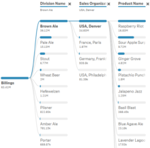
Goal I’m guessing that like other Data Visualizers around the world you spend a lot of your time creating dashboards that are full of Key Performance Indicators (KPI’s), and not nearly enough time creating dashboards that focus on visualizing dimensional… Read more ›
Purpose If I were to sit down at a prompt window with a Generative AI Art tool like MidJourney and ask for a Pirate it might render something like below. That’s what it does. While that is a classic pirate… Read more ›
Prerequisites to the Why You can’t start a post by handing out work to be done before you readers can read it! I would like to follow that convention, however, I find myself in a place where you really need… Read more ›
My Journey I began this blog 9 years ago and was honest in my About statement that my intent was to share my journey as I was learning more and more about Data Visualization and Data Analytics. Most importantly …… Read more ›
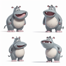
Background I loved playing Hungry Hungry Hippos as a child, as a parent and as a grandparent. So when the opportunity arose to talk about Information Hungry hippos, I mean end users, I just couldn’t pass up the chance to… Read more ›
The ballots have been tabulated and the 2022 Dorksi for Role Playing Dimension of the Year goes to the “Physicians Table.” The CEO, CIO, CMO, CNO of the ficticous, soap opera based General Hospital Health System all shared the same… Read more ›
Background In my last post What’s In It For Me I provided a step by step example that showed how I could gain peace of mind by backup an important SaaS application to GitHub on a scheduled basis. Then I… Read more ›
WII-FM When I was young Dork starting my career I participated in Toastmasters International for 7 years. If you aren’t familiar with the organization it is a non-profit group with clubs all over the world where you meet on a… Read more ›
Foreword All businesses have a product which they sell and hospitals, even non-profits, are no exception to that rule. Their product? Beds. Oh, sure they have lots of human beings that poke you, prod you, care for you and feed… Read more ›
A picture paints a thousand words They say that a picture paints a thousand words. If that were true, you should be able to describe a picture with a thousand words. Right? Like you, I have no idea who “they”… Read more ›