I’ve enjoyed my career in Business Intelligence but after seeing the following visualization which shows the amazing potential for earning profit in the home flipping business I think it’s time I became a real estate mogul. Unless you’ve been under… Read more ›
One of my favorite activities as a child was doing mental puzzles. Matchstick puzzles like this were among my favorites. Easy to understand wording like “Move 2 matchsticks and turn this fish that is swimming to the left into a… Read more ›
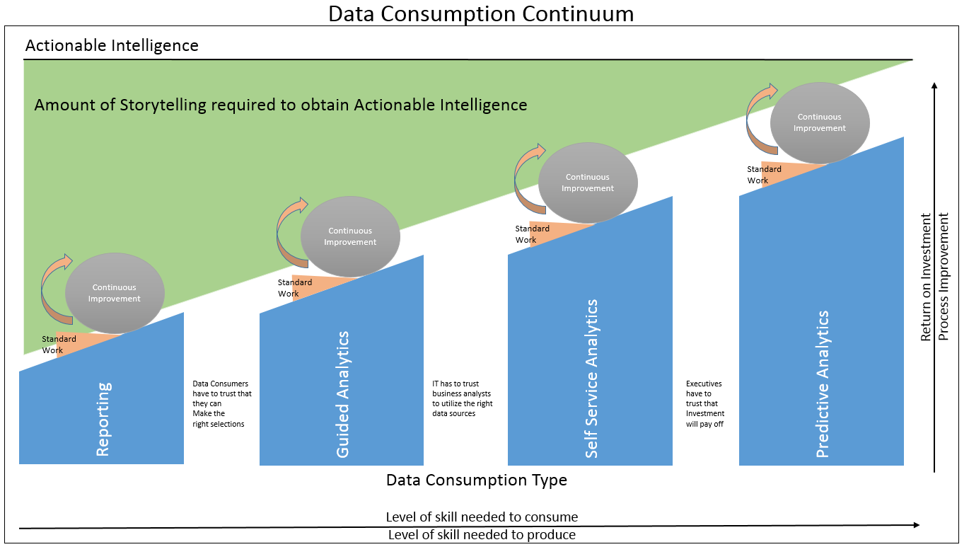
As this is intended to be a blog about visualization it seemed only fitting that I devote this post to visualizing the concept I introduced last week that I called a Data Consumption Continuum. It all started with … A… Read more ›
We humans love to consume. Food. Water. Fuels. And my personal favorite Chocolate. You name it we want to consume it. Health warnings have little effect at deterring us from consuming mass quantities of the wrongs things. Yet sadly there… Read more ›
In 30 years as a parent I can tell you I’ve had many memorable moments with my 2 amazing daughters. As humans, most of our memorable moments around babies involve movement. Let’s face it as cute as they are it… Read more ›
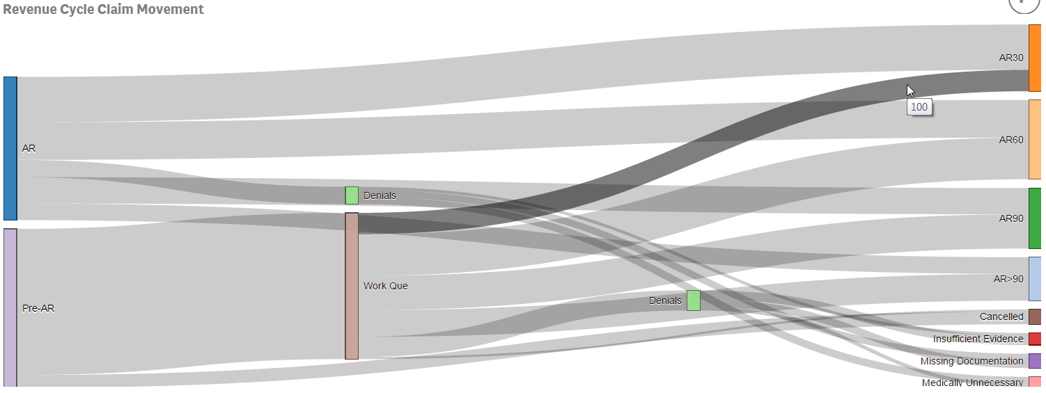
I recently had the opportunity to demonstrate Qlik Sense for the Director of a large health system’s Revenue Cycle team. The consultant who recommended us spoke with me ahead of time and we got along great. “This guy has been… Read more ›
This past week I had my annual review. This time of year always makes me envious of those that produce widgets. I would love to be able to show my boss a list of all of the widget producers and… Read more ›
What do the numbers 3.53, 17.6 and 4 all have in common? They are completely useless when displayed by themselves because they have no context. Length of Stay is a vastly important metric in health care and here is the most… Read more ›
“It was the best of times, It was the worst of times, It was the age of wisdom, It was the age of foolishness …” These are the unforgettable opening lines to Charles Dickens’ classic “A Tale of Two Cities.”… Read more ›
Not that anyone would be surprised to discover a direct correlation between supply and demand but in my last post on “Visualizing Knowledge” the scatter plot proved to be a very advantageous chart type in that it showed there was… Read more ›