Removing the clutter
Ask any Data Visualization expert and one of the best pieces of advice that they will give you is “remove the clutter” so that your “data can tell the story.” Would it be going to far if I suggested that… Read more ›
Ask any Data Visualization expert and one of the best pieces of advice that they will give you is “remove the clutter” so that your “data can tell the story.” Would it be going to far if I suggested that… Read more ›

I can tell you that as the father of two daughters, the grandfather of 7 and a 20 year veteran coach/instructor for thousands of adolescent female athletes I’ve probably said “What in the world were you thinking” at least a… Read more ›

Many who make requests seem to have a belief that Business Intelligence is magic. They loose their ability to listen to logic and reason and simply ask you to do the impossible. Many who make requests seem to have a belief… Read more ›
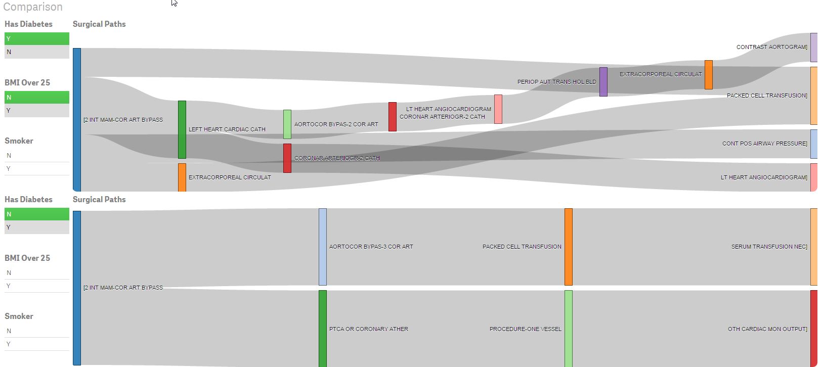
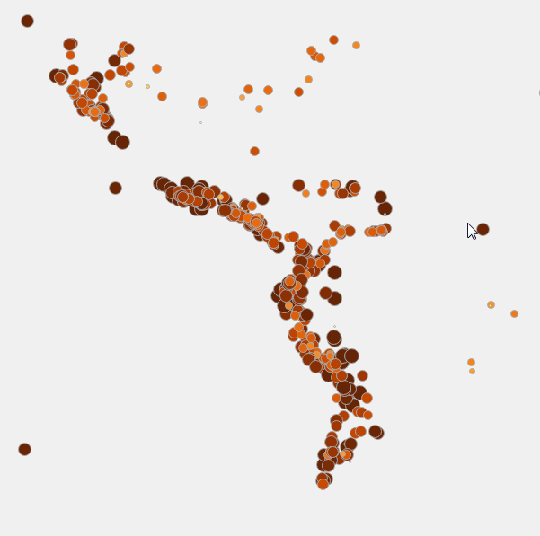
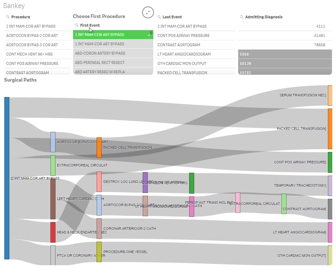
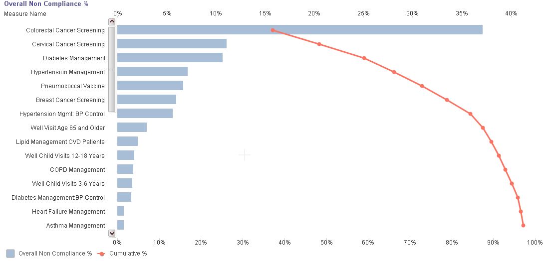
Have you ever wondered what events happen to patients after a particular surgery is performed? Well I did. Like I seriously can’t sleep when I start wondering about things like that. I start believing crazy things like we can change… Read more ›

When most people think of Qlik they think of our patented Qlik Indexing Engine having all of your data in memory. I love demonstrating the lightning fast speeds and responsiveness with hundreds of millions of rows of data. More and… Read more ›
Advanced Analytics with Aster I recently stumbled upon Teradata’s Aster and I’m pretty fired up. It turns out there is an entire community dedicated to helping data visualization people like myself learn how to implement advanced analytic functions. The site… Read more ›

That is the question. At least it’s the question that we in the business intelligence community should be focusing on. Why weave my title so closely to one of the most famous lines by William Shakespeare? Simple. Our ability to… Read more ›
Ever have one of those days where you feel like you are surrounded by a bunch of whiny brats? No I’m not talking about your children (or grand children in my case.) I’m talking about your leadership team. You’ve written thousands… Read more ›
Besides helping customers by day and being an all around Qlik Dork at other times I happen to have a very strong passion for helping fastpitch softball players elevate their game. When I say elevate their game I mean getting over… Read more ›

You know I love to go out on a limb using data metaphors. Sometimes they are my own and sometimes I flat out steal them from others. (Imitation is the sincerest form of flattery you know.) I’ve wanted to continue… Read more ›