Skip to content
Qlik Dork

Let's make it simple

  • About
Filter By:
  • Show All
  • Admin
  • Analytics
  • Application Automation
  • Architecture
  • Business Value
  • Coding
  • Data Literacy
  • Data Modeling
  • Data Quality
  • Data Science / Big Data
  • Design
  • FinOps
  • Fun
  • General
  • Generative AI
  • Geo Analytics
  • Performance
  • Population Health
  • Predictive Analytics
  • Qlik Cloud Data Integratin
  • Security
  • Self Service
  • Storytelling
  • Training
  • Uncategorized
  • User Adoption
  • Visualization

Visualizing Knowledge

Visualizing Knowledge surfaces the interconnections between different pieces of information

I love it when a plan comes together. For the past several weeks I’ve been reading furiously and working like a dog doing my day job, while also trying to come up to speed on Qlik Sense as quickly as… Read more ›

January 19, 2015
DaltonRuer
Visualization
Knowledge, Median Minutes to Bed, Visualization, Visualizing Knowledge

Visualizing Lab Results

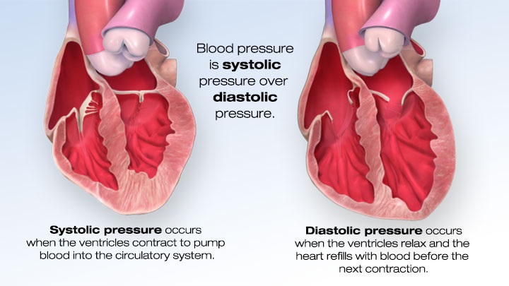
Have you heard the joke about the lab technician that walks into the room to stick you with a 15” needle and draw your blood? Of course you haven’t that’s just not very funny stuff. More than likely you are… Read more ›

January 8, 2015
DaltonRuer
Visualization
fishbone diagram, QlikView, visualizing blood pressure, visualizing lab results

Visualizing Blood Pressure

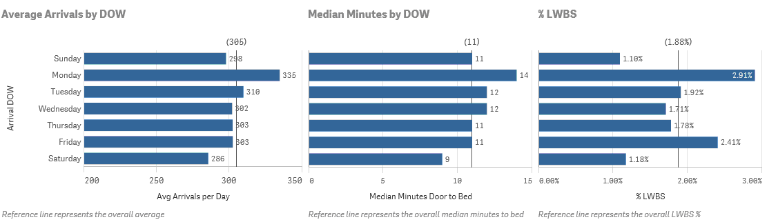
I was recently asked to produce a rounding report for physicians. Easy enough right? Slap some vitals on a page, toss in some lab results and the medication administration record and voila … you have a rounding report. But that… Read more ›

December 29, 2014
DaltonRuer
Visualization
continous time series, data discovery, Infographic, QlikHealthCare, QlikView, Randy Krum, Stephen Few, visualizing blood pressure, visualizing vital signs
Newer posts →
Qlik Dork © 2026. All Rights Reserved.
Proudly powered by WordPress
A theme by Sampression