Visualizing Dimensional Relationships
Goal
I’m guessing that like other Data Visualizers around the world you spend a lot of your time creating dashboards that are full of Key Performance Indicators (KPI’s), and not nearly enough time creating dashboards that focus on visualizing dimensional relationships. You know, the categorical values in your data that help you track your organizations Operational Key Results (OKR’s) to improve. KPI’s are great for understanding where you have been and where you are, but they do nothing to help you understand what actions to take if you aren’t on course.
My goal for this article is to help you show some love to the poor under appreciated dimensions in your organization. Because it seems to me that Dimensions are the ugly step child in the Measures family in a Measures world. Together we can change that.
To help you understand what I mean, I am going to I am going to promote you from Analytics Guru, to the Big Cheese title of your choice at my internationally acclaimed brewing and distribution conglomerate Dorkweiser. Don’t get to excited, there is no money or corner office that comes with the promotion. Only the responsibility of now viewing information like a big cheese rather than an analytics guru.
Dorkweiser
At Dorkweiser business has been good, very good. You got your bonus and can finally build the pool your family has always wanted.
But for some reason the stakeholders are demanding even more revenue, even more profit, even more customers and even more profit per customer next year. While you can add more KPI’s like “Target” and “Actual vs Target %” etc. Those are only going to show you whether you accomplish the goal. They aren’t going to help you achieve the goal. Guess what you need to do?
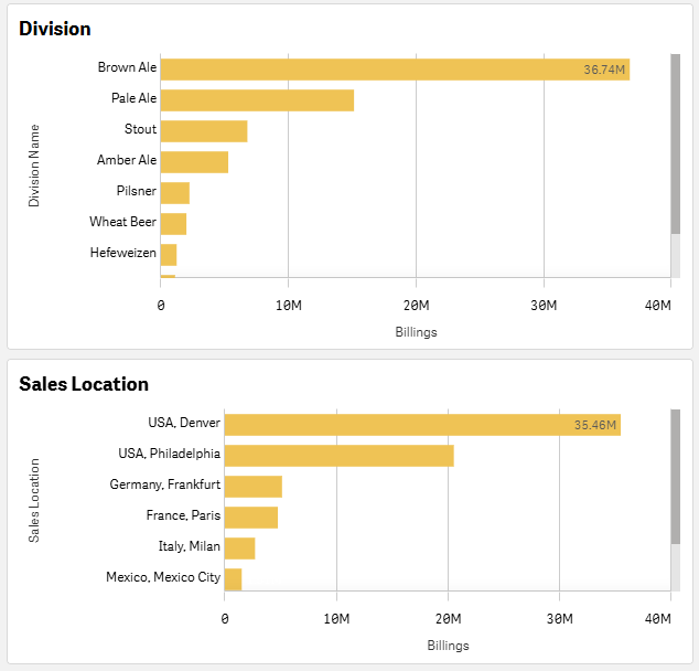
If you said “Visualize the Dimensions” you are pretty smart for a big cheese. That’s why I promoted you. So, here you go. Some of those bar charts you big cheeses love so much. If you follow my buddy and Data Viz guru Steve Wexler or have read his book The Big Picture, then you will understand why the bars showing Billings are the same color as the Billings KPI above. Consistent color is always a data visualization best practice to help end users quickly understand what they are seeing. While I have included the Measure label, you wouldn’t really need it would you?
But the point of this post isn’t to share best practices on displaying the measures, it’s to focus on how you can visualize dimensions and specifically the relationships them. I know what you are thinking, those bar charts show the dimension. One shows Dorkweiser’s many Divisions and one shows our various Sales Locations. But there are some problems, because they aren’t really there to focus on Divisions or Sales Locations, they are only their as a way to slice the Measure(s) which will pose several problems when you try to consume the information.
Problems
Problem 1 – Lack of Context without Selection
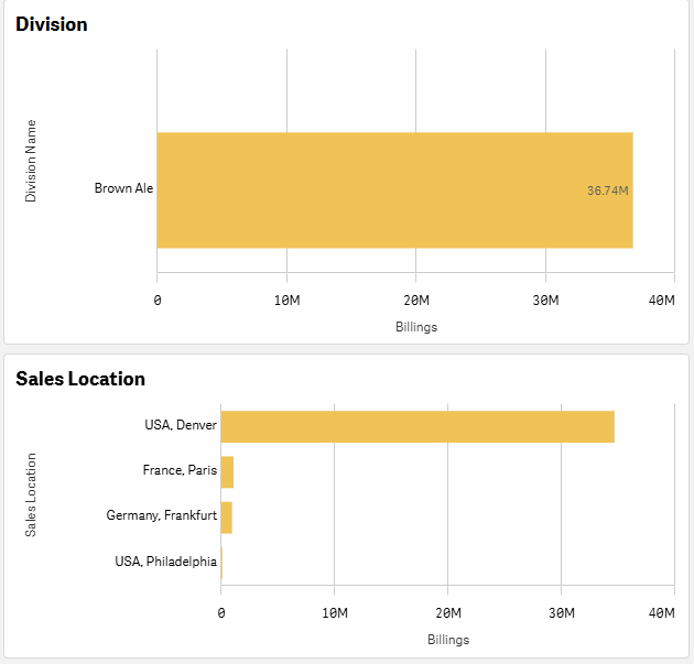
While both “best practice” bar charts might be great individually, they do nothing at all to reflect the context in their relationship. Although both charts have 1 really huge bar, you have no idea if they are related or not. Is Denver selling all of the beer for our Brown Ale Division, or is it really selling all the beer for the other Divisions, while the other locations are responsible for most of the billings for the Brown Ale Division?
Problem 2 – Context after Selection
In order to understand which locations are selling the most Brown Ale, you need to click on Brown Ale. Yeah, you can quickly see how much each location is selling for that Division. But now you have lost the context of why you selected the Brown Ale Division, and you know that for me “Context is King.” Plus, you can now understand my point that while the chart contains the dimension name, we literally threw away the dimension values. Because the focus was never on them, the focus was really on the measure.
If this bothers you, like it does me, then please checkout a post I wrote to help you eliminate the problem from charts called “Data Brushing for Context.” In the post I demonstrate how you can quickly and easily visualize values in your charts to show selection (focus) while still maintaining the context and all of the dimensions values. [The point of this post isn’t to train you on the technique, but I have created a very short video that demonstrates what it would look like for this very example. Click here to see this data using the Data Brushing technique. ]
Visualizing Dimensional Relationships
Besides our passion for Healthcare Analytics, one of the things that Joe Warbington and I share is our love for Sankey Diagrams.
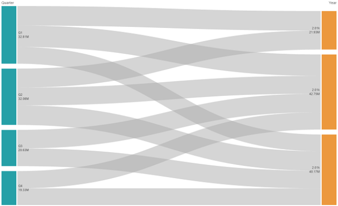
If you aren’t familiar with Sankey Diagrams they accomplish the same thing as Pie Charts or Bar Charts in that you can visualize the proportion of values for each Dimension, while also viewing the values as they relate to each other. In the example you can quickly see the proportions for each quarter, the proportions for each year, quickly see that for one of the years, we only have 2 quarters worth of data, and see the distribution of values in the relationship between the dimensions. Ironically, you could glean all that, while not even knowing what measure was involved at all. Because this chart type is focused on “relationship” between dimensions.
As you can imagine, in the Healthcare space there are so so so so many “dimensions” and to improve those relationships must be known. Which is why Joe and I love this visualization.
So, why aren’t Sankey Diagrams used more often? One of the issues is that not all end users have a graphicacy or data literacy level to consume it. You quickly picked it up, because your previous job was Analytics Guru.
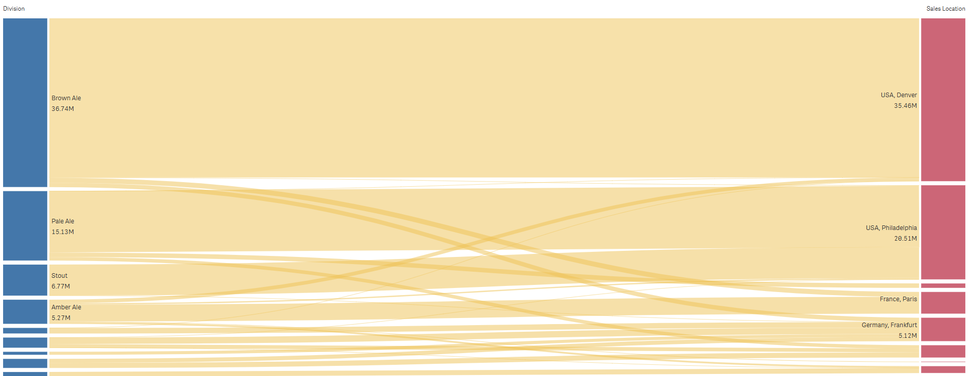
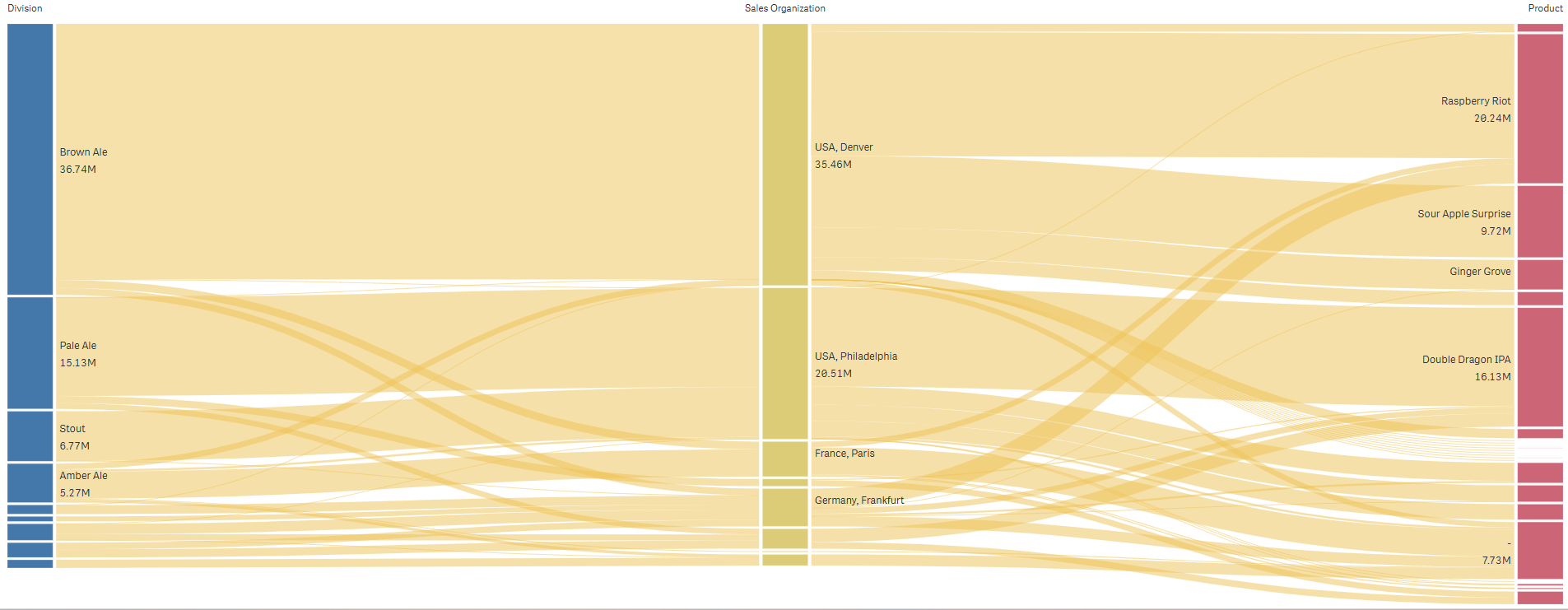
As the Big Cheese Officer at Dorkweiser you naturally need to understand the relationships between Divisions and Sales Locations that were missed in the bar charts. The good thing is that we can quickly see that Denver is most certainly responsible for nearly all of the billings for the Brown Ale Division, and almost none of the billings for other Divisions. One of the knocks against Sankey Diagrams is that it’s hard to understand it all. But don’t let perfection, be the enemy of good.
If you can answer the following questions, then using this visualization type to visualize dimensional relationships has worked:
- Which Sales Location is driving the Billings for our Brown Ale Division?
- Which two Divisions provide the products that are driving Billings for our Philadelphia Location?
- Which Sales Location is driving most of the Billings for our Amber Ale Division?
One of the really cool things about a Sankey Diagram is that you aren’t limited by the number of dimensions you might want to visualize the relationship/context for. At Dorkweiser we also need to see this information for each Product. See if you can answer the following:
- Which Product has the most Billings for our Pale Ale Division?
- Which Sales Location had 9.72 million in billings for our Sour Apple Surprise beer and what Division makes it?
- What are our Top 3 selling Products? Which location is selling them and which Division makes them?
If you were able to answer the questions, then I’m sure you will agree with Joe and I … Sankey Diagrams are awesome. For those who can consume them, and they focus on, and retain context about the Dimensions, rather than just focusing on the Measure.
Can it get any better?
Well to be better … it would have to be less cluttered. Because that would alleviate the fear from end users. Even as a former Analytics Guru, it might have given you some concern when you first saw the first Dorkweiser Sankey Diagram. Even though you could answer the questions I posed, you may still have some reservations. Now magnify those thoughts for the real big cheese officers in your company.
While needing to be less intimidating, any “better” chart type would absolutely still need to show all of the dimension values to retain context, while also still showing the relationship between dimensional values. Context is never going to stop being king.
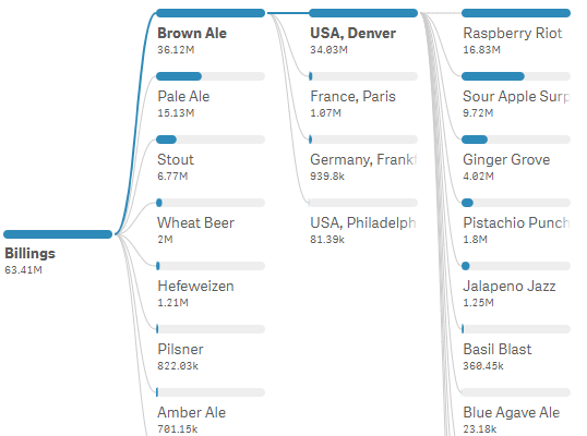
Does the following image do the trick?
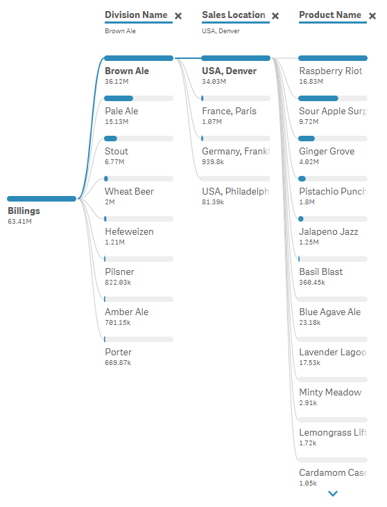
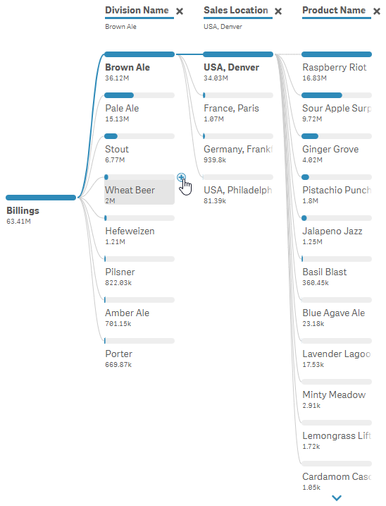
Decomposition Tree Visualizing Dimensional Relationships between 3 Dimensions in an easier to follow story where all names and values are visible.
Notice that you can clearly see all of the Dorkweiser Division names. The problem with a Sankey Diagram is that the proportional values (focusing on the measure) absolutely prohibit the display of the dimensional values whose proportion is too small. Whereas, this Data Visualization shows all the values, while reflecting the proportion as a bar. For the Products, notice that there is a simple to understand arrow interface that users can press to see even the teeniest and tiniest product billings.
Notice that without having to hover any section, as we do with a Sankey Diagram, the Measure value is displayed.
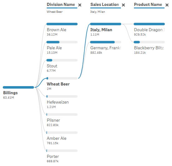
To be fair, the Sankey Diagram was showing all relationships between everything. This visualization doesn’t. But take heart, with the simple click of the mouse, end users and Big Cheeses like yourself can easily switch. Want to get all of the details about our Wheat Beer Division? Just click it.
So, cool. Right?
But I get it … that was so 10 seconds ago, and now you want more. Your focus now, is on the Products. You want to see who is selling what and where they are selling it. With a few clicks “you” get to that. By “you” … I mean the Big Cheese Officer, end user “you”, not the Analytics Guru designer.
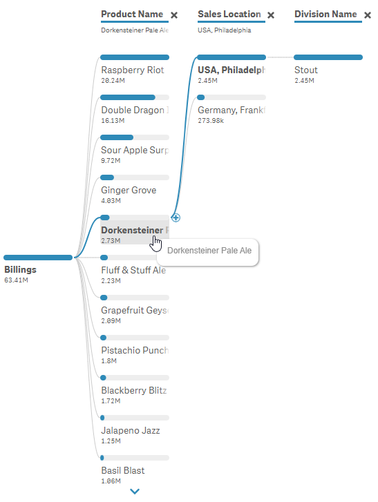
Decomposition Tree with Product Name, Sales Location and Division Name. The reverse order of the first image that was shown.
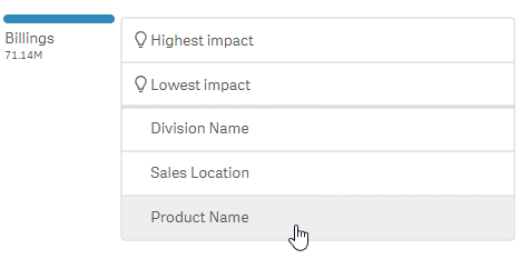
Before “you” even manage to clap for yourself, and this visualization, you dream up another need. A fleeting thought in your head that you might not know which Dimension you want to focus on. Maybe you want the visualization to tell you which Dimension has the Highest or Lowest Impact on the overall Billings for the company.
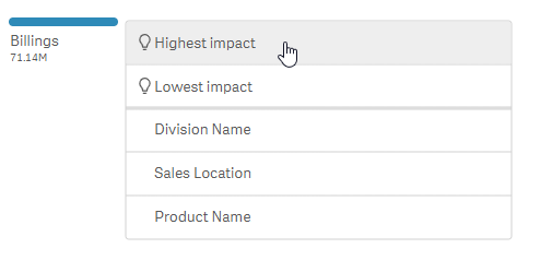
“AI Splits” help users who need help understand which Dimension has the highest or lowest impact on the measure
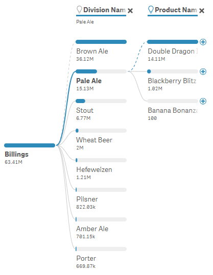
Decomposition Tree showing a dashed line to the highest driver for the measure while continuing to visualize dimensional relationships.
Voila, it showed me that Division had the highest impact on Billings which was probably obvious to both of your personas. But think through the possibilities if the dimensions were actually Sales Person, Day of Week, Day of Month, Quarter … etc. You know … the Dimensions that aren’t related to our Global Hierarchy. Hopefully a lightbulb went on. And I’m not talking about the one that shows by the Dimension names in the visualization. Besides that, notice the dashed line to make it clear the Division Name selected is not the one with the highest impact.
The same works for this Data Visualization when choosing the Lowest Impact.
Decomposition Tree
No I didn’t use some fancy schmancy Generative AI Art program to generate images. These are all from an extension called a Decomposition Tree object created by Qlik partner AnyChart.
It’s one thing to see images, but it’s another thing entirely to see how it actually works. To help you further understand how incredible the Decomposition Tree can be in helping you visualize dimensional relationships, I’ve created the following video.
Demotion and Good News
The goal of data visualization isn’t to build the prettiest screens that show off “your” design talents. It’s to build screens that the real end users can consume information from, and more importantly, take action on. I gave you a fake promotion, that I’m now rescinding, simply to help you think through how you might see the screens in that role. The good news is that as you help your organization see the relationships between it’s many dimensions you just might get a promotion to Senior Analytics Guru.
Study Guide
Questions
- What is the main criticism I have against so much focus on using KPIs in data visualization?
- What is the primary function of dimensions in data visualization?
- What are the two main problems I highlight with using standard bar charts to visualize dimensional relationships?
- What data visualization technique(s) do I suggest as a superior alternative to bar charts for showing dimensional relationships?
- What are the key advantages of Sankey diagrams for visualizing dimensional relationships?
- What potential drawback of Sankey diagrams do I acknowledge?
- What specific feature of the Decomposition Tree visualization helps to address the potential drawback of Sankey diagrams?
- How does the Decomposition Tree visualization allow users to explore different dimensions and their impact?
- What is the author’s ultimate goal for data visualization, beyond simply creating aesthetically pleasing visuals?
Answers
- KPIs primarily show whether goals are achieved, not how to achieve them. They often lack the context necessary for understanding underlying trends and driving improvement.
- Dimensions provide context and help users track Operational Key Results (OKRs) for improvement. They represent categorical values that clarify relationships within the data.
- First, bar charts lack context without selection, making it difficult to see relationships between different dimensions. Second, selecting a specific dimension value removes the context of the original selection.
- I highly suggest using Sankey diagrams as a superior alternative for visualizing dimensional relationships.
- Sankey diagrams effectively show the proportions of values for each dimension and clearly visualize the relationships between them. They allow viewers to quickly understand complex connections within the data.
- Sankey diagrams can appear cluttered and may be difficult for users with limited data literacy / graphicacy to interpret effectively.
- The Decomposition Tree visualization displays all dimension values, even those with small proportions, overcoming the cluttering issue often seen in Sankey diagrams.
- Users can click on different dimensions within the Decomposition Tree visualization to explore their impact and relationships. The tool also highlights the dimension with the highest or lowest impact on the chosen measure.
- Data visualization should empower end-users to consume information effectively and make informed decisions based on the insights presented.


