
Visualizing Analytics in Virtual Reality

Total Immersion
How cool is this image of a physician totally immersed in patient data in this virtual world?
As soon as the coolness wheres off your brain is left scrambling for reality. Can we really do this? Would it add any value if we could?
The answer to both questions is an emphatic YES!
The technology is there. Over 2 years ago I helped one of the super geniuses at Qlik, Todd Margolis, create a demonstrable use case for Augmented Reality. The premise was augmenting the reality of the triage worker with analytics they could interact within a crisis setting.
The value potential is there. In our demo the value was seeing the patient while also seeing the potential issues they could and watching the options narrow as each question is answered.
Our use case was pretty basic and if you watch the video and see a monkey on a chair interacting with a chart you might even think it was goofy. Ignoring our comedy routine, imagine the impact if the questions were being driven based on artificial intelligence and best practices for workflow.
Easy as Pie
The real question is “Are you ready for it?” “Can it add value for you?” Because that’s what really matters. So instead of suggesting you place yourself in the image above let’s back up about 1,000 steps and start from the beginning. 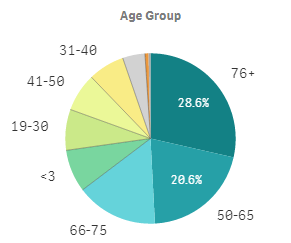
Let’s say you are analyzing admissions. A very simple way to break down admissions would be by Age Group.
As you look at the chart the question pops into your head “How long has the distribution been like this?”
In other words you want to see a trend. In the real world that is common, yet sometimes difficult. Is there a line chart showing the trend over time already built? What page is it on? How do I move from where I am to that page? Shoot now I’m looking at the trend chart but what happened to my pie? “Uggh you starting wishing there was a better to actually interact and engage with my data.”
I’m just spit balling here, imagine instead of being in the “real world” you were immersed in Virtual Reality instead. You simply raise your hand, point at the pie chart, squeeze the controller’s trigger and swipe to the right indicating you want it over time. Now you see the pie chart and beside it a trend chart over time. Well that doesn’t seem like such a stretch.
More Pie Please
As we approach the holiday season it’s always about the pie. You know what I mean we eat 19,398 calories and yet still find room for just 1 more slice of pie. Figured that would be as good a way as any to transition to another concept for interacting with pies in analytics.
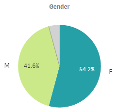
If viewing 1 pie is good, viewing 2 pies must be better. Or is it? What insights can we gain from looking at both of these pie charts? None. They are 2 distinct items that have nothing in common, there is no context for how they relate. Yet we know they are both for patients.
What if in Virtual Reality you could reach out and grab both pie charts and smoosh them together. Insisting that we see the relationship between them via a Sankey.
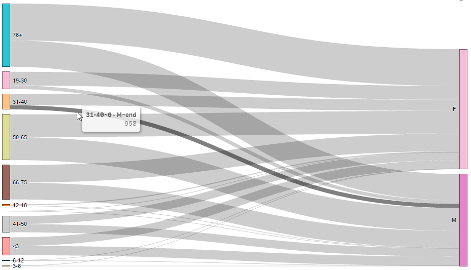
Don’t get me wrong, I’ve written and talked about Sankey Diagrams in the past. They certainly play a part of our “real world 2 dimensional” visual analytics. The problem is that if they aren’t already constructed for you, they don’t help. Whereas, in a virtual reality world the interface of bringing things together is more intuitive and possible. You simply use your hands.
Year over Year
Seasonality is what Year over Year line charts are great at depicting. In the following chart I can clearly see that for both years we are up 1 month, and down the next. Up down. Up down. Just like the heart pounding roller coaster videos that are so prevalent in virtual reality.
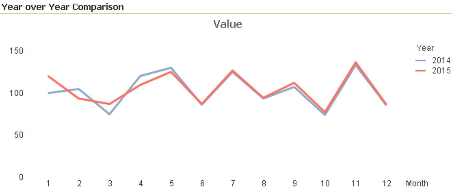 But honestly other than seeing the seasonality these year over year line charts are pretty useless at conveying the real story behind the data. And as my most recent Dork Cast illustrates, I’m a big believer in visual data storytelling. (Click here to watch it when you finish reading.)
Like with the pie chart example you need to establish a contextual relationship between the years right? That’s what Year over Year means. Comparison. Yet that up and down, roller coaster ride, makes it impossible to retain the very context you asked for.
If I’ve done my job you are already wondering what you could do with your hands in a virtual reality world to provide you with that context. If I haven’t then let me spell it out. In a virtual reality imagine you reach out your hand, grab 2014 and drag it downward. Implying you want it as the “base” for a new chart.
The system then converts the YoY line chart into a context based bar chart and you see 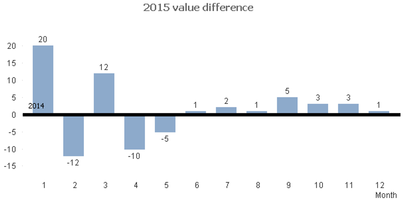 2014 as the baseline. The bars are the amount of difference that 2015 represents over 2014. The context.
Here is why I mentioned storytelling. Notice that for the first 5 months of the year we are up and down. That either means we are dealing with completely varying data, or that our process isn’t working. Yet for the last 7 months of the year we are over every single month. Likely the process improvement changes we made actually worked.
Step beyond Static Reporting and Pause
Analytics is one of those vague concepts that those who like to pontificate about can do so at great length. In my mind analytics isn’t about visualizing flat static reporting type data in pretty charts. It’s about allowing you to engage with the data so that you can:
- Ask and answer the next question.
- Argue with the data to ensure they are right.
- Drive so deep in the data that they would fight an army to make the changes they believe are needed to improve.
So far we’ve only taken a few baby steps together to help you grasp the concept that in a virtual reality world we can add more ways to engage. To literally immerse yourself in the data and let you go any direction you want. That may take time to sink in. Let it.
It’s a scary world out there
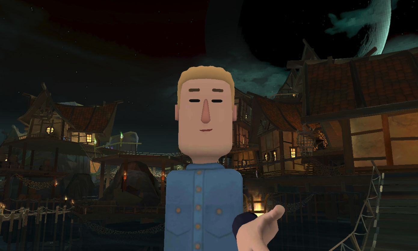 I’m not talking about this selfie image I took when AltspaceVR created a new Halloween themed world to explore.
I’m talking about the fact that there are so many technologies out there like Artificial Intelligence, Machine Learning, Deep Learning, Natural Language Processing and Natural Language Generation that it’s hard to keep up.
If you can’t keep up, you don’t trust them. That lack of trust makes it hard to act upon the data, and it should. Yet, that action is what we are looking for. Rasu Strestha, Chief Innovation Officer at UPMC, puts it this way “Data is nice but we really need is behavior change.”
Bringing the virtual world to life
Imagine that the good looking dude above wasn’t a selfie of me in that scary world, but was instead a computer. A “bot” if you will that used those “black box” concepts above like Artificial Intelligence, Natural Language Processing and Natural Language Generation to converse with you.
I recently posted a video where I demonstrated those very things. The technology is in place via one of our partners called Crunchbot AI. As you watch the video I want you to imagine how much more believable it would be if it was in Virtual Reality and had a face on it?
Imagine you are wandering around your data and something is unclear. You could simply say “help” out loud and that “governance” system that contains all of your systems data definitions and metadata showed up … as another image.
Summary
I’m not a hypnotist. There is no way in a few minutes I can completely get you to change your mind and suddenly demand your company utilize Virtual Reality as an analytics platform. What I hope I have done is to help you understand that initial image of a physician totally immersed in data. So that you can begin seeing it’s not so far fetched after all, even for you.
As humans we have the ability to interact beyond what our 2 dimensional monitors allow us to. A virtual world provides the ability to interact in all those ways. It allows us to put faces on the technologies that scare us, thus making them less scary and more believable. So that we can immerse ourselves in our data, then take action on the insights that we discover.
[Updated 11/16/2018]
That Qlik genius Todd Margolis guy I mentioned early in the post. Just found out that he’s co-authored the first published book on Immersive Analytics. So many great use cases and information for those of you that really want to dive in. Click here for the book.
Pingback:2018: Year in Review and 10 Best Qlik Articles « Learn Qlikview