Skip to content
Qlik Dork

Let's make it simple

  • About
Filter By:
  • Show All
  • Admin
  • Analytics
  • Application Automation
  • Architecture
  • Business Value
  • Coding
  • Data Literacy
  • Data Modeling
  • Data Science / Big Data
  • Design
  • Fun
  • General
  • Generative AI
  • Geo Analytics
  • Performance
  • Population Health
  • Predictive Analytics
  • Qlik Cloud Data Integratin
  • Security
  • Self Service
  • Storytelling
  • Training
  • Uncategorized
  • User Adoption
  • Visualization

The Data Consumption Continuum

We humans love to consume. Food. Water. Fuels. And my personal favorite Chocolate. You name it we want to consume it. Health warnings have little effect at deterring us from consuming mass quantities of the wrongs things. Yet sadly there… Read more ›

September 20, 2015
DaltonRuer
Data Literacy, Predictive Analytics, Self Service
descriptive, guided, predictive, Static reports

Crawl. Walk. Run. Fly?

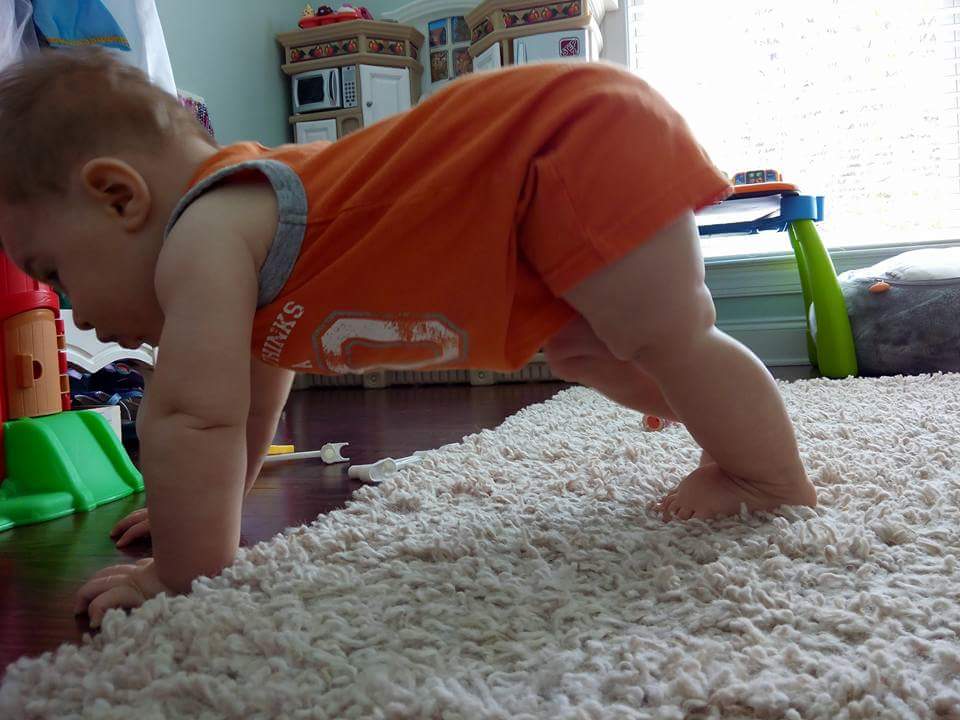
In 30 years as a parent I can tell you I’ve had many memorable moments with my 2 amazing daughters. As humans, most of our memorable moments around babies involve movement. Let’s face it as cute as they are it… Read more ›

August 21, 2015
DaltonRuer
Self Service
Checklists, data visualization, Self Service, Static reports

Visualizing Healthcare Claims

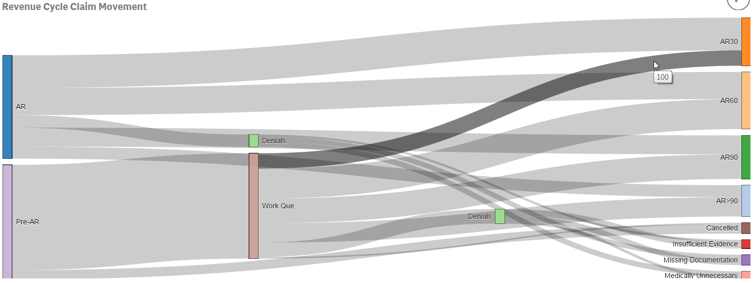
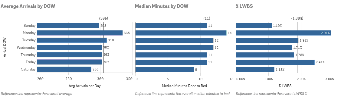
I recently had the opportunity to demonstrate Qlik Sense for the Director of a large health system’s Revenue Cycle team. The consultant who recommended us spoke with me ahead of time and we got along great. “This guy has been… Read more ›

June 7, 2015
DaltonRuer
Data Literacy, Visualization
claims, data visualization, Healthcare, Qlik Sense, Revenue Cycle, sankey

Visualizing End User Adoption

This past week I had my annual review. This time of year always makes me envious of those that produce widgets. I would love to be able to show my boss a list of all of the widget producers and… Read more ›

April 3, 2015
DaltonRuer
User Adoption, Visualization
QlikHealthCare, QlikView, User adoption

Visualizing Length of Stay

Avg LOS KPI

What do the numbers 3.53, 17.6 and 4 all have in common?  They are completely useless when displayed by themselves because they have no context.   Length of Stay is a vastly important metric in health care and here is the most… Read more ›

March 16, 2015
DaltonRuer
Visualization
data visualization, Length of Stay, numerical context

Visualizing the Story

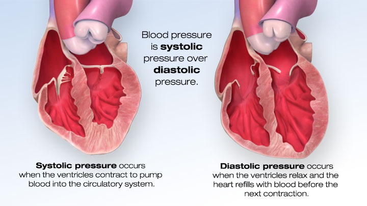
“It was the best of times, It was the worst of times, It was the age of wisdom, It was the age of foolishness …” These are the unforgettable opening lines to Charles Dickens’ classic “A Tale of Two Cities.”… Read more ›

February 8, 2015
DaltonRuer
Storytelling, User Adoption, Visualization
data journalism, data visualization, Qlik Sense, QlikHealthCare, QlikView, story telling

Visualizing the Busy-ness

Not that anyone would be surprised to discover a direct correlation between supply and demand but in my last post on “Visualizing Knowledge” the scatter plot proved to be a very advantageous chart type in that it showed there was… Read more ›

February 2, 2015
DaltonRuer
Data Literacy, Visualization
alberto cairo, color, ed, emergency department, gestalt theory, heatmap, pivot table, staffing, staffing on demand

Visualizing Knowledge

Visualizing Knowledge surfaces the interconnections between different pieces of information

I love it when a plan comes together. For the past several weeks I’ve been reading furiously and working like a dog doing my day job, while also trying to come up to speed on Qlik Sense as quickly as… Read more ›

January 19, 2015
DaltonRuer
Visualization
Knowledge, Median Minutes to Bed, Visualization, Visualizing Knowledge

Visualizing Lab Results

Have you heard the joke about the lab technician that walks into the room to stick you with a 15” needle and draw your blood? Of course you haven’t that’s just not very funny stuff. More than likely you are… Read more ›

January 8, 2015
DaltonRuer
Visualization
fishbone diagram, QlikView, visualizing blood pressure, visualizing lab results

Visualizing Blood Pressure

I was recently asked to produce a rounding report for physicians. Easy enough right? Slap some vitals on a page, toss in some lab results and the medication administration record and voila … you have a rounding report. But that… Read more ›

December 29, 2014
DaltonRuer
Visualization
continous time series, data discovery, Infographic, QlikHealthCare, QlikView, Randy Krum, Stephen Few, visualizing blood pressure, visualizing vital signs
Newer posts →
Qlik Dork © 2025. All Rights Reserved.
Proudly powered by WordPress
A theme by Sampression