Total Immersion How cool is this image of a physician totally immersed in patient data in this virtual world? As soon as the coolness wheres off your brain is left scrambling for reality. Can we really do this? Would it… Read more ›
The real question that’s plagued the world has never been “Should I visualize the data?” it’s always been “How should I visualize the data?” Because it’s not that people don’t want to see things visually it’s a matter of how… Read more ›
Ask any Data Visualization expert and one of the best pieces of advice that they will give you is “remove the clutter” so that your “data can tell the story.” Would it be going to far if I suggested that… Read more ›
Many who make requests seem to have a belief that Business Intelligence is magic. They loose their ability to listen to logic and reason and simply ask you to do the impossible. Many who make requests seem to have a belief… Read more ›
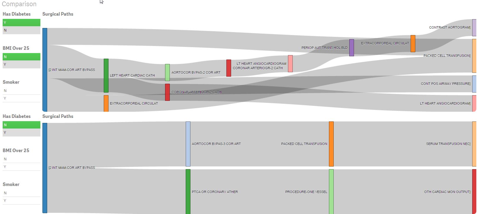
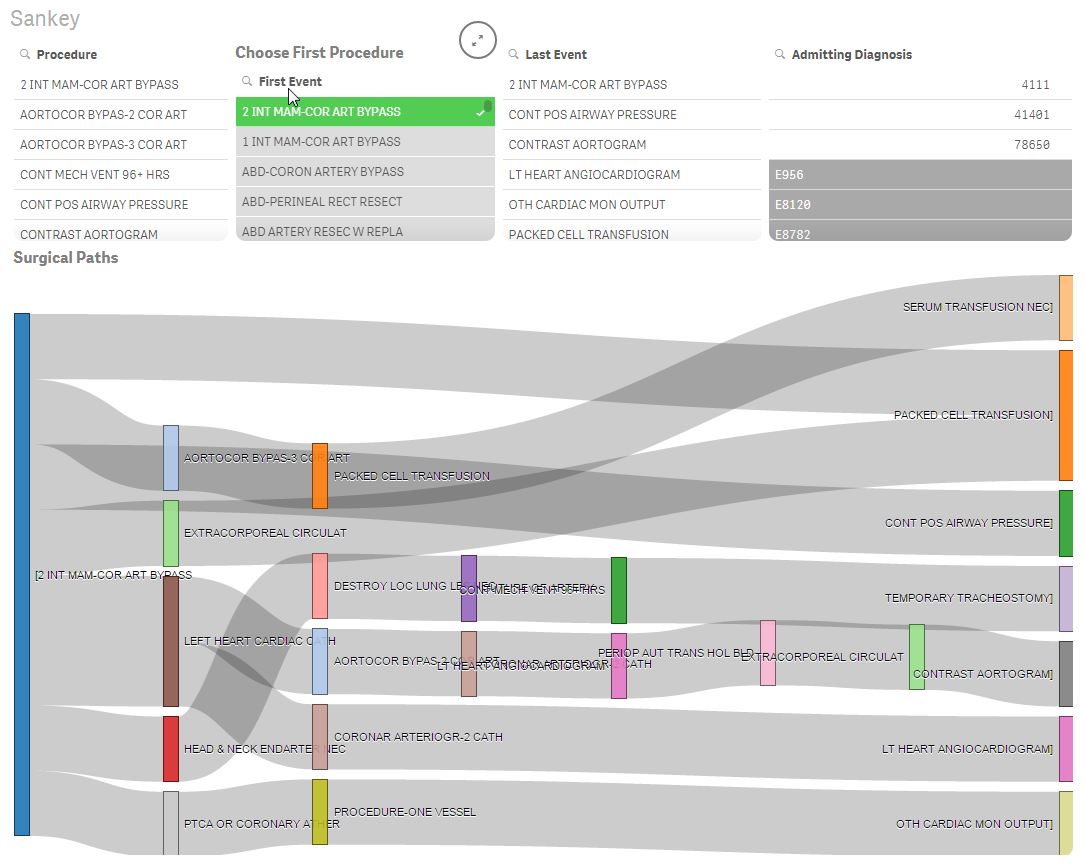
Have you ever wondered what events happen to patients after a particular surgery is performed? Well I did. Like I seriously can’t sleep when I start wondering about things like that. I start believing crazy things like we can change… Read more ›
Advanced Analytics with Aster I recently stumbled upon Teradata’s Aster and I’m pretty fired up. It turns out there is an entire community dedicated to helping data visualization people like myself learn how to implement advanced analytic functions. The site… Read more ›
Besides helping customers by day and being an all around Qlik Dork at other times I happen to have a very strong passion for helping fastpitch softball players elevate their game. When I say elevate their game I mean getting over… Read more ›
One of my favorite activities as a child was doing mental puzzles. Matchstick puzzles like this were among my favorites. Easy to understand wording like “Move 2 matchsticks and turn this fish that is swimming to the left into a… Read more ›
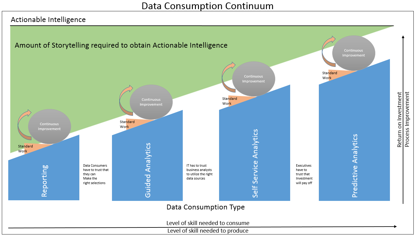
As this is intended to be a blog about visualization it seemed only fitting that I devote this post to visualizing the concept I introduced last week that I called a Data Consumption Continuum. It all started with … A… Read more ›
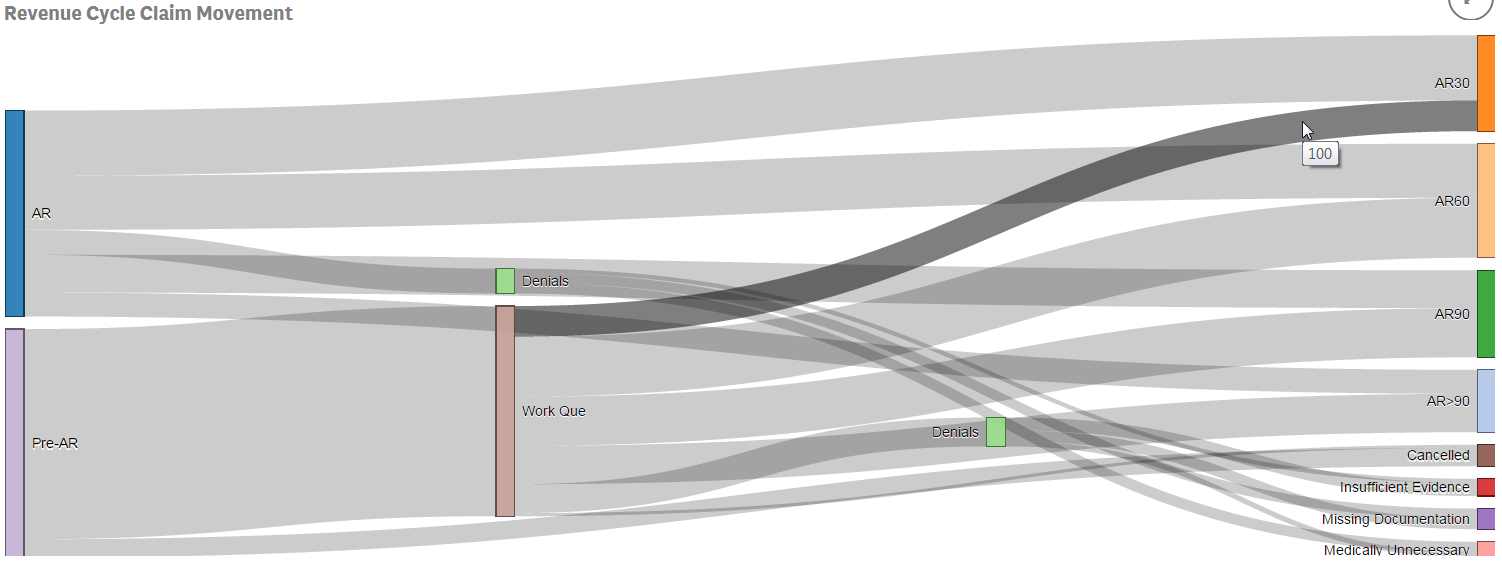
I recently had the opportunity to demonstrate Qlik Sense for the Director of a large health system’s Revenue Cycle team. The consultant who recommended us spoke with me ahead of time and we got along great. “This guy has been… Read more ›


