Visualizing the Whole Story
Recently my colleague, friend and all around nice guy David Freriks asked me to help him “analyze” the data available for Peloton. As you can imagine two data dorks like us had a lot of fun trying to create an informative dashboard for him. Part of the fun involved actually getting the data using since Peloton’s API isn’t always the easiest. That’s where the brainiac coding skills of our buddy John Park came into play. David has thoroughly documented the process in a blog series in case you want to dig in.
What David specifically asked of me was to help him “analyze” the data to see how he could maximize his time and “improve.” We hear those phrases everyday and I’m sure you have thoughts in your head of what they mean. But what they mean to you, and what they mean to me might be tremendously different. So I’m going to start at the beginning and share my thoughts and as always the comments are open for you to share yours.
The following is an image of 1 of the many different data tables that Peloton returns through it’s REST API that we call.

Now let’s visualize that data to help David get insights faster.
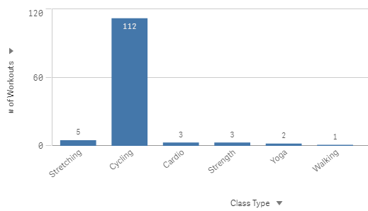
I believe there is absolute value in data visualization and the fact that it’s much clearer to see that David has ridden his bike soooooo many more times than any of the other workouts he has tracked through Peloton. But if we were being honest wouldn’t we say that David likely knew that. Did he really need the table of data or the bar chart to know that? Does visualizing the obvious really help him “analyze” or “improve?”
If you were to click on the arrow by the Class Type you would find that there are 4 different ways that David could view the # of Workouts. In the Qlik world those are called “Alternative Dimensions.” They allow the data consumer to choose how they want to see the data. David may want to see how many workouts by Class Type like Peloton provides OR he might alternatively want to see how my Workouts per Weekday, OR he may want to see how many workouts per Instructor OR he may want to see how many workouts by the Class Duration.
OR is a bad word in my vocabulary
Personally I hate the word OR when it comes to visualizing data. Each dimension provides only 1 side to the story, and we all know that there are always at least 2 sides to a story. Especially when it comes to improving health and fitness. So why not see them all together.
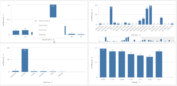
Now the screen is full, and David can visualize all 4 sides of the story and that’s a good thing right? Actually NO! We are trying to right a novel where the parts fit together coherently and right now each of the charts tells a totally independent short story. There is no context for how either of the charts relates to the others and you know my capstone phrase is “Context is King.” So we have to provide one.
Measures are like Characters in a story
Worse yet, if you notice in the charts we have the tell tale “alternative” triangle by the measure. We are showing David the # of Workouts but that is just 1 character in the story. David’s story actually involves 16 characters, yet we are showing him only one. Nobody wants to read a story about 1 character.
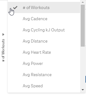
So now we have 4 Dimensions and 16 Measures. I suppose we could put 64 charts on the screen for David to consume. I guess that’s no so bad. But the problem is that wouldn’t be enough. Because even then all he would be seeing is the information about each character in each chapter. There would still be no context for how they interact. How is that “analytics?” How will that help him “improve?”
I suppose we could provide “some context” for him by using Scatter Plots so he can see how up to 4 characters interact in each story. We can use the X Axis to visualize the # of Workouts, the Y Axis to visualize the Total Work, we can size the dots (each Dimension/Chapter) by Avg Cadence and color the dots by Max Speed.
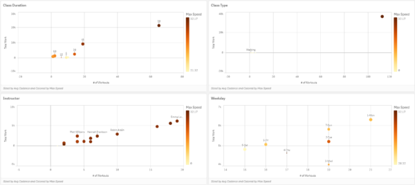
If David is Data Literate enough to consume all 4 characters within each chapter that’s a great thing. If he’s got the skills to combine in his head how the 4 characters relate in all 4 chapters that’s a great thing. If he’s got the ability to combined the context for how those 4 characters relate in all 4 chapters and how all 4 chapters relate to each other that’s an ESP thing.
Let that set in for a second, while I try and address the screams I hear coming from one of the readers. They are saying “Use a Grid plot instead of a Scatter plot to show David the data.” That sounds like a great idea now I can visualize the context of 1 character among 2 chapters.
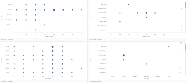
So many visualizations so much missing information
If slapping charts on the screen is “analysis” then by golly we are in business. We could generate 64 bar charts, dozens of scatter plots and dozens of grid plots. My buddy David could have an application with 50 tabs and can spend endless hours in “analysis” trying to “improve.”
We would have given him an awful lot of elements about his story. We have several chapters (Dimensions) and 16 characters (Measures.) But have we given him the “whole story” so that he would know how to actually analyze how he’s improving or what he needs to do to improve more?
Hundred’s of books on Data Storytelling yet you’ve never thought about this way before have you? Whether my being weird, and so literal is a good thing or a crazy thing is up to you to decide. Hopefully I’ve challenged your perception and are willing to at least try and understand where I go next. However, I warn you it’s about to get deep so feel free to grab some caffeine before continuing.
Visualizations are Data Literacy bound
In many regards Data Visualizations can only stretch as far as the readers level of Data Literacy. I was thrilled to read the term “graphicacy” in an upcoming book called “The Big Picture” How to Use Data Visualization to Make Better Decisions” by friend Steve Wexler. I think the term and book so plainly illustrates the concept I’ve shared for so long.
If readers of data are only able to consume 1 character from 1 chapter at a time, then all we can give them are visualizations that do that.
So the real question we need to ask ourselves as we struggle to give David the “whole story” is “What are the limit’s of David’s Data Literacy?”
Because my buddy asked for help in “analyzing” the data so that he could “improve” but all we have provided him are the same data visualizations we use for people with far less levels of Data Literacy. David is beyond bar charts. He’s better than Scatter plots or Grid Plots. David can handle more. So let’s give him more.
Let’s give him the Whole Story
You may be thinking “but Qlik Dork there are no data visualizations that allow us to present all 4 chapters and 16 characters at a 1 time.” That’s where you are wrong my friends. There is.
Qlik partner Immersion Analytics allows you to visualize up to 18 different elements of data at one time. Seriously!
If I showed you the finished product it would blow your mind, and that’s not my goal, so let’s take baby steps first.
First their product Visualizer not only reads Qlik Sense applications, it interacts with them. By interact I mean that just like mashups if you select something it is making live selections in the application, and if you are in the application it visualizes your selections.
Making the Connection
The first step in our journey will begin with simply connecting to the Qlik Sense application we want and tell Visualizer what data we want to see. Of course I picked it all because I want to present the whole story.
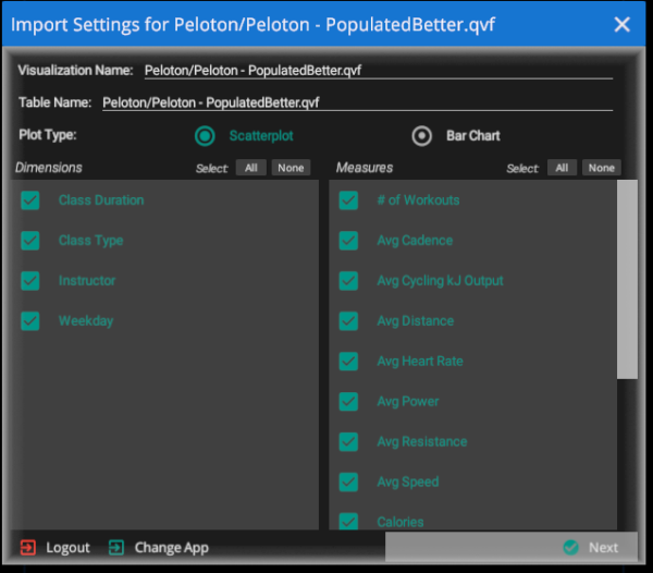
Choosing the Visual Properties
The next step in our journey involves a little of mental adjustment. We are so used to the terms “Dimensions” and “Measures” and how they are used in charts that we need broaden our scope. We can visualize them as they make the most sense. However, I will keep things very simple to begin with and simply allow the “dimensions” to be visualized on an Axis, and the # of Workouts to be visualized as the Size.
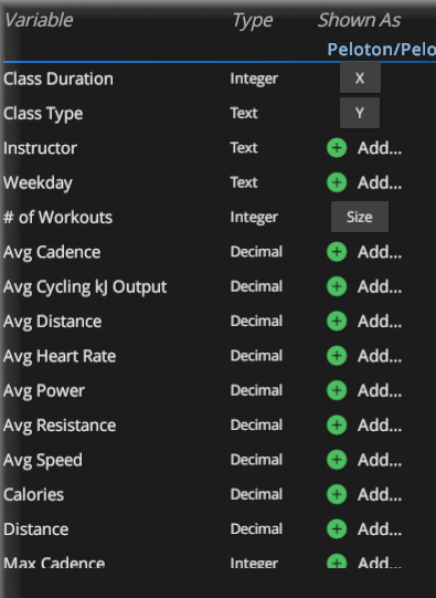
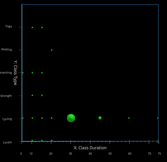
Well that’s no fair that’s just a simple Grid plot. But we are just getting started slow because frankly “you can’t handle the truth.” Or can’t handle 18 dimensions at 1 time yet.
Expanding our Visualization thoughts
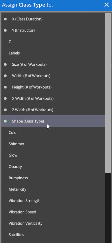
Given that we fully understand the “Class Type” chapter so well do we really need to visualize it as an axis? Is there perhaps a better way to see it, freeing up the Y axis for another chapter? What if instead we introduce the “Instructor” chapter and visualize “Class Type” as a Shape instead. Notice how many other ways we could visually depict things. Those will be important as we move forward.
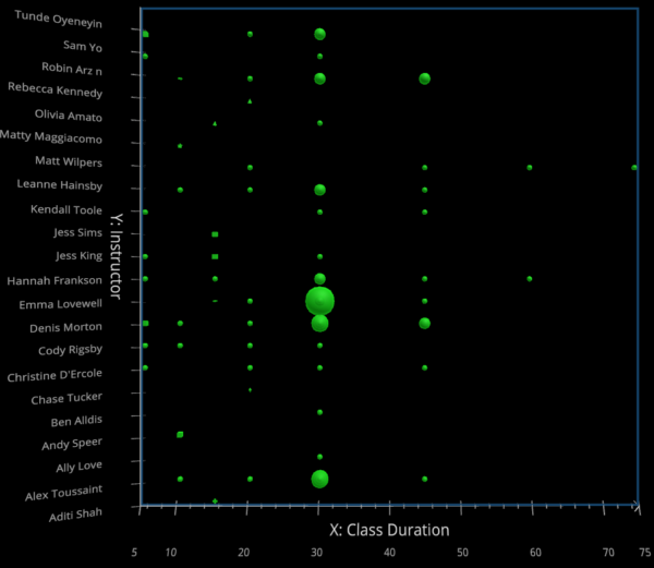
Interesting. There are some instructors that David cycles with a lot more than others, and a few instructors that David does only 1 type of class with and no matter how it’s sliced, David does far more 30 minute workouts than anything else.
Given that by now everyone knows David cycles a lot, do we really need to even keep “Class Type”? Maybe yes, maybe no. But I will remove it because if that’s what David prefers to do, and wants to focus on improving we don’t really need it any longer. So in Qlik Sense I will filter “Class Type” to only “Cycling” to let us focus our “improvement” efforts.
What are we tracking?
If David’s goal is to improve, then we must know what “improvement” means to him. Is it to get more rides than he phones in or is to get better rides? There is in no disputing that David has far more rides with Emma than anyone else. But are they “good” rides? Are they the kind of rides that is helping David “improve” his cycling or health?
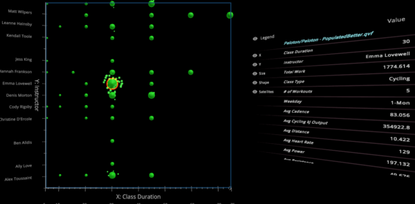
What if instead I use the visual property of “size” to show the Total Work that David has achieved from the rides? That seems more relevant doesn’t it. But I still need to track # of Rides as well. Remember my focus is AND not OR. So what do you think?
Now we need more
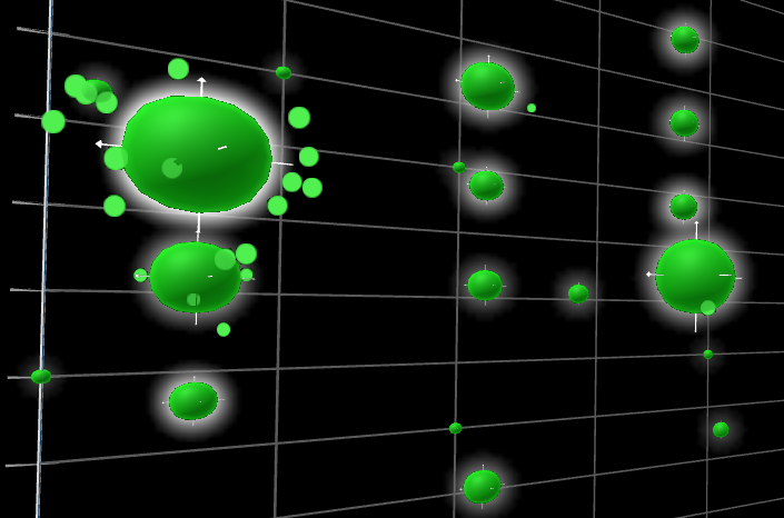
In the screen shots above notice that Emma has a lot of satellites, the # of Workouts that far exceeds everyone else. That is an important character trait for the story but now visualizing the Total Workout as well there seems to be a plot twist. Plus it introduces something else we must consider.
Notice for Emma there are bunch of Satellites circling her, but in the details on the right side of the screen when I introduce legend it says she has 5 workouts. The numbers don’t appear to match and that’s a problem. Notice that right below # of Workouts it says “Weekday 1-Monday.” Oooh yeah that other chapter. You see there are actually a set of concentric circles for Emma and David has ridden multiple days with her. Now I absolutely must see those Weekdays. Does he get more work on certain days? Does he get more Workouts on certain days?
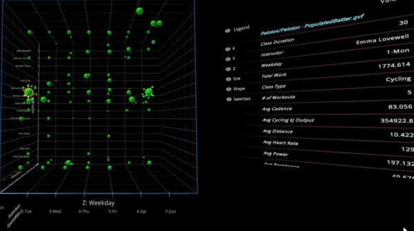
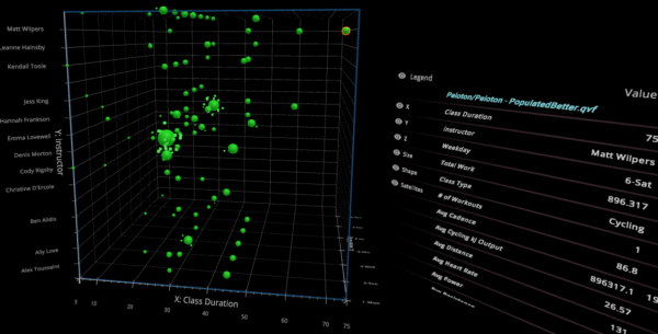
Well isn’t that interesting. As we added another chapter to the story (Weekday) but maintained all of the other context a more complete and different story emerges.
David seems to ride a lot with Emma on Monday’s and Sunday’s than he does through the other 5 days. And while her total work for all of the workouts is higher cumulatively note that helped David accomplish more than half of the total work in just 1 75 minute workout than he obtained with Emma in 5.
Let’s add more
I cycle a bit although not on a Peloton. I can tell you from experience it is a lot easier for me peddling downhill than it is uphill. Guessing you have experience that phenomenon as well. So let’s add Max Resistant to the visualization layer.
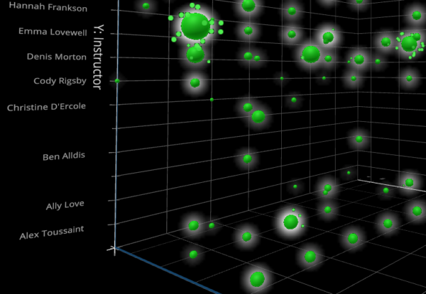
Without my telling you that Glow was the visualization property I assigned to Max resistance it should have been obvious. Humans can quickly recognize the glowing.
In fact if you look at the chart suddenly new information seems to come to light. The workouts that David does with Alex really seem to cause him to amp up the resistance because he’s glowing so strong. Would you be surprised to know that Matt (from above) has a pretty bright glow over nearly every one of David’s rides with him.

Here is where the rubber meets the road. I’ve added an 8’th visualization property, arrows. Notice that some arrows are “longer” than others. Knowing that “Class Duration” is on the Axis so it’s out, Can you guess what property of a bike ride would have to do with “length?”
If you guessed Distance, you would be correct. In fact I used “Average Distance” rather than total distance since the total distance could be impacted by the number of rides and/or the class duration.
Intermission
You are now consuming 8 visual properties at the same time. I’ve got a questions for you to consider at this time.
Does 8 visual elements present a more complete analysis of David’s riding than we could obtain with normal bar charts, scatter plots or grid plots? That’s what I was going for, did I deliver?
Does seeing the elements combined, in context to one another present a more complete “story?” Does it spark even more curiousity?
If I had just thrown you in to 8 elements at one time how uncomfortable would you have been? Be honest now.
Let’s get to the point
That feeling of discomfort, is what so many people in organizations feel like trying to consume combo charts or scatter plots. While it may be second nature for you to consume a scatter plot with 4 different measures, its not to them.
If you think 8 elements provides a more robust story and richer context than you saw with 2, 3 or 4 then imagine how much more you will understand shortly when I show you 18. And imagine what others in the organization would start understanding if they received Data Literacy training to understand 2, 3 or 4.
I realize this has been a longer than normal post. Grant me a little grace because I’m fighting years and years of systemized dumbing down of what “analytics” can and should be. Obviously there are cases where a low level employee doesn’t care about the whole story. But that doesn’t mean that all employees should only get to see 2 characters and their interaction in 1 chapter.
At the onset I mentioned I would go slowly. Now we need to pick up the pace and some of the visual attributes involve motion. That’s right motion.
Visualizing numbers like “heart rate” or “cadence” could be done statically. But as we are expanding our vision of visualization properties do you think they can be more meaningful in motion? You know since they are characters dedicated to motion. Thus, I will finish this little object lesson via video to see how 18 elements can in fact be consumed at the same time so we can see the “whole story.”
Closing Thoughts
I am prone on occasion, in my passion, to confuse some readers or conference attendees. That could be the case here so I want to close with a few crystal clear thoughts:
- I am not suggesting that visualizing data in bar charts, scatter plots and grid plots is a bad idea. In fact the vast majority of business uses for analytics are for low level data workers who frankly only care about 2 characters and 1 chapter. ie A few measures and a dimension. The point of this post isn’t to knock those things, but rather call out that when looking at something like health analytics and improvement there really are way too many things to comprehend in an 2D world.
- If you think analyzing Peloton health data is a one off use case, think again. Instead of ride information pretend we are talking about “oh say gigantic global corporations” who want a 360 degree view of their customers. Chapters (dimensions) for Country, Sales office, Sales Person, Product Categories etc. Maybe I size the object based on the Total Profit from a Customer. Maybe the satellites represent current opportunities from Salesforce. Are all opportunities the same? Of course not so the satellites could be sized based on the opportunity $ values. Their speed controlled by an aggregate of the forecast status. Maybe the dots movement could be controlled by the frequency in which orders are placed or delivered. Maybe they are colored by the time it takes customers to pay after the goods are delivered. Isn’t that kind of “whole story” the goal?
- I love the fact that Qlik provides Alternative Dimensions and Alternative measures. Because to stay with my story writing theme, they are able to create their own story about the characters they care about. I am so committed to that flexibility that I documented a way to make it even more flexible in a blog for DataOnThe.Rocks recently called “An Alternative to Alternatives.”
- The program I demonstrate in the video, Visualizer is real. This isn’t just demo ware. The software really is point and click in regards to the integration with Qlik and you can visualize information in the tool while also visualizing in Qlik Sense and interactions are reflected in both. If you are curious and have data analysts begging to read the whole novel, or you are ready yourself just reach out to them at https://www.immersionanalytics.com/
- If you are curious about my insights back to David after analyzing his data be sure to attend the upcoming Qlik Virtual Data and Analytics Power Hour when he and I will take a deep dive together on March 11, 2021 from 2-3 PM EST.
Feedback and comments are always welcome. I would especially love to know your thought on Dimensions as Chapters and Measures as Characters and Analytics as a Novel. This just may be the next Qlik Dork Conference topic. Should I ever be able to travel and deliver content face to face again.
