Visualizing How to Improve
Besides helping customers by day and being an all around Qlik Dork at other times I happen to have a very strong  passion for helping fastpitch softball players elevate their game.
When I say elevate their game I mean getting over their greatest fears so that they can play the game like they OWN IT.
I have zero interest in spending hours of my life working with players on how to improve the minutia of their game (foot work for a double play, where to go to receive a cutoff, etc), that’s where their coaches and hours and hours and hours of practice come in. What I teach them to do is dive. Head first. All out. No fear. Diving aggressively with no fear.
The change in every aspect of their game is so astronomically improved once they overcome that fear the rest of their game falls into place. Click this link and watch the intro to one of my instructional videos to see what all out speed and a lack of fear looks like exploding through the air
You are still reading because you know me well enough by now to realize that there is a solid point to why I brought up what I do in softball. If you are going to set goals to improve it seems only reasonable that you figure out how to make the biggest impact with your time. Whether it is in the lives of young ball players, whether it is with your own actions or whether you are trying to improve quality at a health facility to help improve the health of your patients.
Clinical Quality Measurements
I recently had the pleasure of working with a large health system who wanted to focus on analysis of their Clinical Quality Measurement data. To set the stage they had 62.5 million quality measurement records covering 35 different measures across 8 systems and involving 511 practice groups and covering 2,241 providers.
Naturally we needed to illustrate some “dashboardy” type deal to reflect their starting point. They happened to be at 56.01%. Is that good or bad?
That my friends is a trick question. Starting points are neither good nor bad they are simply starting points. So as you consider your improvement efforts don’t judge yourself based on some myth in your head of where you should have been. Simply measure and report where you are. Only then can we look at going forward.
Too much data to see the problem
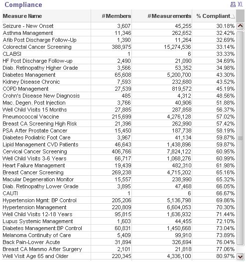
The next logical step of course is to begin analyzing the data. In a traditional report driven world we would ask for some details based on the different  quality measures. So we did that. We created a very simple chart that showed the name of the quality measure, the # of members involved (patients), the number of quality measurements taken for the measure as well as the % of the measurements that were compliant.
You know the typical stuff that emulates what you could get out of any $9.95 report writing tool. Then we sorted the chart in order of the % of records that were compliant. It’s where they were.
Naturally we also added the ability to change the dimension (Measure Name) to System, Practice or Provider so we could see the same details as we drilled in.
Visualizing How to Improve
The purpose of the project was to improve their compliance percentages as an organization. So here is where my opening point comes in. What should they spend their time on? Who should they speak to?
The natural inclination for folks is to start with the worst on the chart and go from there. The compliance for “Seizure – New Onset” was at 30.18%. Again neither good nor bad, just where it was. I said the natural inclination is to start there, but that would be wrong. My friends the biggest bang for the buck isn’t to charge down the halls trying to improve the compliance of a measurement that only has 45,255 out of the 62.5 Million overall records. So if we’re going to help them determine how to best spend the time of their valuable human resources I better create a visualization that actually does that.
Visualizing what Isn’t Right
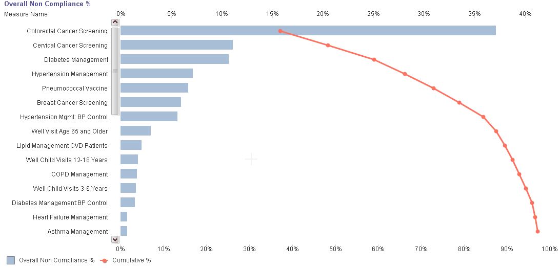
The visualization that I believes help most with where to spend time is a Pareto Chart. Instead of looking at compliance percentages a Pareto Chart does the opposite it looks at what isn’t compliant. More to the point a Pareto Chart looks at each Quality Measure (or any dimension) and looks into how many non-compliant measurements it has versus all of the non-compliant measurements in the entire data set.
It also visualizes the cumulative effect as you proceed through the list. Sometimes graphics in posts are simply to add a little excitement like the girl diving, but in this case a picture is needed to really understand the tremendous impact of what a Pareto Chart can do for you.
In the image below you will see that “Colorectal Cancer Screening” by itself as a measure makes up 37% of all of the non compliant measurements. Why? If you look at the detail chart above closely it has over 15 million measurements for it’s members. It’s the biggest piece of the pie by a long shot. Followed by “Cervical Cancer Screening” and then “Diabetes Management.” The red line indicates the cumulative affect and you’ll see that if you focused your time on simply the top 6 of the 35 measurements you would be effecting a cumulative 80% of all measurements.
How did you do that?
That Pareto dealio is pretty powerful isn’t it? Kind of illustrates how to improve in a slick and easy method so I know you want to jump right into your systems and add it so the question you may be asking is “How did you do that?”
I start be creating a combo chart. The bars simply represent the total number of items that are not compliant divided by the overall total of non compliant items which is handled using simple SUM functions and the wonderful key word “TOTAL” that tells the system to ignore the dimension that the current row may represent. (The IsNotCompliant field is simply a bit field with a 0 or 1 value indicating if the measure was not compliant or not)
SUM(IsNotCompliant) / SUM(TOTAL IsNotCompliant)
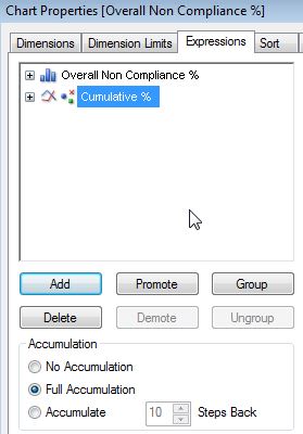
The cumulative line is simply the exact same expression and the clicking of the radio button that says “Full Accumulation.”
It’s really that powerful.
The question now is simply “Where can you use a Pareto Chart to help your organizations ”
Meaningful Use? Absolutely!
CPOE? Absolutely!
What I love about this profession is that we have the tools that make visualizing how to improve so easy. What would take weeks in an old fashioned report writing and hours and hours of old fashioned human analytic skills can be created in a single chart that instantly identifies where people need to spend their time if they want to improve the numbers and not just measure the numbers.


% can be misleading. So working with the raw data is the key to analysis and will provide opportunities for different kind of analysis. Pareto Chart a good solution to identify your focus for action as suggested!