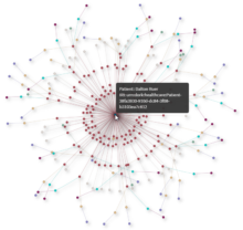
Goal While on a recent journey to learn more about Semantic Modeling and Graphing Database technology, I set off to try and visualize a Knowledge Graph. Oh sure I could have created some fake sales data with 2 or 3… Read more ›
A picture paints a thousand words They say that a picture paints a thousand words. If that were true, you should be able to describe a picture with a thousand words. Right? Like you, I have no idea who “they”… Read more ›
Recently my colleague, friend and all around nice guy David Freriks asked me to help him “analyze” the data available for Peloton. As you can imagine two data dorks like us had a lot of fun trying to create an… Read more ›
The real question that’s plagued the world has never been “Should I visualize the data?” it’s always been “How should I visualize the data?” Because it’s not that people don’t want to see things visually it’s a matter of how… Read more ›
Advanced Analytics with Aster I recently stumbled upon Teradata’s Aster and I’m pretty fired up. It turns out there is an entire community dedicated to helping data visualization people like myself learn how to implement advanced analytic functions. The site… Read more ›
In 30 years as a parent I can tell you I’ve had many memorable moments with my 2 amazing daughters. As humans, most of our memorable moments around babies involve movement. Let’s face it as cute as they are it… Read more ›
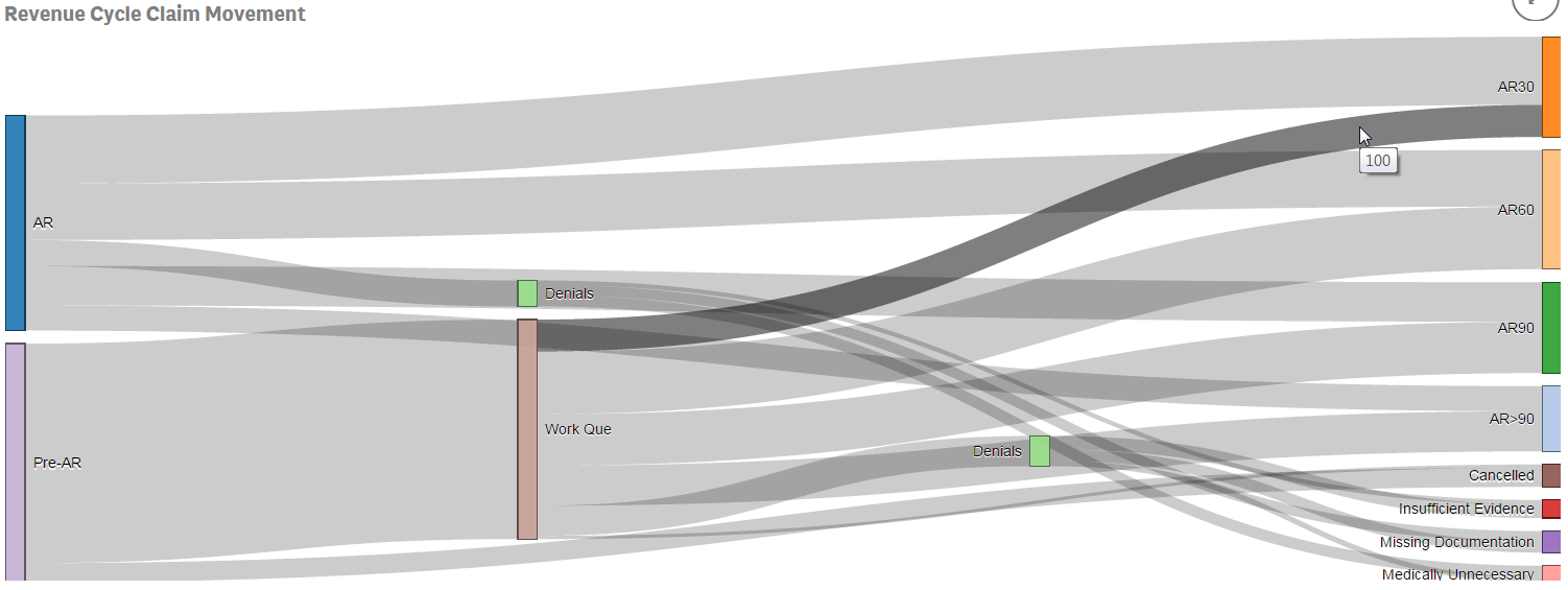
I recently had the opportunity to demonstrate Qlik Sense for the Director of a large health system’s Revenue Cycle team. The consultant who recommended us spoke with me ahead of time and we got along great. “This guy has been… Read more ›
What do the numbers 3.53, 17.6 and 4 all have in common? They are completely useless when displayed by themselves because they have no context. Length of Stay is a vastly important metric in health care and here is the most… Read more ›
“It was the best of times, It was the worst of times, It was the age of wisdom, It was the age of foolishness …” These are the unforgettable opening lines to Charles Dickens’ classic “A Tale of Two Cities.”… Read more ›

