Visualizing a Knowledge Graph?
Goal
While on a recent journey to learn more about Semantic Modeling and Graphing Database technology, I set off to try and visualize a Knowledge Graph. Oh sure I could have created some fake sales data with 2 or 3 simple tables, but you know that’s not how I roll. I wanted to visualize a knowledge graph that was more real world.
I wanted to visualize a knowledge graph that was complex and made me think.
I always talk about how complex Healthcare data is … so I thought “If I could walk the walk, instead of just talking the talk about how complex Healthcare data is, then I would really be able to make a point.”
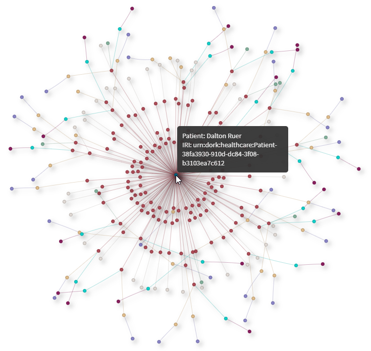
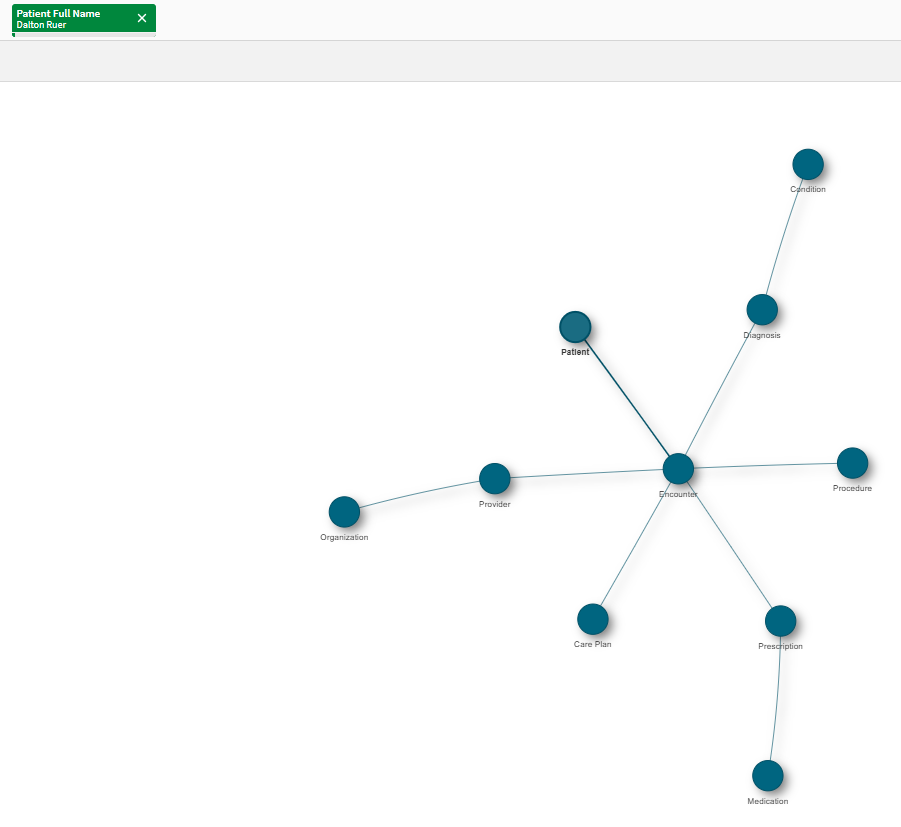
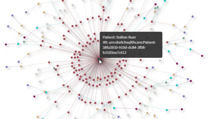
So, I sat down with my headphones on and 15 minutes later I had this beautiful Network Chart completed. All my healthcare friends would be pleased that I put patients at the center of the universe, and selected good ‘ole Dalton Ruer as a demonstration. Surrounding Dalton are all of his encounters. Each encounter has Procedures performed, Care Plans that were issued, Diagnosis that were made, and Prescriptions that were rendered. Around those are the details about the Procedures, Care Plans, Conditions and Medications. Along with the Providers and the details about them. If you ever wondered what a “frequent flyer” in a health system looked like … This is it. That guy clearly has issues.
Truth be told
I was crossing my fingers when I said “15 minutes later” (kind of fibbing a bit) because honestly, I struggled a little. Ok, I struggled a lot.
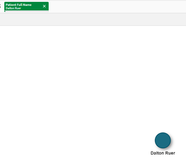
I started out great … all the data loaded and the node table I built visualized very cleanly. But alas, I filtered for Dalton Ruer … and my chart didn’t change a single bit. I tapped my keyboard ever so gently, threw my mouse across the room, and screamed … but nothing changed. WHY OH WHY was this so hard. All my lovely filters worked perfectly. I could see all of the information mentioned above in them. But nothing changed in my Network Chart changed.
Data Modeling
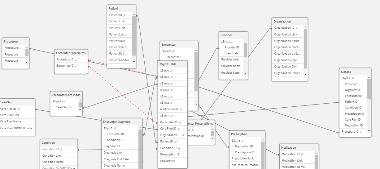
It’s been weeks, but I’m still blushing as I share an image of the first data model that I created. Now you might be thinking “Qlik Dork you should have denormalized those end tables so you had a Star Schema, instead of a Snowflake Schema.” But that wasn’t the issue at all. So, don’t wag your finger at me. 😆
It was a much more fundamental issue. It’s ok if it doesn’t jump out at you right away … it didn’t jump out to me either. (Which is a good thing because my struggle led to this post which will hopefully help you alleviate a struggle in the future.)
Network Chart
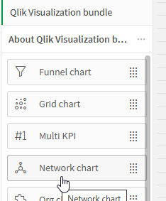
Before I go much further, I should give you some details about what Network Chart is and the values required to make them work. A Network Chart is a Qlik Sense Extension available as part of the Qlik Visualization bundle. Simply go to Custom Objects and drag/drop one to your screen.
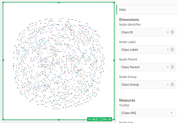
A Network Chart takes a series of parameters. 4 Dimensions and 1 Measure that can be displayed as Help.
The Node Identifier is like any other tables “id/key” and needs to a unique value.
The Node Label is what will be displayed when you select the node. The splash image and the image for the Goal section above, demonstrates that.
The Node Parent is a reference to the Node Identifier of the parent node.
The Node Group is really for coloring. In this posts case, it distinguishes Patients from Encounters … etc.
The Tooltip measure is for displaying some value about that instance. In my case I am displaying the “Class IRI.” While the rest of the values all probably made sense, If you aren’t familiar with Graphing Databases, or Knowledge Graphs I’m sure that may be a new term for you. IRI stands for Internationalized Resource Identifier, and is what I’m displaying below the Patient Name in that image in the Goal section. You can read more about them by clicking here.
Back to the Story
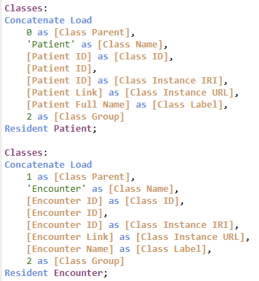
Before I dig into the real data, you need to understand the basic pattern. The image in the “Truth be Told” section was created by starting with this basic Inline code block. A Patient has no parent. An Encounter has a Patient as it’s parent. Other Classes all have the Encounter as their parent. All of it’s Class Groups are 1, which is why in that image all Nodes in the Network Chart are the same color.
With that foundation I went through a series of walking my actual healthcare information tables.
Easy breasy. I looked at the Preview of the Classes table and could see all of my entries. They were perfect.
So, why in the world wasn’t the Network Chart reflecting my selection of Dalton Ruer?
Data Model Modification
If it didn’t stand out to you before, if you go back to the image of the Data Model you will notice what I eventually realized … The Classes table is what is referred to as a Data Island in Qlik terms. It had absolutely no connection to my Patients, Encounters or anything else. Literally out on an island all by itself.
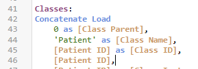
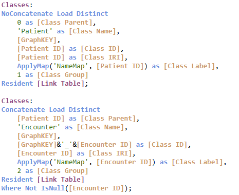
If you look at the script code above you will notice that Key/ID values for each of my real table’s values were renamed as [Class ID] so that they could be displayed in a common manner. After smacking myself in the head, and then laughing, I realized there was no chance of any filters working.
I quickly went back to the code and also added each value so that it would be associated with my actual tables.
While that would certainly contain the Associations needed … Can you guess how that worked out for me?
If you guessed “Horribly Horribly wrong” you really understand Data Modeling with Qlik. I had multiple tables referring to the same combinations of fields which created Synthetic Keys. But worse was the fact that a Circular Reference was created. Uggghh.
Data Model Rewrite
It’s all fun and games laughing at myself now, but I assure you at the time I was losing my mind. I tried many attempts … over the course of … many days. I changed the code to eliminate the circular reference and considered the concept of simply not letting anyone see all of the synthetic keys.
But I hit another logical brick wall. While the table was associated, and my filter for my boy Dalton Ruer did show the Patient node for Dalton … all of the other nodes were then excluded. So, all I saw was Dalton and nothing else.
Clearly that wasn’t optimal. Dalton was the parent record, and the only record not excluded from the Classes table was (… insert drum roll here …) Dalton as the Patient.
Light Dawns on Marblehead
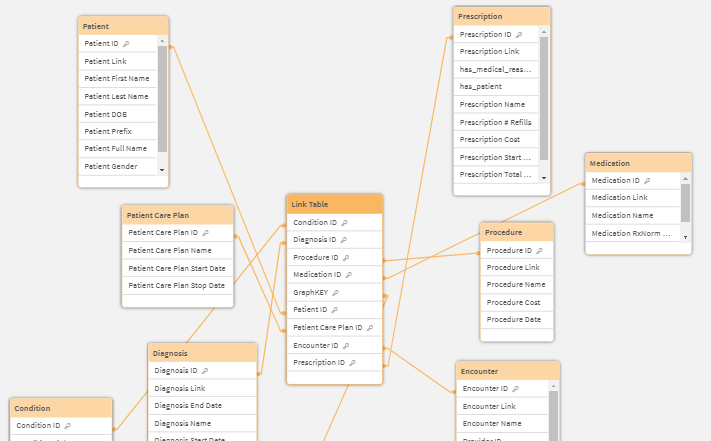
I realized I needed a Link Table model where all of my ID’s were in 1 table if I wanted to be able to visualize the children and the selected parent(s). If you aren’t familiar with the concept of a Qlik Link Table, then be sure to check out my previous post Creating a Qlik Link Table.
Seriously, if you aren’t already familiar with Qlik Link Tables be sure to read it. If you read it, and wondered why I made a big deal of creating a Link Table just to handle 2/3 tables, the image below will clear that up for you. I needed a single fact record that related all of the information so that when Dalton Ruer was selected, I still knew how to visualize all of that other beautiful information.
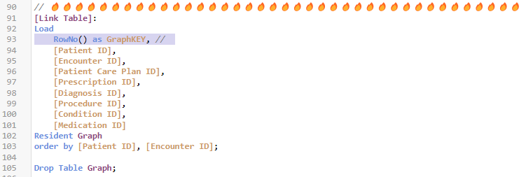
Yeah you got the Star Schema you wanted when you were wagging your finger at me. But most importantly I had a structure now that was more fitting of visualizing a Knowledge Graph. The final step in my Link Table was creating a Graph Key column that was a unique identifier for each row.
Graph Key for the Win
That unique Graph Key was then the field that could associate the Nodes in my Classes table with the data itself. The Link Table solved the problem of only being able see any 1 Node if I filtered to something, while this Graph Key provided the Association to the nodes when I made selections. The code was the same for each class of data. I built a bunch of mapping tables to define what value(s) I wanted to use for each classes label.
For the child classes I used a concatenated key comprised of the GraphKEY value and the data ID for the Class ID. Why? You probably guessed … The same Encounter ID had lots of children and when I first just used the Encounter ID as the Class ID none of them were distinguishable. Ooops! I shouldn’t have shared that I had made yet another mental mistake. 😂
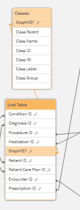
Data Model Viewer image showing the GraphKEY as the association between my Link Table and all the data and the Classes table used to visualize the knowledge graph
Goal Achieved
The goal of this post wasn’t to argue for or pitch for any data modeling technique over any other. I had a perfectly good associative data model on my first attempt that worked great until the requirements changed. In this case, the requirements were to visualize the data within it, in the form of Triples for a Knowledge Graph, by using the Network Chart visualization. That “oh by the way can you show me … ” feature change, was what caused the need for a different data model approach. One that was able to be achieved by using a Link Tale.
Per the starting image the end result was one in which I could visualize the complexity of all of the data for Dalton Ruer. The following image demonstrates that I am also able to visualize multiple patients if desired as well. Appears like my boss Hugo Sheng is competitive and is trying to catchup on visits.
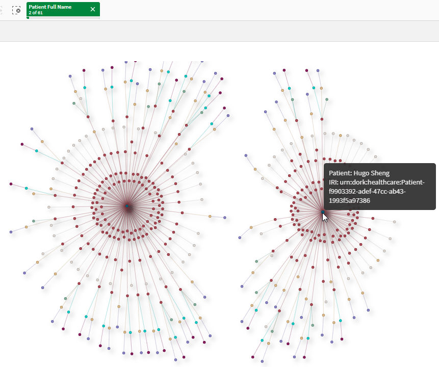
Image of the goal being achieved illustrating I could pick multiple patients and see the knowledge about both/all of them
Disclaimer
Admittedly what I visualized in the Network Chart is not a complete Knowledge Graph. Just one representation of the Knowledge it would contain.
Study Guide
Questions
- What type of data did I use to illustrate the process of visualizing a knowledge graph? Why did I choose this type of data?
- What specific Qlik Sense visualization tool is used for creating a knowledge graph representation?
- What are the key parameters required by the Network Chart in Qlik Sense? Briefly describe each.
- Why did my initial data model prove unsuccessful for visualizing the knowledge graph?
- Explain the concept of a “Data Island” in Qlik Sense.
- What data modeling problem arose when I tried to directly connect the “Classes” table to the rest of the model?
- What is a Qlik Link Table, and why did I decide to use it in their revised data model?
- How did the introduction of the “Graph Key” column in the Link Table contribute to the successful visualization of the knowledge graph?
- What was the ultimate goal of my exploration of data modeling techniques in this post?
Answers
- I used healthcare data to illustrate the process, because of its inherent complexity and real-world relevance, demonstrating the power of knowledge graphs in handling intricate relationships.
- The Network Chart, a Qlik Sense extension available in the Qlik Visualization bundle, is what I used for visualizing a knowledge graph.
- The Network Chart requires: Node Identifier: a unique identifier for each node, like a primary key. Node Label: the displayed text when selecting a node. Node Parent: a reference to the identifier of the parent node. Node Group: used for color-coding nodes based on category. Tooltip measure: displays a value associated with the node, like an attribute.
- My Classes table with the node information was a data island and lacked connections to the other tables, preventing filtering and proper visualization of relationships.
- A Data Island in Qlik Sense refers to a table that is not connected to other tables in the data model. The “Classes” table initially acted as a Data Island, hindering the visualization as selections in connected tables could not propagate to the isolated “Classes” table.
- Directly connecting the “Classes” table led to synthetic keys due to multiple tables referencing the same field combinations. Additionally, it created circular references in the data model, making the model illogical and unusable for analysis.
- A Qlik Link Table is a central table connecting multiple fact tables, simplifying complex relationships. I used it to avoid synthetic keys and circular references, providing a clean and efficient structure for representing the knowledge graph relationships.
- The “Graph Key” column in the Link Table served as a unique identifier for each row, linking it to the “Classes” table. This connection enabled the Network Chart to associate specific data points with their corresponding nodes, allowing for dynamic filtering and visualization of the connected data.
- My goal was to highlight the importance of choosing the right data modeling approach based on specific analytical/visualization needs. While an associative model might work for general analysis, visualizing a knowledge graph required a Link Table structure for clarity and accurate representation. We all have situations where users introduce new requirements into the situation that may force data model changes. Give yourself grace when that happens.
