Removing the clutter
Ask any Data Visualization expert and one of the best pieces of advice that they will give you is “remove the clutter” so that your “data can tell the story.” Would it be going to far if I suggested that perhaps you might even want to remove the underlying map when you are doing Geo Analytics?
I recently came across a post from a data visualization “guru” that I follow named Ken Flerlage. His post was entitled Visualizing Earthquakes. As always Ken’s post was very clean and informative and could be printed as an “infographic” with little additional work.
Normally I would press “like” and move on, but for some reason I was very intrigued with something that caught my eye. So unlike the multitude of times in the past I felt like I “had” to get involved so I pulled the data set down myself and starting playing with the data using Qlik GeoAnalytics.
North and South America
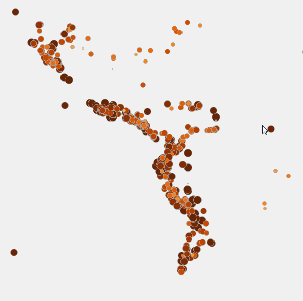
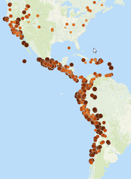 The first thing that caught my eye with Ken’s image and that jumped off the screen when I visualized it was that as large an area as North and South America are it’s crazy to me that the fault lines clearly lie along the Pacific Ocean side of both continents. Hard to miss isn’t it.
In fact, here is where the title for the blog post jumped into my head … Did I even need the map? Did the map add value? Or did the map in this case actually detract from the story that might jump into you mind if it wasn’t even there?
 So I decided to experiment and I removed the map. You tell me. Does the map need to be there, or is there a pretty cool story that lies in the data itself?
Hopefully the question in your head is … Are there other areas in the world where the distinction is so incredibly clear cut?
Africa
What I found was a resounding … Yes there are. If you knew that the following image was for another continent could you guess?
 If you guessed Antarctica, you might be geographically challenged. I’m guessing that you nailed it immediately … Africa.
Very clean northern and eastern border lines with very few points on the western edges of what is a gigantic continent.
With “normal” dashboards you probably already knew that removing the clutter was an important aspect of really telling a visual story with your data. Would you have ever imagined when you started reading and I suggested that removing the map might actually be a good thing to do?
But wait! The story gets more interesting and why I believe data visualization is so intriguing. Yes less is more, but sometimes more is more as well. There are times where visualizing the same thing in multiple ways can make a huge impact. You see while you could take the image above and lay it right down along the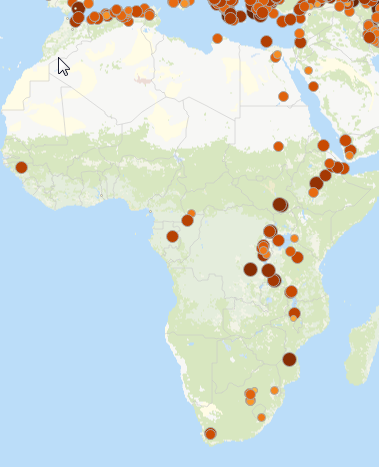 continent of Africa on a map the fact is that the points are inland from the coast. Yet they follow the coastline unbelievably well, wouldn’t you say? And just like North and South America, the earthquakes spare the entire western edge of Africa almost entirely.
Infographics vs Analytics
I can’t recall in the 18 months of doing this blog ever explaining the difference between visual analytics and infographic. This is a great time. An infographic is meant to convey a story from the authors perspective. Visual for sure. But also static. If you read Ken’s post you will see that he goes the extra mile in conveying information even about the sizing of the points. For my analysis I simply used a linear scaling of the point sizes based on the magnitude of the quakes. Ken does a great job of visual helping readers understand that the points should really range a gigantic amount in size. Informative. For my “analytics” I only cared about helping the end user doing the analytics realize that some points were 2.0 and others were 8.5. So I used scale and color but I didn’t go the “extra mile” of “informing with detail” as Ken did. I’ve pulled some images and shared the “story” that I thought was intriguing but the application is very much one that is for analytics.
If I wanted to go the extra mile and I had research to back my “coastline” theories I could certainly turn it into an infographic, but that’s not what I do. That extra mile is what reporters and people like Ken do when documenting the story they want to share visually. The infographic is a form of data visualization intended to inform and answer questions, while analytics are intended to answer questions you may have and also prompt new ones.
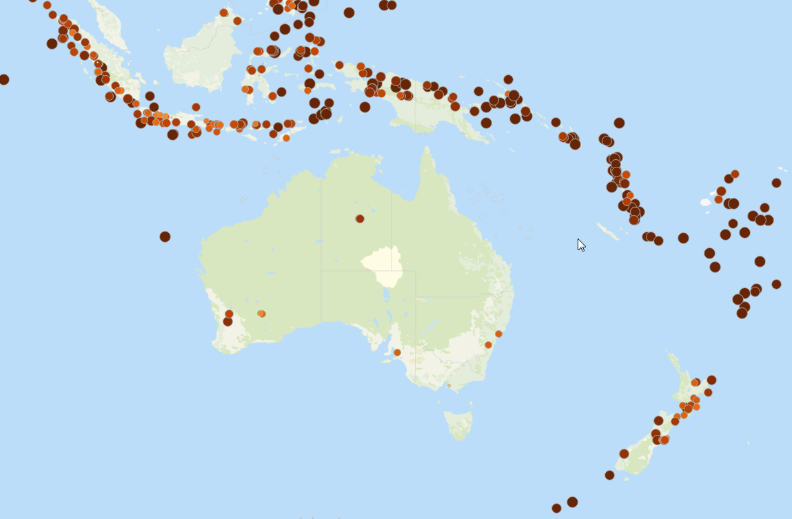
For instance in my application you would see the following image and you could immediately count 8 to answer the question “how many earthquakes has Australia had?” But more importantly hopefully spur you to ask “Why on a continent so large have they only had 8 earthquakes, nearly all along the southern edge, and yet nearly all of the surrounding area is covered with earthquakes.
While many online infographics are becoming interactive to some degree, analytics would enable you to filter to what you want. “Show me only earthquakes over 6.5 in magnitude” “How many square miles were affected by earthquakes in the USA?” “How much money did earthquakes cost from 1990-2000 vs 2000 – 2010?” “Which decade from 1900 until present had the most earthquakes?” “If you added the magnitudes together what would a line chart look like over time?”
In this case that time component might have it’s own story to share. So of course you would want to see earthquakes animated over time. In this video I cover quickly the same points above, but I also video the animation. In one screen I animate the decades from 1900 until current and the points are sized and colored based on magnitude. Again only using a linear scaling, not a logarithmic scale as the point sizes would be so big for some they would hide others. Each decade simply displays the earthquakes for that decade. I then do the same animation, but instead I color the points based on the decade. 1900 is a light yellow, while 2010-current is a deep red. The goal for this is that I can then aggregate the earthquake points starting in 1900 and you can tell where the points are for 1910-1920 as they are added and so on.
Analytics would then involve running the same things but coloring the points based on the dollar values that were involved. Or the number of deaths inflicted. Always, always, always searching for ways to visualize in the best way for the data itself to tell the story and help you answer the next question you have.
Popcorn Time
As you enjoy some popcorn while watching this short video of the animation take the time to ponder a philosophical question: What clutter can you remove from your life so that “your personal” story shines brighter?


Brilliant as always Dalton. You, and Ken, are doing the community a great service with your insights and observations. Glad you are back blogging again!