Have you ever wondered …

Have you ever wondered what events happen to patients after a particular surgery is performed?
Well I did. Like I seriously can’t sleep when I start wondering about things like that. I start believing crazy things like we can change the world by using analytics. What do you when you get crazy analytical questions in your head? Do you just let them go or do you dig and scratch and claw until you pull the data together and solve the puzzle?
In this case even though it’s just a hypothetical example for a blog post I still worked crazy hours setting up the data, building the application, filming the video and writing this post. Why? Because I think there is huge value in tracking not just the variances in costs and timing for individual procedures but in analyzing an entire series of events as well.
Notice I used the word “events” and not just “procedures.” Certainly it would be nice to know if having 1 procedure leads to another procedure in 75% of the cases for a physician. But wouldn’t it also be nice to know how often a procedure leads to a patient having a Code Blue? Or having to have a tube placed? You know … KEY MEDICAL EVENTS in a patients stay. Or … even their return after a stay?
Ok now that we are all agreed me working crazy hours to set this up is a valuable exercise let’s examine what I will demonstrate in my video.
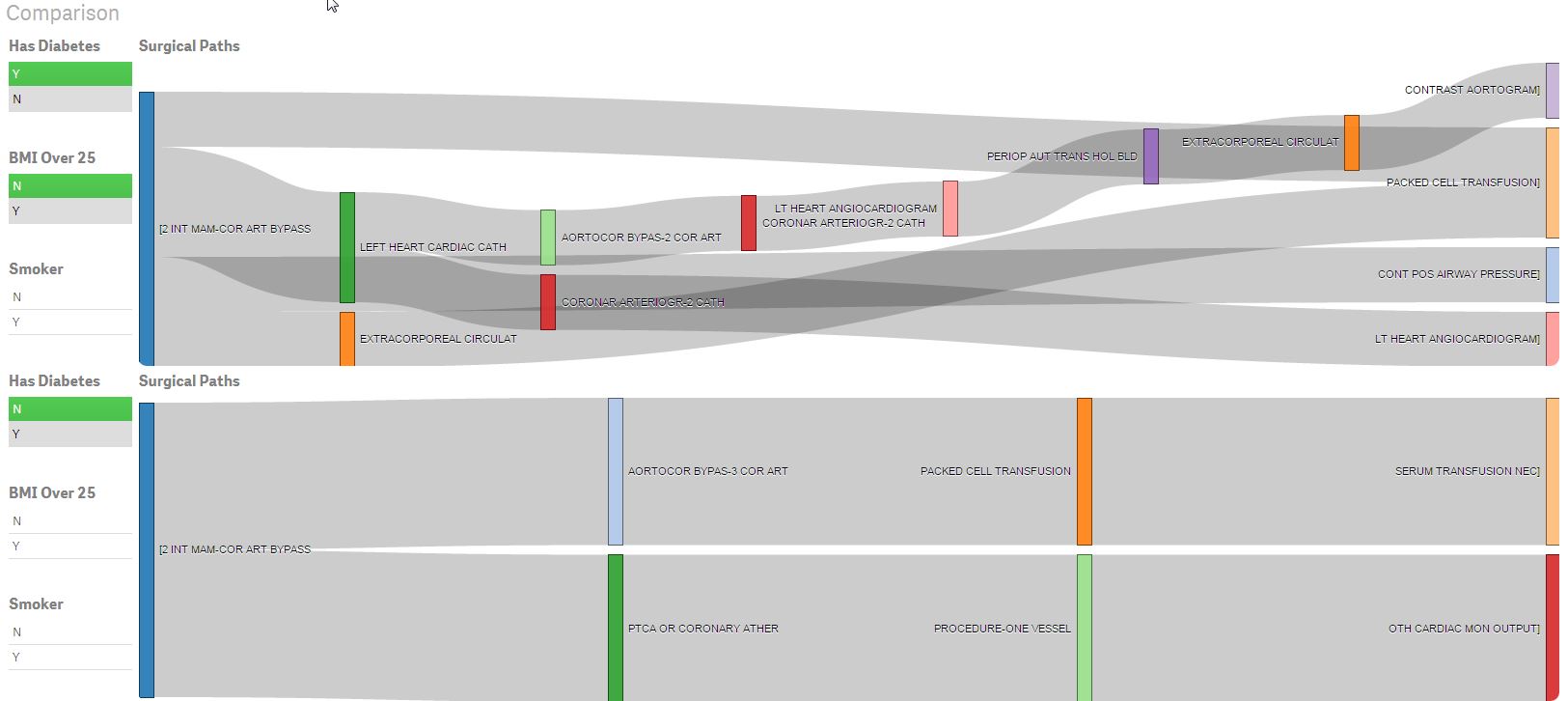
- I use an Aster NPath SQL-MR query just like in a previous post to process a set of surgical event data that I’ve loaded.
- I also take advantage of Qlik’s ability to do some cool ETL things on the fly and I capture the First Event and the Last Event so that in the UI I can choose which procedure I want to start with or likewise in your world you could select the last event to occur and find the various paths that led to that preceded that event’s occurrence.
- While I was at it I also load in some sample patient demographic information to demonstrate that the advanced analytics you can do with Teradata Aster doesn’t have to be visualized in a vacuum. Of course you will want to take advantage of the Qlik Associative model and load data from as many sources as needed.
- The application consists of two basic screens. The first is a blah-blah-blah you can filter the data using demographic information and see the results of the NPath query visualized in a Sankey Diagram just like you would expect. The second screen is more a “Are you kidding me I didn’t know you could do Alternate States in Qlik Sense like you can in QlikView” kind of thing you would expect from a Qlik Dork. I demonstrate the ability to compare the event paths between different patient sets thanks to the great extensions built by Svetlin Simeonov.
I could have just shared the video but where is the fun in that I had to do a little creative setup so that you would understand what you were watching.
Do I think you are going to run right out and start building an application like this to analyze surgical events?
Of course I do. I’m a dreamer. I wouldn’t put this kind of effort into something if I didn’t believe it would spark an interest in at least a few of the readers to really start putting advanced analytics to work. Perhaps not for this specific situation but certainly there is some other big problem you’ve wanted to tackle that is like this. You have all of the pieces you need at your fingertips … so GET GOING!
hi,
from aster data path analysis looks like this
[a.b.c.d]
[a.c.d]
…
and so on
I can not used the sankey diagram.
How data for sankey must look like ?
thanks