Visualizing Blood Pressure
 I was recently asked to produce a rounding report for physicians. Easy enough right? Slap some vitals on a page, toss in some lab results and the medication administration record and voila … you have a rounding report. But that was the old me. The new me is inspired to put as much effort into visualizing the data as I’ve been putting into finding it, extracting it, transforming it, loading it and modeling it. The problem is I’m a 0’s and 1’s kind of guy … what do I know about clinical data or how physicians need to see it or the decisions it may help them make … or worse what decisions won’t they make if I present the data in a way that is misleading. In this post I’m going to focus simply on the presentation of the blood pressure data. In future posts I’ll move on but this seems to be the perfect data type for how me to demonstrate how to add value to something through the art of data visualization. The first point I need to get across is that your visualizations won’t be successful unless you truly understand the data you are presenting.
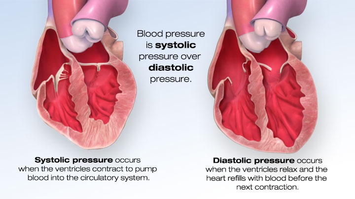
I’ve just begun my journey through Randy Krum’s book “Cool Infographics.” I can tell you that even he would smile at the American Heart Associations site I found to research bloodpressure. They take boring blood pressure information and present it with static, interactive and video based infographics. Like a learning tri-fecta for me. Helps me understand the data I’m dealing with, helps me clearly understand the points Randy makes and provides me with a catchy opening graphic for this post. Clicking on the image will take you to their website so you can see why I think it’s so cool, plus you’ll have the chance to learn everything you wanted to know about blood pressure, it’s effect on us and why it’s so vital to portray this vital (pun intended) in the best way that we possibly can.
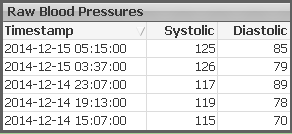 One of the wonderful facets of QlikView is that it allows you to present raw data tables so that you can verify the data when there are questions. “What you don’t believe my numbers … here is the raw data to back them up.” That’s huge for sure.
Clean. Single source. Raw data is a valuable commodity in our profession but I’ve got to be honest it also has a huge flaw. If the data above was pulled at 5:17 (two minutes after last vital) then the numbers have more meaning than if the values were pulled 8 hours later. In a nutshell this flaw in the raw data is called a lack of context. You can read more about context and the role it plays in the data consumer’s experience in Stephen Few’s … must have … book “Now you see it.”
An initial approach to make the data more visual might be to present the data via a line 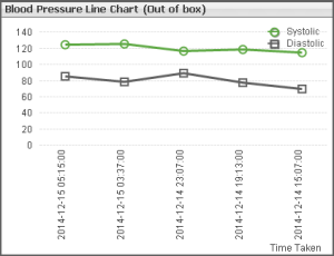 chart. Prettier than raw data for sure. But by the time we ensure the timestamps are visible we have almost zero room for the data points themselves. One common mistake you might be inclined to make is to simply uncheck the box that says “Enforce 0” for the axis and thus freeing the line chart to use it’s own number range so that you get more precision and can see the trend better. While that provides a better view for a single patients numbers it makes it more difficult for the end users. Their “context” keeps changing from chart to chart.
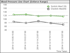 Few also discusses this in his book and suggests an alternative … a well defined data range that you can use across all of the displays. I’ve chosen 40-180 as my range. Unless a trend is really substantial you won’t see a spike up or down. The reference lines help the end user quickly ascertain if the numbers are within the expected boundaries or if this patient needs monitored more closely. Notice that without making the chart undreadable by showing every data point value you can adjust the labels to include the MAX values for each.
Basically out of the box all the line chart does is put lipstick on that pig that is a “lack of context.” We still haven’t addressed that issue. Not only do we not know when the data was extracted in relation to the data points in the chart, the default display is to simply spread the points apart in equal amounts. But that dimension at the bottom of the chart is time. Time isn’t A, B, C and D. Time itself has a context and visualizing it as a dimension requires that we handle it appropriately. In other words it isn’t honest to display points that are take 2 hours from each other equal distance apart as points that might be 6 hours 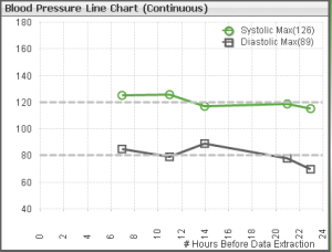 apart. What if instead of displaying the raw timestamps as the dimension we instead display the number of hours since data extraction? We still show the user their 5 data points but wow what a difference this change makes wouldn’t you say? Not only do they see data points they have a more accurate picture to assess the situation. In the default chart the physician may think this patient is trending towards hypertension and action is needed. But in the continuous time chart they can clearly see that there is a 7 hour gap between the last time vitals were taken and perhaps a different action is necessary.
Why are there such big gaps in the vital collection?
Is it isolated to this patient?
Is it isolated to this nursing unit?
All questions that might arise from viewing the data in a continuous time chart instead of the default. Big win for us we just led to Data Discovery so we must be done now. Right? Now so fast. We still have 2 pretty key issues to tackle. Systolic and Diastolic are the raw readings. Most physicians are concerned with the Mean Arterial Pressure. (Remember my first point about researching so that your visualizations can be as valuable as possible.) Secondly in a chart with just 5 readings it’s pretty easy to tell which Systolic value goes with which Diastolic value, but what happens if the patient has lots more readings in a compressed time frame. How will the physician know which goes with which? They won’t.
Sure wish QlikView offered a different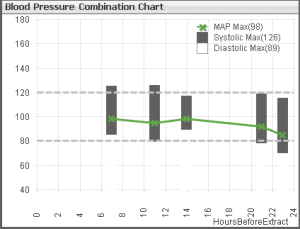 type of chart that provides us all of the tools we needed to present this data in a meaningful way that made the correlations between values crystal clear while also allowing us to add the calculated MAP values to the chart. Oh wait it does. It’s called a combination chart. By simply displaying the Systolic and Diastolic as stacked bars and the MAP as a line we can easily see which values belong to each other and would continue to see those relationships regardless how many points we have.
Sharing my journey into visualizing blood pressure with you has been way to much like fun. While it may seem like it was a long post to you, I feel glad that I kept weeks of work and research to 1,243 words at this point right here. Now it’s your turn though. What additional value can you add? Can you add color to make bad numbers pop off the page? Would displaying the values along the axis add value? If we were viewing weeks worth of vitals instead of 24 hours would a box plot be a better choice? So much fun … so little time.


Dalton, Great article, I am always impressed with how well you, a self-described 0’s and 1’s guy, not only transforms data into information but has the ability to articulate it so that it turns into shared knowledge. I look forward to your future posts and articles.
Pingback:Visualizing Lab Results - Qlik Dork
If you are taking medicine for high blood pressure, but that does not reduce continually and to better
health level, a good reason why is that there may
be:. When your body has high amounts of acid and not enough oxygen, your
immune system will suffer. 2010.
Hi – great article, glad I found it! Just wondering if you have gone any farther with this . . . I am working on a research project studying cardiology patients and how they interact with their personal health record (PHR). One key element there is showing them different sorts of displays for lab results/blood pressure/etc. and seeing how they “like” and how they perform with the different options. Would love to include some of your ideas . . .
Thanks!