
Visualizing the Busy-ness

Not that anyone would be surprised to discover a direct correlation between supply and demand but in my last post on “Visualizing Knowledge” the scatter plot proved to be a very advantageous chart type in that it showed there was a very distinct correlation between the two. On the busiest days (Monday) it took longer on average for a patient to transition from walking in the door to being placed in a bed.
The scatter plot was a good visualization choice to help us quickly and effectively see the relationships by day of week. The goal of this post is to try and drive deeper because while “day of the week” is a common unit of measure in reality that is a rather large unit of measure that is comprised of 24 individual hours.
More specifically we want to find a way of visualizing the busy-ness hour by hour. Just for fun let’s challenge ourselves to provide what Albert Cairo refers to as the “boom” effect in his book “the functional art.” In simplest terms we want the graphic to show up as a visual pyrotechnic. I want our visualization to explode off the page into the readers mind.
The natural starting point I suppose would be a pivot table. It’s a simple way of visualizing a measurement like “# of people who walk in the door” across multiple dimensions like “Day of the Week” and “Hour of the Day.” Easy peasy right?
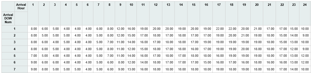
Easy for whom?
Easy peasy to create perhaps, but is it really so easy to read? A pivot table may be the perfect choice for multi-demension analysis when both dimensions have few values. But in this case we have 168 unique cells and it is all but impossible to spot any immediate patterns. Fortunately I specifically indicated that we needed to provide a “boom” factor in our visualization or we might have been tempted to stop and simply say “look Mr. E. D. Director you asked to see 168 values and I showed them to you.”
In his afore mentioned book “the functional art” Alberto Cairo spends a great deal of time explaining the science behind how we visualize anything as humans. He specifically puts forth an image of what could be a pivot table and says “The brain is much better at quickly detecting shade variations than shape variations.” The point he was making is that its nearly impossible for humans to see that many numbers side by side and on top of each other and make them out.
Pop Quiz
Look at the following and try to identify all of the 6’s :
4 3 6 9 1 6 5 7 8 2 4
9 8 4 6 3 2 1 9 5 3 1
7 2 8 1 4 5 9 6 7 3 1
2 4 1 5 6 8 1 4 2 5 3
He then shows an alternative image with the exact same sequence of numbers but uses shading and suddenly what we as humans can do is made abundantly clear:
4 3 6 9 1 6 5 7 8 2 4
9 8 4 6 3 2 1 9 5 3 1
7 2 8 1 4 5 9 6 7 3 1
2 4 1 5 6 8 1 4 2 5 3
The Human Brain
Cairo immediately goes on in his book to describe the Gestalt theory that human brains don’t see patches of color and shapes as individual entities, but as aggregates. How can we take advantage of that? We need that kind of impact for Mr. E. D. Director. We want him to be able to immediately visualize the busy time periods but avoid all of the busy-ness of 168 cells with numbers.
You probably guessed that we don’t want to use a 168 slice pie chart.
Nor do we want to use a line chart with 7 different lines each with 24 points.
What we want is affectionately known as a heat map.
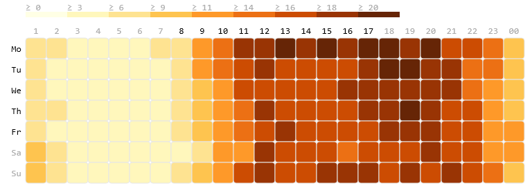
There can be no mistaking the busiest hours across all 168 unique cells.
There can be no mistaking the obvious patterns either.
Rapid Consumption
The purpose of the heat map is to allow you to visualize your data in a way that makes the data explode off the screen and into your users heads.
In the previous post we used the scatter plot to determine the pattern between the busiest days of the week and the time it took to get a patient from the door into a bed. So let’s keep driving into that analysis. The neat thing about Qlik Sense is that it allows the end user to simply drag/drop a different measurement onto our visualization and voila they now see a heat map of the median minutes to bed for patients.
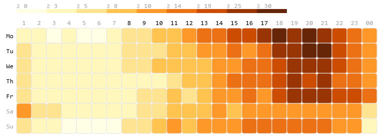
If the problem were simply one of a lack of beds we should see a pretty close relationship between the two. But that isn’t what we see at all is it?
How come there are obvious patterns of when the busy time for arrivals can be absorbed?
Why is their a pattern across all week days where time to bed slows down around 6 PM and remains the slowest from 7-10 PM?
More questions are a good thing
Those questions are what drive true data analytics.
Are you helping your users not only answer the questions they came into the application to ask, but also providing them those answers in a way that leads them to ask even bigger questions?
Questions that involve processes and not just data.
Questions that involve staffing models and not just data.
If we can provide them the answers to those questions in any manner we did our job.
If we can provide them the answers to those questions in a way that removes the “busy-ness” of all of the data from the important data we are trying to visualize and do it all in a way that provides a “boom” effect we can certainly take 2 seconds to pat ourselves on the back before digging in to the next problem.
Another well thought out, keenly articulated article. Love the series thus far!
Nice approach,
would you mind to share the formula used to achieve the heatmap? Was trying with HRANK, but do not really succeed.
Peter
Peter – I just used the Calendar Heat Map provided on the Branch.Qlik.Com site. The only thing I needed in my data so that it would correctly was adjust my Day of Week and Hour of Day values. My data comes straight from SQL Server and considers Sunday the 1’st day of the week, but the control expects Monday to be #1. Also 12:00 – 1:00 AM is considered hour 0 but the tool wants that to be #1 as well. Once I made the adjustments on my load to account for that the control worked right out of the box. There is also a JS Pivot Table extension that you can use which does marvelous things. It allows you to show a pivot table, and set a flag that says “let user change the look”. While displaying the control you can then say “I’d like to see this as a Heat Map and it will apply the coloring while still leaving all of the data visible.” Way cool.
Hi Dalton,
Thank you for sharing your technique. Is it possible for you to share how you use Median as your totals aggregation using JSPivot Table? I only show Count, Sum and Average as possible aggregation method.
Tai
Absolutely and so sorry for taking so long. One of the awesome features of Qlik Sense is the ability to pre-define measurements using any expression you would like including Median. By pre-defining them you also take the complexity out of the users hands. While an end user would have a real problem trying to write an expression that uses set analysis you can pre-build it and define the measurement as “Number of Visits in 2014” or “Number of Visits in the prior year” etc. Now you greatly elevate what the end users can do through self service without requiring them to become programmers.
If you used variables in Qlikview you can think of Measurements as basically the same thing. You pre-build the code behind it and the end user simply uses it over and over.