Show and Tell

One of my fondest memories of early years in school was Show and Tell. For those not familiar with the concept, students could bring 1 item to school with them and show it off to the class. As you can imagine young children love showing off their favorite toys. Telling the class what it was and why it was important to you was scary for many but most usually managed because the item was something they loved.
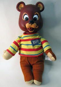
For me it was my Biff Bear. Most young children like teddy bears, but Biff Bear was special. When you pulled a string in his back his lips moved a little and he talked. I realize that toys these days can move, talk and read your mind. But this was 1969 after all, and Biff Bears were pretty rare, so I was quite the proud little man. Don’t tell the cool kids on me, but I kept and talked to that sweet little Biff Bear until I turned 12.
The reason I bring this up, and the reason that I called episode 8 of my Dork Cast series “Show and Tell” is that I’m a big proponent of Data StoryTELLING. Not just Data SHOWing. Even simple things like KPI’s can become KPY’s with a brief tidbit of a textual narrative. One that explains WHY the number matters. WHY the person reading the value should get out of their chair and act. For an example refer to this previous post called Actionable Intelligence.
Graphicacy
On an even bigger scale though, I fully believe that Data Storytelling aids in the process of increasing Data Literacy or what Steve Wexler refers to in The Big Picture as “Graphicacy.” To me, narration helps users speed up their journey as they are always moving along the continuum from beginner to experts.
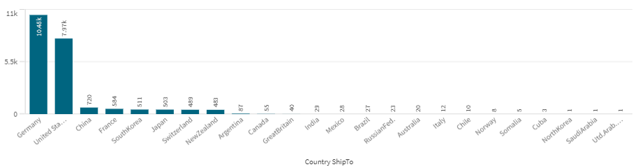
Let me give you a working an example. In this bar chart you can easily read which country has the highest value. Users don’t really need a story that Germany is the highest. I know you want labels “blah blah blah” that’s what other Data Storytelling experts tell you. But what the value is, is not the important part of “this story” so get over it. All that matters, is that you can easily determine the country that is the highest even at a beginning level of data literacy/graphicacy.
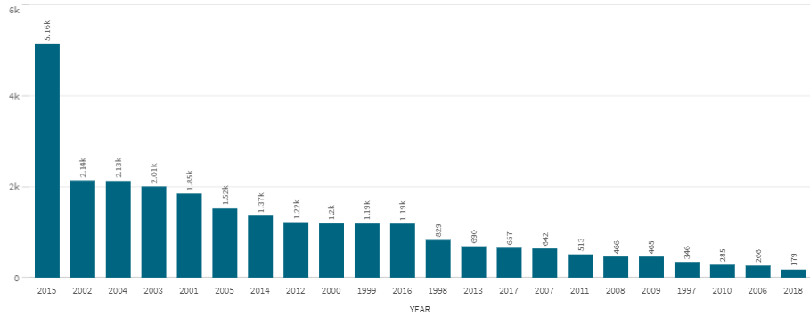
Now imagine I show that chart on a screen and the end users say “But Qlik Dork, we also need to see the values year by year.” So I add the following chart on the screen. Again with even a modicum of Graphicacy the end users can instantly see that 2015 was the highest. (Don’t you dare ask for the labels that’s not important.)
Well this might be a problem
Yeah! Everyone can quickly glean insights from those two bar charts. But before I can even pat myself on the back, some wise guy in the crowd says “But Qlik Dork, we need to understand the relationship between the countries over time. No problem for me, I’m a Data Visualization wanna be. So I simply show them the following Grid Plot so that they can see “the value”, for both dimensions.
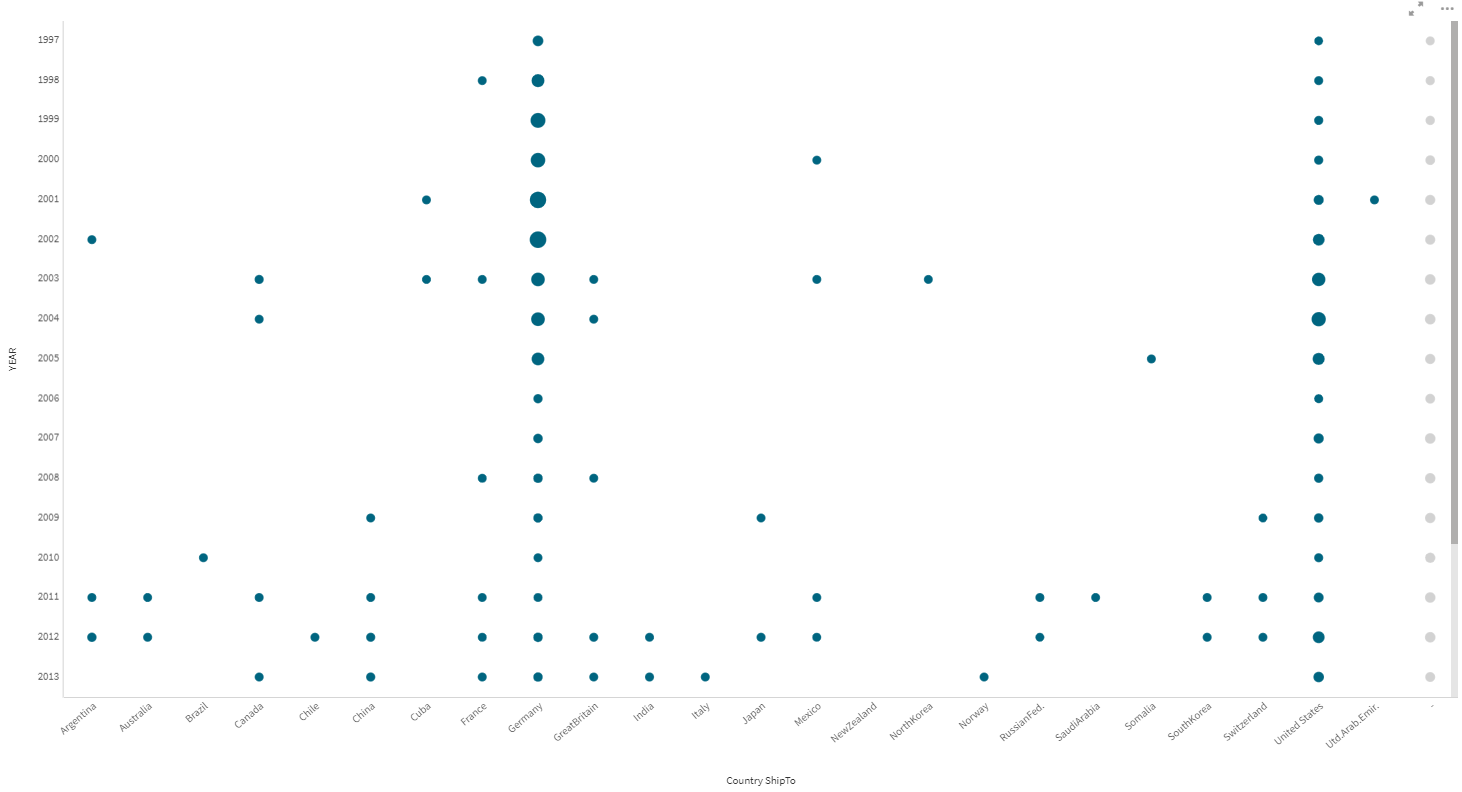
That’s what they asked for, but it poses a problem. The end users don’t understand how to interpret a Grid Plot. Their Data Literacy/Graphicacy skills aren’t up to that yet. Plus, there are so many values that they don’t fit on the screen so they have to scroll. Don’t even suggest a line chart with a different line for every year or for every country. I will reach through the screen and pull your nose off like I do with my grandchildren. Nobody can read those Spirograph line charts with this many lines.
Tell them what you’ve Shown them
Here is where things get interesting, they need the insights about the relationship between both dimensions, but they can’t interpret what I SHOW to them. Now you understand why the actual “measure label” isn’t relevant to the story, as the label isn’t going to help them. The story is that they need to be TOLD about the insights.
But how?
In the ideal world I would sit next to them and help them learn how to interpret the Grid Chart or hold their hand and tell them a Hollywood worthy story about the insights in a spiffy board room. Let’s be real that might work once per quarter for reviews, but it’s not like I can do that for every single user, every time data is reloaded or they make a selection. So how in the world can there possibly be a TELL for this SHOW?
For these cases it would be nice if every chart came with a talking Biff Bear. Wouldn’t it? Something that comforts you with voice when you are scared and alone. Unfortunately, Biff Bears aren’t sold anymore so I had to resort to the next best thing, Natural Language Generation.
Seriously! NLG is a legit, automated way of providing a narrative for complicated data relationships. The coolest part of it is that the more dimensions/measures that you feed it, the better it gets at providing an incredible story.
On with the show this is it
Below you will find Episode 8 of my Dork Cast series. After all the best way to SHOW and TELL, and help this concept sink in is via a video. In it I sit down with Mohammed Yaseen who is the Director of Sales Engineering for Qlik Partner Arria NLG. In the video we discuss their Articulate Intelligence extension for Qlik Sense. Don’t stop watching when I show you the insights they produce for the example above, because you will miss some even cooler features. You see while you get a ton of value out of the box, they also provide a paid version which Mohammed will demonstrate, that allows a developer to customize how to slice and dice your data for custom Hollywood worthy scripts.
This is so cool!!
Thank you as always Angelika.