
Data Brushing for Context

Ask any Qlikkie and they will tell you that the one feature about Qlik that sets it apart from any other product is its Associative Engine. It allows you to hold gigantic amounts of data in memory and navigate it any direction like you are using a Wonkavator. I realize that’s a rather odd analogy, unless you think of a SQL drill path as being an elevator. Then, suddenly the context becomes clearer.
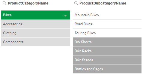
When you select values, a series of things happen visually in filter panes that showcase the Associative Engine’s unique power (which is good since many people are visual learners).
- Your selection turns green while alternative values you can select in the same field turn a light grey.
- Any values in other fields that are associated with your selection are white.
- Any values that are excluded by your selection turn dark grey.
Context is King
Why is any of that significant? Because Context is King and knowing what you didn’t is often as important as what you did select. For the purpose of the analogy, with a SQL elevator you wouldn’t even know those floors in another building existed. After all, that’s the purpose of a where clause: only return the data you asked for. But with the Wonkavator, I mean the Associative Engine, you do know they exist and can select them if your curiosity takes you to them. Going up ways, down ways, side ways, diagonal ways, back ways, for ways or any which ways through your data is Qlik’s thing. So yeah for filter panes!
But what if you want to display values in bar charts, line charts, French silk chocolate pie charts, scatter plots or maps instead of filter panes? Notice what happens to the bar chart below, by default, when a selection has been made.
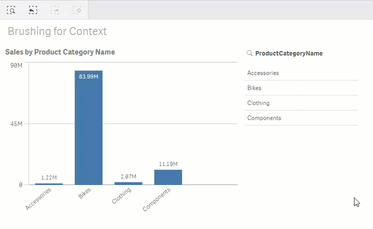 If you said “Oh no! Context is King and we lose the context to why we selected that bar instead of another,” then you win a piece of the afore mentioned French silk chocolate pie chart.
[/vc_column_text][vc_column_text]
Overriding Defaults
Notice that I not only used, but bolded the word default above. What I’m about to share with you is yet another secret of the Associative Engine: it’s amazing “state” engine. The selections you make are toggling flags behind the scenes for the default state in the data model. The default behavior for the charts is to honor that default selection state just like a SQL where clause would. 99% of the time that’s exactly what you want to happen. By golly, if you want to focus on Bikes, you only want to focus on bikes.
But, for that other 1% of the time, it’s nice knowing that you can override the default visual behavior by overriding the default selection state of the data through Set Analysis. You know, the super cool sauce on top of the Associate Engine that allows you to override those pesky default selections by your end users.
Let’s dig in and look at how to do that. First, you need to know that the bar height in the images above is a simple expression:
Sum( SalesAmount )
Sum is a function that will add up all of the values for the field SalesAmount. Behind the scenes, what Qlik interprets is just a tiny bit more: “Show the sum of the field SalesAmount for the default set of selection values.“
Normally you don’t care how Qlik interprets what you typed, because after all, that’s what the default is. But there is no reason you can’t be explicit in your expression: “I want you to give me the sum of the field SalesAmount for the default selection state“:
Sum( {$} SalesAmount )
Not so hard to understand, the {$} is the explicit Set Analysis construct for the default selection state. We can easily change that expression to ignore the user selections altogether for our expression. Fair to do, because they want to make a selection, but they also want to see everything as though they didn’t. The Set Analysis syntax for that is to simply replace the $ with a 1.
Sum( {1} SalesAmount )
But now we have a logical problem. What if they made other selections, like year or region. Oh no, we would keep all of our bars for sure, but our formula would also include all of the years. End users can be tough and now they submitted their 18’th change request. “I want to honor all of the other selections that I make, I just don’t want to honor the Product Category Name so that I can see all of bars for it to know why I might have selected one of the Product Category Names.”
No problem. Qlik’s Set Analysis allows us to honor some selections while overriding others. In English, we would say “I want you to honor the default selection states for all fields except those that I want to override.” This is how we would do that for the field ProductCategoryName:
Sum( {$ < ProductCategoryName= > } SalesAmount)
Notice that the syntax for telling Set Analysis that you have a list of fields is bounded by < > then you simply provide the field name you want to override. But what set are we telling Qlik to use for the field? The NULL set of course.
Note: I used the word set because you don’t assign values, you assign a set of values. Super important to engrain that concept as you begin working with Set Analysis.
We are saying “I want you consider all values“. That’s pretty easy to do, but then we have another logical problem. If we tell the expression to calculate all values, even for the dimensions that have been excluded by the default selections state, the chart will simply show all values. And the user has no clue what has actually been selected.
[/vc_column_text][vc_empty_space empty_h=”1″][vc_column_text]
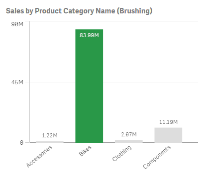
Color Expressions
Here comes change request #19 – “I want to see all of the bars, but I need them color coded so that I know which are selected, and which are not selected… like the filter pane shows me“. Qlik provides a color expression property so we should be able to handle this request. All we need to know is how to account for the fact that a field has been filtered out by the default selection state; that it’s in the NULL state.
Qlik provides a function to check if the field is NULL, so we are in luck:
=If ( ISNULL ( ProductCategoryName ) , RGB(221, 221, 221) , RGB (41, 152, 72) )
Note to self: the RGB value for Qlik’s default alternative selection light grey in a filter pane is (221, 221, 221) and the default green for a selected value is (41, 152, 72).
So close, but the user is whining about the coloring when no selections are made. We are pros and should have thought that through. Thus, I suppose we can forgive them for change request #193.

We need to adjust our color expression to logically handle the use case “If no selection is made then color the bars the default color being used by the system, else if a selection has been made then color using the green or grey“.
=If ( GetSelectedCount(ProductCategoryName)=0, ‘#4477aa’,
If(ISNULL ( ProductCategoryName ) , RGB(221, 221, 221) , RGB (41, 152, 72) ) )
Notice that you can utilize either a hex code or an RGB expression in your color expressions so that you don’t have to constantly bring up your favorite conversion website.
 [/vc_column_text][vc_empty_space empty_h=”1″][vc_column_text]
Final thoughts
This concept of allowing the user to see what they’ve selected in a colored way is often referred to as Data Brushing or Brushstroking. In plain English, I call it “allowing the user to retain the context of why they selected a value for charts“. Probably too long winded for most, so that’s why I’m writing a blog post and not a coffee table book on data visualization.
The charts below are interactive so have a little fun and see what you think. Can you imagine uses cases where seeing the alternatives within charts might add value (context) for the end users?
I used the default Qlik green for the color expression only for the sake of illustration to match the filter pane. My recommendation for the real world would be to stick with the color for the bar that is there when no selection is made.
[/vc_column_text][vc_row_inner][vc_column_inner width=”1/1″][vc_separator][vc_custom_heading]
Live Example
[/vc_custom_heading][vc_column_text]In the ‘live’ app below you can use the (tree map) filter below to select your data. This basically queries your data using a SQL ‘WHERE’ statement. Watch the difference in behavior in both charts. Once you selected some data, you will be able to clear your selections in the navigation bar above the filter or below the bar charts.[/vc_column_text][vc_raw_html]JTNDaWZyYW1lJTIwc3JjJTNEJTIyaHR0cHMlM0ElMkYlMkZxbGlrLmRhdGFvbnRoZS5yb2NrcyUyRnFsaWslMkZzaW5nbGUlMkYlM0ZhcHBpZCUzRGVkYjA3NDQ0LTZhODYtNDc0NS05Yzg5LTdhODQxNzQ3ZjZhZCUyNm9iaiUzRG1iREhWTGolMjZ0aGVtZSUzRERPVFJfVGhlbWUlMjZvcHQlM0RjdXJyc2VsJTI2c2VsZWN0JTNEY2xlYXJhbGwlMjIlMjBzdHlsZSUzRCUyMmJvcmRlciUzQW5vbmUlM0J3aWR0aCUzQTEwMCUyNSUzQmhlaWdodCUzQTI0MHB4JTNCJTIyJTNFJTNDJTJGaWZyYW1lJTNF[/vc_raw_html][/vc_column_inner][/vc_row_inner][vc_row_inner][vc_column_inner width=”1/2″][vc_raw_html]JTNDaWZyYW1lJTIwc3JjJTNEJTIyaHR0cHMlM0ElMkYlMkZxbGlrLmRhdGFvbnRoZS5yb2NrcyUyRnFsaWslMkZzaW5nbGUlMkYlM0ZhcHBpZCUzRGVkYjA3NDQ0LTZhODYtNDc0NS05Yzg5LTdhODQxNzQ3ZjZhZCUyNm9iaiUzRHRLTVhYbiUyNnRoZW1lJTNERE9UUl9UaGVtZSUyNnNlbGVjdCUzRGNsZWFyYWxsJTIyJTIwc3R5bGUlM0QlMjJib3JkZXIlM0Fub25lJTNCd2lkdGglM0ExMDAlMjUlM0JoZWlnaHQlM0E0ODBweCUzQiUyMiUzRSUzQyUyRmlmcmFtZSUzRQ==[/vc_raw_html][/vc_column_inner][vc_column_inner width=”1/2″][vc_raw_html]JTNDaWZyYW1lJTIwc3JjJTNEJTIyaHR0cHMlM0ElMkYlMkZxbGlrLmRhdGFvbnRoZS5yb2NrcyUyRnFsaWslMkZzaW5nbGUlMkYlM0ZhcHBpZCUzRGVkYjA3NDQ0LTZhODYtNDc0NS05Yzg5LTdhODQxNzQ3ZjZhZCUyNm9iaiUzREpxU2trenclMjZ0aGVtZSUzRERPVFJfVGhlbWUlMjZzZWxlY3QlM0RjbGVhcmFsbCUyMiUyMHN0eWxlJTNEJTIyYm9yZGVyJTNBbm9uZSUzQndpZHRoJTNBMTAwJTI1JTNCaGVpZ2h0JTNBNDgwcHglM0IlMjIlM0UlM0MlMkZpZnJhbWUlM0U=[/vc_raw_html][/vc_column_inner][/vc_row_inner][vc_row_inner][vc_column_inner width=”1/1″][vc_raw_html]JTNDaWZyYW1lJTIwc3JjJTNEJTIyaHR0cHMlM0ElMkYlMkZxbGlrLmRhdGFvbnRoZS5yb2NrcyUyRnFsaWslMkZzaW5nbGUlMkYlM0ZhcHBpZCUzRGVkYjA3NDQ0LTZhODYtNDc0NS05Yzg5LTdhODQxNzQ3ZjZhZCUyNm9iaiUzRFRkUnNEQWYlMjZ0aGVtZSUzRERPVFJfVGhlbWUlMjIlMjBzdHlsZSUzRCUyMmJvcmRlciUzQW5vbmUlM0J3aWR0aCUzQTEwMCUyNSUzQmhlaWdodCUzQTEwMHB4JTNCJTIyJTNFJTNDJTJGaWZyYW1lJTNF[/vc_raw_html][vc_column_text]
This example should give you an idea on how to keep context intact while doing analysis. Remember that having context available can help you to imagine what your data looks like compared to other data within the topic of interest.
[/vc_column_text][vc_separator][/vc_column_inner][/vc_row_inner][vc_column_text]
Article Resources
These are the links to get the data and the QVF file we checked today:
If you have any questions, thoughts or ideas, please reach out to one of us or use the comment section below.[/vc_column_text][uncode_share layout=”multiple” bigger=”yes”][/vc_column][/vc_row]
Pingback:Data brushing on a user-defined Set > Blog Emark
Pingback:An Alternative to Alternatives – DataOnThe.Rocks