Actionable Intelligence

For my entire 35-year career I have been focused on “Actionable Intelligence.” It’s a worthy goal. One that you have likely dedicated your career to if you are reading my blog.
- How do you convert data to information?
- How do you turn information into knowledge?
- How do you convert knowledge into insights?
There is a simple workflow for analytics and we all know it.
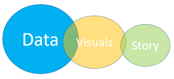
- You are given some data.
- You create super cool visuals following all kinds of visualization guru advice
- Then you slap labels to the charts correctly and perhaps add some reference lines so that the visuals tell a story.
4 years ago, I wrote a post called Visualizing Length of Stay. In it I espoused my own principles for you to follow as you march towards producing “Intelligence” for your end users.
- Numbers themselves are useless
- Don’t compare unlike things to each other
- Context is king
- There is tremendous value in using visuals that depict more than a single number
I’m guessing that you’ve been following a similar pattern in your work as well. Hopefully you have had success in your career as I have had in mine. We must be doing it right. Right?
Flipping the script
In November I sat down with David Ciommo the Data Visualization Principle for Humana in their Visualization Center of Excellence to talk “Data Storytelling” for one of my Dork Casts. As a customer/partner I’ve seen the results of his work for several years now. They’ve been nothing less than stellar. Applications with huge adoption from thousands of users across a wide spectrum of positions and data literacy levels. All that was important for me to remember when he told me that I had been doing it completely wrong.
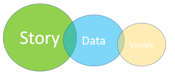
He said we needed to flip the script and that the workflow should be:
- Develop the story
- Decide if you have the data needed to tell the story and if not go get it
- Design the visuals needed to convey the story
You know what? He was right. Actionable intelligence is a simple 2 word phrase and yet we spend 99% of our time on the word “intelligence” completely ignore the primary word “actionable.” We focus on the data. We focus on creating pretty visuals. Then we complain to each other about how we just spent 1.5 years building something that isn’t adopted across the organization.
We spend 99% of our time on the word “intelligence” completely ignore the primary word “actionable.”
His workflow starts with “what will it take to move someone to action?” Once you identify that then you go after the data needed to tell that story. Finally, find or create the right way to visualize the data in a way that tells the story. Crazy right? But that’s how genius works.
Real world example
I’ve spoken with several people who watched my Dork Cast with David and they all asked for a practical example. So let’s use my original post on Visualizing Length of Stay and follow David’s workflow and see where we end up.
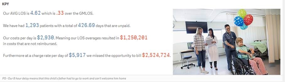
Who is the audience going to be for the Length of Stay project we have been asked to undertake and what is going to motivate them to take action? For this example we will say that the audience are administrators who are motivated financially. After all healthcare is a business and one of the biggest drivers of our entire economy so no rush to judgement on their motives.
So on to step 2 in David’s workflow. Do we have the data needed to tell a length of stay story about finance? No. We have the raw clinical data about patient encounters. If we display our Length of Stay as a number without a $ they are going to ignore it even if they admire how pretty we showed it.
We need more data
Let’s find out what the costs are to the system for each additional amount of time for Length of Stay. What aren’t we reimbursed for? What are the costs that we pay out of pocket? What are the dollars we miss capturing because a bed was tied up that should be free and we off load patients to another hospital? We postpone surgeries because we have nowhere to put them? That’s a lot more data sources that we need.
Are you seeing where that goes? We could rush to deliver a project that will result in no user adoption, or we can delay the start of the development in order to create a product that actually drives action and is highly adopted.
Finally we come to agreement on that type of financial data. Now it’s time to display it for end users. Woohoo now I can use a spinning 5-dimensional chart. You know the kind that requires us to spend hours explaining to the administrators so that we can enlighten them on how to read it. Or we could keep it really simple and textual.

Closing thoughts
What David opened my eyes to was that the phrase “Actionable Intelligence” starts with the word action. Hopefully I’ve helped you see that as well.
I’m not suggesting for a second that my Length of Stay example above is the only thing you would ever build for Length of Stay. I only used it to draw your attention to how diametrically opposed that KPY is to the KPI’s I utilized in my original post on Visualizing Length of Stay 4 years ago.
All I’m asking you to do is ponder David’s workflow very carefully as I have for the last 3 months. Especially if you find yourself banging your head against the wall due to such low user adoption project after project. Maybe you need to rethink your approach. Consider stepping back from the mad rush to “just do something with the data you have” and think about what you really need in order to drive “action” on it. That’s how you will increase your user adoption.
Hug me or scream at me I’d love to hear your thoughts on this.
Brilliant content. Nice use of a prior post, to provide context and show an example. I will revisit this post.
Pingback:Of Dashcards and Drill-Down Maps • AfterSync - Everything Qlik
Pingback:Show and Tell - Qlik Dork
Pingback:Data Artistry - Qlik Dork