Visualizing Data Fluency

The real question that’s plagued the world has never been “Should I visualize the data?” it’s always been “How should I visualize the data?” Because it’s not that people don’t want to see things visually it’s a matter of how “data fluent” they are and how creative you can be in displaying the data.
For the sake of this post (which may never be completed) I’m going to use a set of data that represent Healthcare Quality Measures. I will gradually unveil deeper and deeper dives into the data (Analytics and Data Discovery) and as I go forward hopefully you will realize that ones “data fluency” is going to limit what you can do. At the same time driving you to increase your own and encouraging others to do the same.
Let’s start really simply and imagine that we want to show Ed Zecutive the # of measures that we are dealing with in our dashboard.
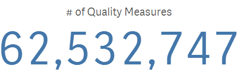
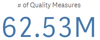
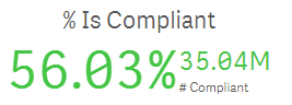
Wow that’s a big number of records and it’s a completely accurate account of the volume of data we are dealing with. Two things to consider “Ed is a busy guy, does he have time to read that many digits and does he really care about that kind of precision.” If Ed can interpret the following KPI (with M for million) instead … wouldn’t this allow him to consume the value faster?
Ed also asks to see “our compliance” which of the following do you think answers Ed’s question? Do you think he really means he wants to see both? Does the color indicate anything to you? What does it imply?
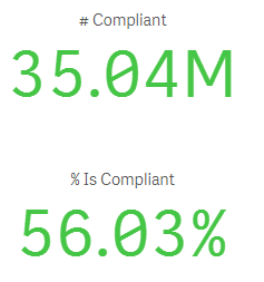
Now we have to ask ourselves if we need to waste that much screen real estate to show ED those 2 numbers? But if I show only him 1 or the other which is most important? If he is “data fluent” enough to figure it out by combining them in a single KPI object that shows both, but in a way that he sees the %, always most important but the number is there in case he wants it. All in a single compact KPI that saves space.
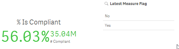
That may well be all that Ed Zecutive cares to see. But what about Candi Stryper won’t she want to drill in and see the number for the most recent compliance versus last years compliance? Of course she will. If she is used to “fitlers” we can do something like the following where we let her simply click “Yes” or “No” to indicate what she wants to see.
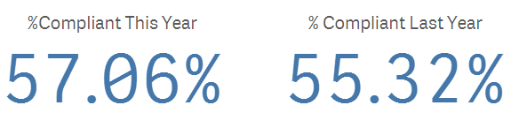
But perhaps she’s afraid to “filter” anything for fear she’ll do something wrong. Or what if we simply want to save her time as opposed to just doing the minimal work necessary to give her what she asked for. Then we can calculate and show her both values at once.
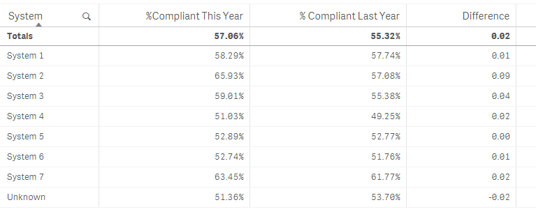
Ok you are screaming “Well duh if you could show both numbers don’t give her a filter in the first place just show her both numbers.” To which my response is “It’s never about 2 numbers instead of 1 or 1 simple filter.” Her very next question is going to be “Can you show me those numbers for each system. Of course we can. Now all Candi has to do is process all of those cells and do some mental gymnastics in her head.
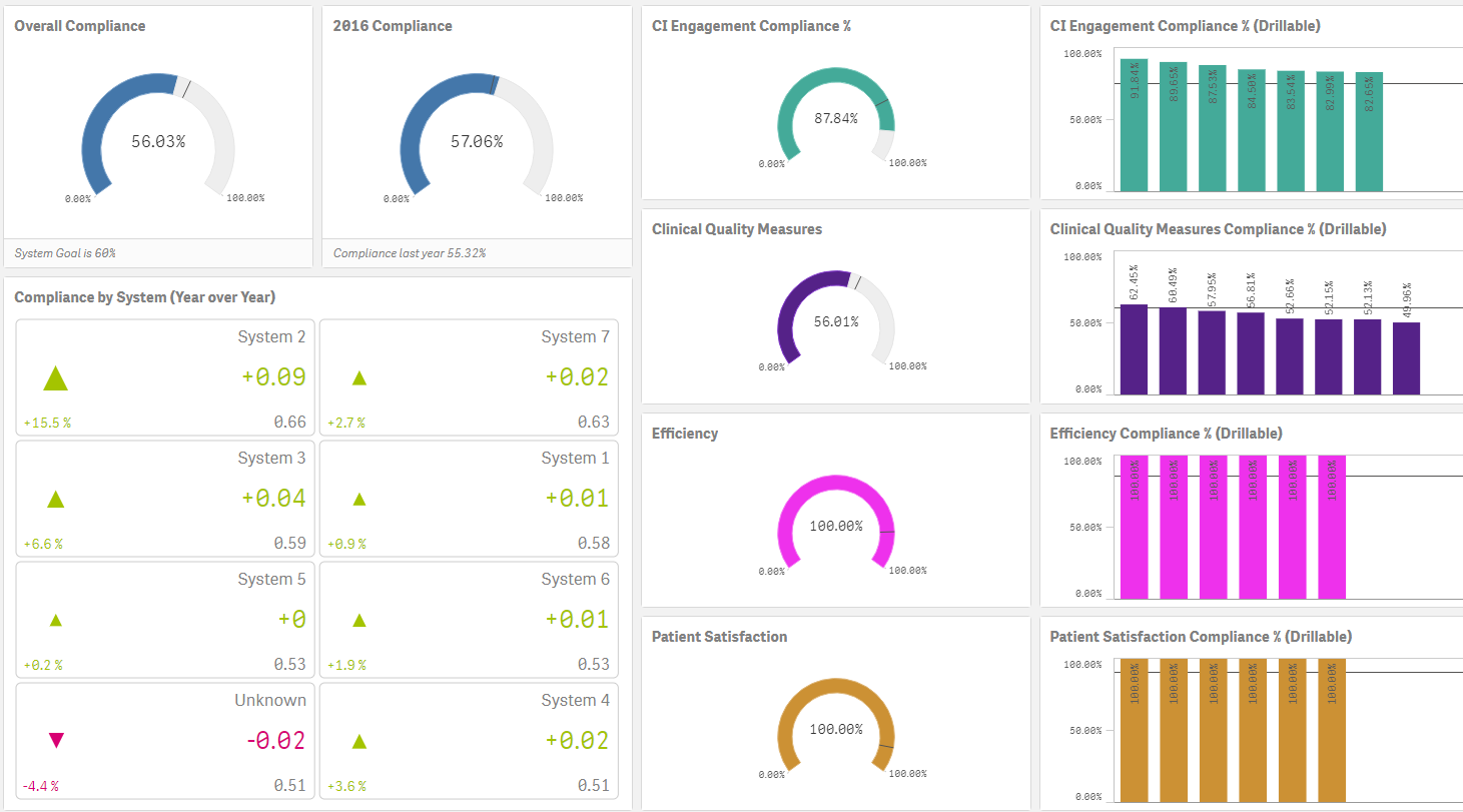
Here is where the rubber starts meeting the road. If we can increase Candi’s data fluency so that she can handle something like this we can present what I’m about to instead of the table above.
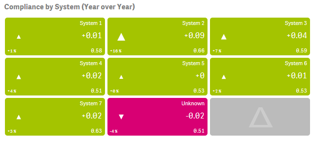
Each cell represents a different system and contains SO much more information. Clearly the green immediately lets her know that all 7 systems have improved year over year. The one that hasn’t … is “unknown” meaning the data doesn’t identify the system name for the quality records.
What is the next thing you notice about each cell of this KPI?
The sizes of the triangles of course. I didn’t have to explain that to you and she didn’t need me to explain it to her either. Numbers tend to blend together size wise their isn’t much difference 0.01 and 0.09 but by golly if the arrow is 9 times the size wow that makes a difference in her ability to immediately focus on big/small etc. Don’t believe me scroll back to the table version and honestly consider if your eyes are immediately drawn to systems 2 and 5?
On any given day she may want more meat on the visual bones. The lower right corner shows the % of compliance for the current year. Above that is the change from year over year. In the lower left corner that difference is calculated as a percentage of difference. System 2 has improved 16% year over year, whereas System 5 is virtually unchanged (when rounded) but did in fact improve slightly.
But if Candi isn’t ready to handle this kind of a chart we are wasting our time using it. The fact that we can produce it, doesn’t mean that end users like Candi can consume it.
…. Updated 8/31/2017
Introducing the Tree Map
Great news is that I heard from Candi and she completely got it. When I told her that she could actually click on any of the KPI’s to “drill down” into the Practices for that system she was ecstatic as well. Said she had never dreamed of having that much information at her finger tips. But she called back a short time later and said that her boss wanted to know if they could see Systems and Practice groups together instead of having to drill into each. Apparently they had seen a Pivot Table at some point and liked that kind of flexibility. Of course we could show a pivot table, but again, that isn’t very visually appealing and it forces you to do lots of mental gymnastics.
I told her that viewing 2 dimensions at the same time is absolutely presentable in what is called a Tree Map. Each System can be shown with blocks inside of it for each practice. (Any 2 dimensions.) The blocks are sized by the value represented. “What about Year over Year she asked, we really love being able to see that?” Hehe I knew where she was going and told her that we can color the blocks based on whether or not each practice within each system had improved year over year or not.
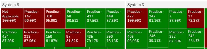
Those of you who are familiar with this type of thing are probably waving your finger at me saying “But Qlik Dork you can’t use red and green because people are color blind you should have used a different color scheme.” I can use any colors I want, we all can, but rather than focusing so much on color blindness the point of this article is to focus on moving people along the Data Consumption Continuum and helping them become more Data Fluent. For those used to Red and Green Scorecards that are manually produced in Excel making a shift to another color scheme will slow the process down for them to immediately recognize “good versus bad.” The fact is that the red/green jumped out at you before you ever looked at the numbers themselves. You immediately knew which was getting worse and which was getting better.
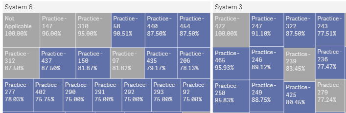
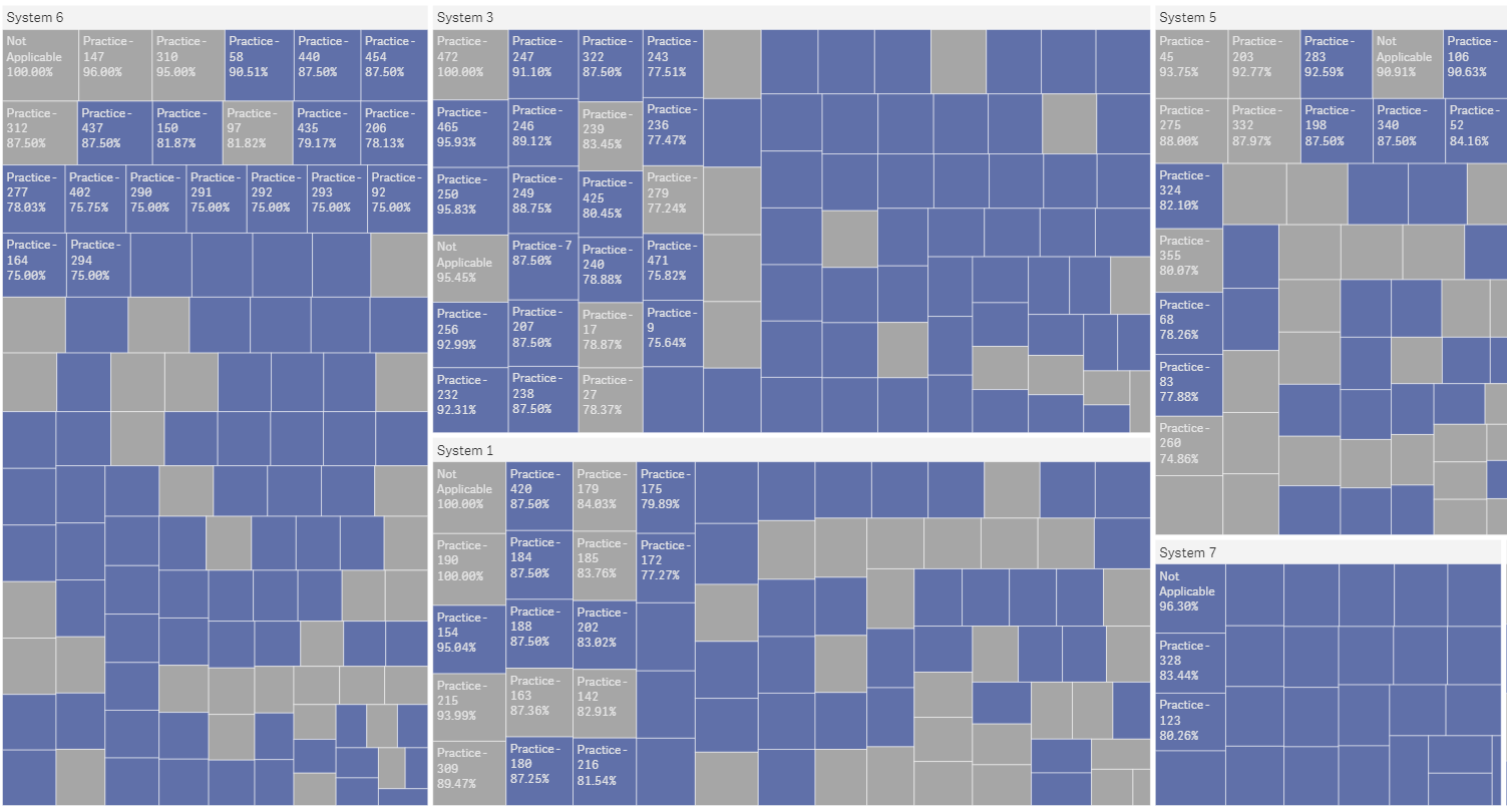
You will notice that the blue/grey version contains more practices than the red/green version. That’s because the world isn’t always as simple as what we want to display in a given amount of space. And this is no exception. You see the systems that Candi and her boss work for has lots and lots of practice groups within each system. I mean lots. The above were simple captures of just a small region of the actual tree map in the application I’m building for this post which is below.
So why didn’t I just start with the full screen shot?
Great question. I’m not sure that you could consume it. Because as you will see many of the cells don’t show the practice names and values. Figured that might freak you out because you aren’t ready for the next step in the journey to data fluency.
The entire chart is meant to take you from what you are familiar with. You might tell me that you get every name and every value in a pivot table. To which my come back will be “Liar, liar pants on fire.” In fact you can’t see them all the same time you have to scroll throw. You have to take action to move around.
What smart responsive objects like those in Qlike Sense do is present to you the high level overview and as much detail as the real estate will allow. You can see the systems sorted by the highest ranking of compliance. Then you can see how many practices each has and get a really quick understanding of how many practices within each system have improved year over year.
What I’m going to suggest is that you can actually obtain more information without the numbers than you can with them. Let me give you some examples:
Notice System 7 does not have the best compliance, but every single practice has improved year over year.
System 5 is kind of mid range of the systems in terms of its overall compliance but the vast majority of the practices within the system did poorer this year than last. But perhaps the volumes of those that did better pulled it up.
Now that you are seeing things that wouldn’t jump out at you otherwise, let’s keep going. Out of the top 24 practices in terms of compliance at System 2, only 5 of them performed poorer this year than last.
Stark comparisons and insights that we can obtain regarding System 2, System 5 and System 7 that we would very likely miss entirely if we simply saw numbers in a pivot table. None of which really involved knowing or caring about the values or the practice names.
However, I do need to ensure that people are ready to deal with this concept. They have to be “data fluent” enough to understand that the system isn’t going to simply display .00002 font sizes that wouldn’t be readable anyway. They have to understand that they can zoom too see more data. They have to be willing to want to gain the insights that numbers alone don’t show. Because if they are focused on numbers they might be missing the much bigger picture.
…. Updated 9/1/2017
How do I know what to target?
That’s the call I received this morning from Esta Mate. A Junior Business Intelligence Analyst assigned to the Quality Improvement team. Apparently Esta sorted a list of the practices with the worst percentages of compliance and started working with the lowest group. They laughed at her when she told them what she was there for and thus the call to me.
What Esta had missed in looking at the list was that when you are trying to move the dial of quality for a large system you have to account for not only the percentages, but the number of items. If a practice has a compliance of only 12%, but they only have 100 quality measures all together, out of our 63 million total, getting them to 100% isn’t really going to move the dial. Counter intuitively we might actually want to focus on the group doing the best already if they have more overall records.
But how do you relate 2 different measures to someone so that they can consume both numbers at 1 time? A great way to do that is a Scatter Plot. It means that Esta will have to learn how to consume both measures at 1 time though and make inferences.
Being the Data Fluent person you are can you read the scatter plot below and determine which System we should focus our efforts on?
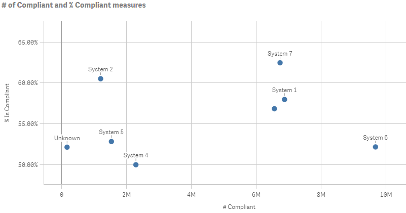
Often times we focus on what we are thinking. Our goal is “Compliance” so we measure it.
What if in order to improve, we shifted our focus to “non compliance” and plotted that in a scatter plot instead. Does this help at all determine which system we should focus on initially?
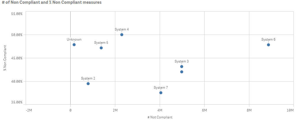
Poor Erma is pretty new. She sees the benefit of a Scatter Plot and we ended up talking about it’s usage for other types of measures but she still wasn’t confident using it as a way to explain to her boss why she wanted to focus on System 6. BTW — Is that the one you chose?
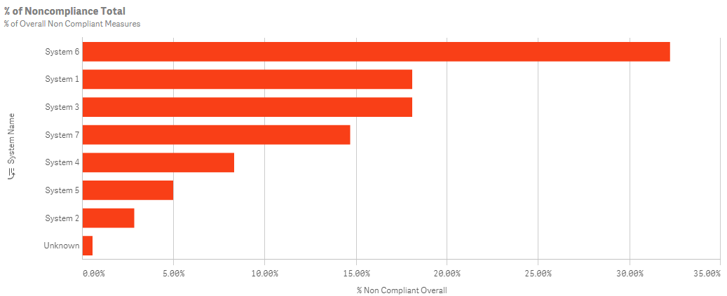
I then made another suggestion to Esta. Since she understood the concept of focusing on the non compliant measures instead of the compliant measures perhaps we could avoid the complications of two measures by looking at the Overall % of Non Compliant Measures instead of making her guess the relationships to the whole. Meaning look at all of the measures that were non compliant, then figure out who had what % of them.
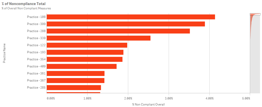
The following very simple bar chart shows that System 6 has over 30% of the overall systems non compliant measures. While the next closest were Systems 1 and System 3.
But a system is just made up of practice groups. So I built the bar chart so that she could drill into each system. When she drilled into System 6 she could clearly see that Practice 399 was obviously the practice within the system that needed her focus.
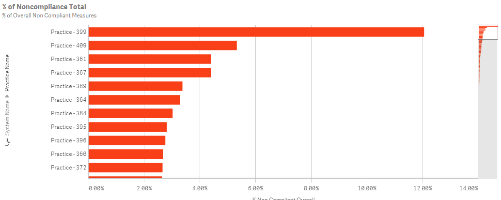
My eyes got a little salty when Esta asked if she could have the same kind of bar chart but not have to drill into the System first in case there were practices that had a lot of non compliance but the overall system wasn’t near the top of the list. You better believe I gave her that immediately. How about that for a guess? Esta won’t be a Junior BI Analyst for long and her data fluency is growing as well.
…. Updated 9/8/2017
Quit taunting me!!!
I’ve enjoyed the flexibility that writing and updating has given me as I’ve played with this data set while also tackling what I believe to a real issue that impacts User Adoption. I realize that many of you are probably getting tired of my updating an existing blog every couple of days so I’ll end your suspense now.
You are welcome to play with the application I actually built to see one potential real world approach to visualizing 62.5 million quality records for 2.76 million patients, covering 8 health systems, with 685 Practice Groups employing 5 thousand physicians. Simply click this link and you can start playing with the application on our demo site.
Your turn
If you would like to try your hand at Visualizing this data set just email me at [email protected] and I will send you a link to the QVF used for the demo application and the data set (CSV files) you can download.
I would love to read your thoughts, experiences and approaches to increasing Data Fluency within your organizations and how you’ve seen it impact the User Adoption of your applications.
Hi Dalton,
Really enjoyed your blog. I have been a Qlikview & Qlik Sense developer for a couple of years now but moving to a more challenging & demanding internal role at my company which requires me to be an expert in what I deliver. Hence, was researching the internet for advanced learning of Qlik Sense & Data Visualization best practices. Could you please share the QVF & Data files link so that I can try things at my end? Thanks in advance.
Regards,
Vijay Kumar
Thank you Vijay. The best place to pull lots of visual examples and code is from the Qlik Community Gallery. https://community.qlik.com/t5/Qlik-Gallery/bg-p/qlik-gallery
That is where Iron Sharpens Iron and you can see, pull and touch others work as well as share yours and ask for advice/tips to improve as well.