Visualizing Advanced Analytics

Advanced Analytics with Aster
I recently stumbled upon Teradata’s Aster and I’m pretty fired up. It turns out there is an entire community dedicated to helping data visualization people like myself learn how to implement advanced analytic functions. The site includes a link to download Aster Express free of charge and includes a slew of great training videos.
Click here to see the Teradata Aster Community
I can almost hear the Data Scientists reading this post laughing at me for just discovering that. Meanwhile all of the Data Visualization people stopped reading and have already clicked the link and started downloading.
Visualization with Qlik Sense
Well if you Data Scientists are so cool did you know that there is likewise an online community site dedicated to helping you learn how to visualize your super cool analytic results? Well did you? The Qlik Sense Community offers similar free downloads for the product as well a slew of great training videos.
Click here to see the Qlik Sense Community
Guess me and the other Data Visualization peeps get the last laugh after all.
Kidding, and sharing of links aside, this is a serious post about how Data Science and Data Visualization can be married through the partnership of Qlik Sense and Teradata Aster. They are an easy and natural fit. Why?
Because Aster uses an SQL’ish syntax they call SQL-MR. Qlik Sense can easily fire any native SQL-MR directly against Aster, retrieve the results and then visualize them. No need to build out views. No need to save the results into tables. Simply fire the SQL-MR queries directly as written.
By offering a complete set of Open API’s Qlik Sense provides developers around the world the ability to construct visualizations to enhance what is available natively in the product. Like what you ask? Well a Sankey for one thing so you can visualize paths. Network/Graphing objects for another so you can visualize networks. Like … oh go see for yourself at:
Click here to see the Qlik Sense Community for Extensions
For your viewing pleasure
I could write and write and write and bore you to tears … or … I could take advantage of this chance to show of my cool new Qlik Dork video stinger and demonstrate the functionality … visually.
In a mere 3:57 I take the pure NPath SQL-MR query that John Thuma demonstrated in the Aster training video series for bank web clicks data and I implement it inside of Qlik Sense. I then take the results and display them in the raw form and using a Sankey.
Wowed yet? Don’t be that’s just me getting warmed up. In a paltry 3:05 this second video demonstrates how you can modify the NPath query so that the results aren’t aggregated. Why wouldn’t I allow it to aggregate the million plus paths? So that I can tie the raw paths together with customer demographics information. Allowing you to then discover the paths for selected cohorts. No way!!!
Yes way. C’mon I’m the Qlik Dork of course I would go the extra step for you. I even utilize a mapping object to select customers from selected states. All while the Sankey diagram is being updated to show the paths that were returned from Aster based on the selections.
But wait! There’s more.
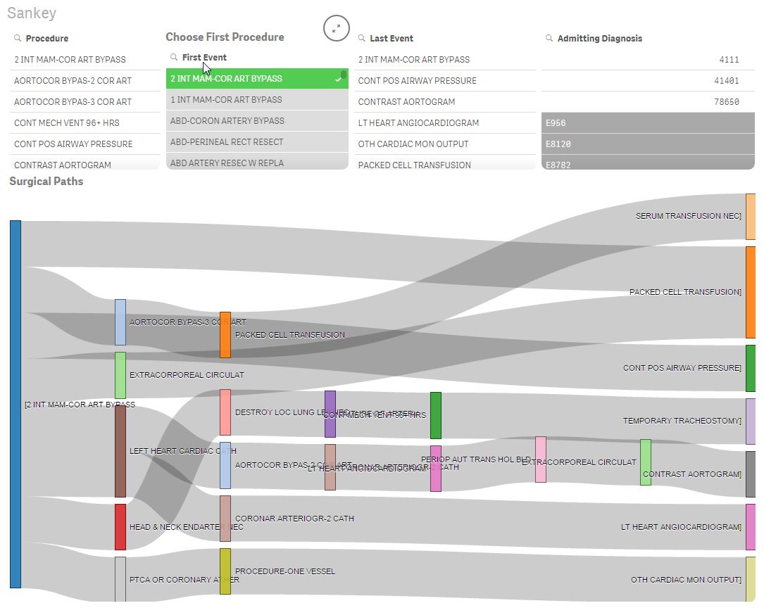
I know you are now fired up and you want more. Don’t worry my friends I’m just getting started down this path of marrying Data Science and Data Visualization. What can you expect next? Keep it a secret but given my background in healthcare it may just have something to do with utilizing an NPath SQL-MR query in Aster to analyze the events for surgical patients but you didn’t hear it from me. After all it’s not like I’m trying to actually help people do real world stuff like that.
I used a Qlik Sense and sankey extension with Aster and I m not able to visualised data as is describes in article ( sankey need more then one dimension). any suggestion how to used the sankey against the Aster analytic nPath functionality ?
I recently created a Qlik Community post to help everyone walk through using this great visualization technique. In the post I walk through everything you need and provide a sample application you can play with to get started. https://community.qlik.com/message/1198765#1198765