Visualizing the Data Consumption Continuum

As this is intended to be a blog about visualization it seemed only fitting that I devote this post to visualizing the concept I introduced last week that I called a Data Consumption Continuum.
It all started with …
A few years ago my good friend and colleague at the time at Northeast Georgia Health System, Zach Ivie, helped me solidify a visual very close to the following.
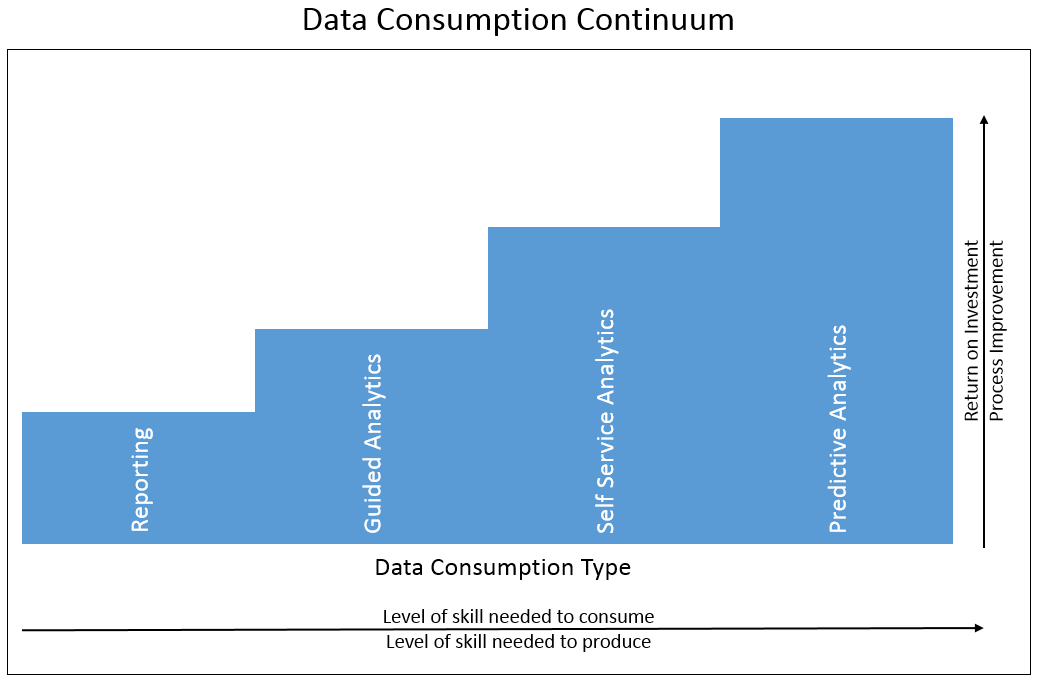
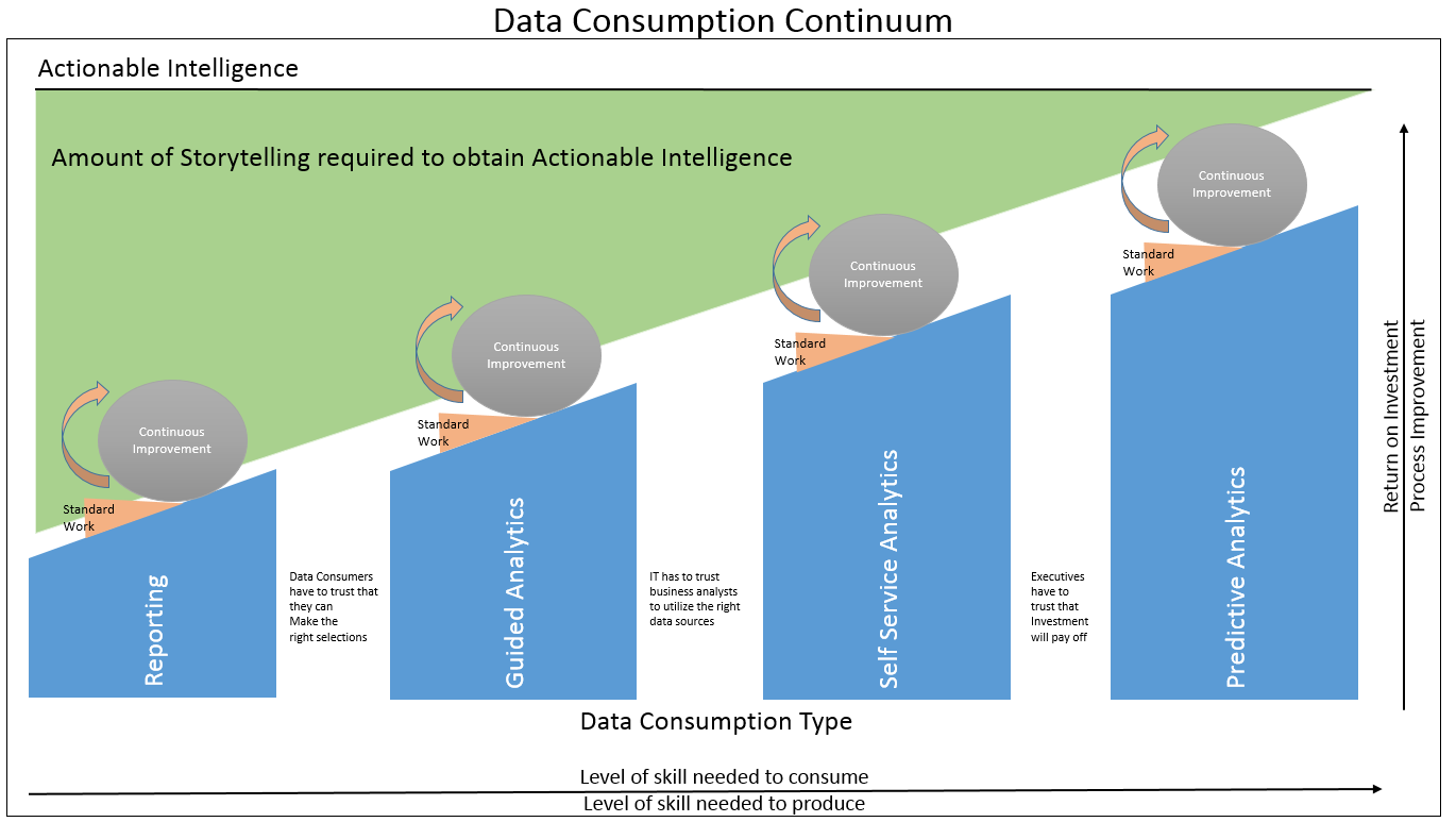
Despite the fact that this is a rather crude version of the work of art that Zach, a graphic guru, helped produce, I believe the message will come across loud and clear anyway. That message is that as you move through the Data Consumption Continuum there is a higher level of skill demanded of both the data consumer and the data producer. However, the benefit to the company of making those investments is clearly that there is a higher level of return on investment as well as a higher level of process improvement that can be achieved.
Not very hard concepts to grasp, but we found it very useful in trying to help data consumers understand that we weren’t trying to replace their roles. We needed them to understand we were trying to help them become even more valuable to the company. Having a visual that they could readily grasp was very effective in our efforts to establish trust that we saw them as teammates and provide the incentive to do the hard work that needed to be done to progress through the continuum. Obviously the same image helps build support through management as well. (In hindsight I would add “Time needed to produce” along the bottom as an annotation as well to help management understand each step in the continuum takes longer than the prior steps.)
Much appreciated input came along …
I presented the graphic when I spoke at the 2014 Qlik World Users Conference in Orlando.
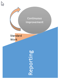 Among othersI met at the time, two gentlemen from Lee Memorial Hospital named Marcello Zottolo and Roger Chen stood out. Over the course of a few weeks following the conference we spent a lot of time chatting and growing our friendship. During which time these Process Improvement gurus asked why the image was like steps instead of being a straight line up the continuum. I indicated that I wanted to illustrate very clearly that you didn’t move up the continuum by accident. That there had to be clear and pronounced commitment to doing so. But I asked how they it. They were gracious enough to share an image with me that was something like the following, and you know I love visuals:
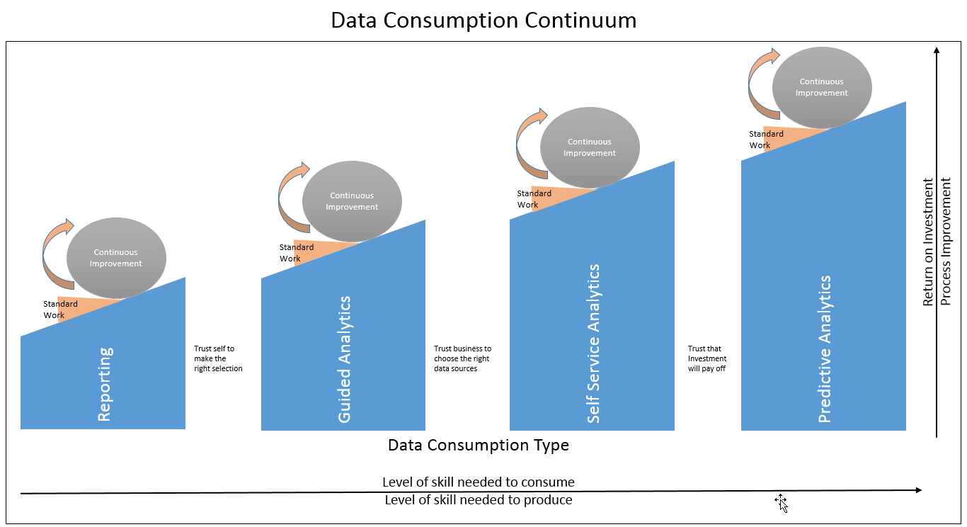
I liked the implications that their suggestion implied. Clearly we should never be standing still and that even the stages of the Data Consumption Continuum are in fact a process. That the hard work I indicated could be visualized as a ball rolling forward, and that there should be documentation supporting the standard work after advances are made. So I adjusted my thinking to include their great thinking and suggestions along with my basic premise that the different stages required a knowing decisions.
Combining the thoughts provided room for annotations to note exactly what I believe those commitments are: Ever increasing levels of trust. There are clearly static reports that are simply needed as “checklists” for workflows. However, there are also thousands more developed simply so that business data consumers can avoid having to accept any responsibility. It’s easy to say “I took off the report that Dalton built for me. Clearly he did it wrong.” Which is also ok with me because I can say “Clearly they gave me bad requirements.” Thus the proliferation of 18 versions of the truth continues. Moving to Guided Analytics forces those data consumers to accept the responsibility for making selections filtering the data they are then responsible for the choices they make. Which only makes sense as they know their business better than IT and a lot is missed in writing up requirements documents. As you are probably well aware from experience getting others to accept responsibility is easier said than done.
Moving along the continuum from Guided to Self Service Analytics forces a department wide level of trust on IT’s part that if they construct governed data sources they can trust the business units to build the applications instead of IT building them. The next stage requires an enterprise wide level of trust that the investments of the amount of time, salary and technology required will pay off. (Clearly there are a lot more complexities than just “trust” but the symmetry in the visual was to hard to pass up.)
One of the great pleasures in my search for more effective ways to communicate and be the catalyst for change is the identification of others in different fields who are also working tirelessly to train up. Others who continually reiterate and show examples to help crack my think skull.
Never stop consuming knowledge …
One such field that I’m trying to hone my skills in is Storytelling. Cole Nussbaumer is one of those afore mentioned people that I love learning from on an ongoing basis. I’ve always been a self-professed data nerd and was always of the mind “For crying out loud the data speaks for itself.” Cole has helped me realize that’s not even close to reality in the field of Business Intelligence. Her blog conveniently named for people like me Storytelling With Data is a resource I’ve referred to many times. She backs up her pontificating through examples to show the flow through projects. For me seeing a visual as a starting point then seeing it progress forward using her techniques step by step has really helped me understand the value of storytelling and more importantly how to do it.
But how does this relate to this post? Well if you give me a second I’m getting to that part of the “story.” I’ve begun realizing that Actionable Intelligence requires not only the data and visuals but storytelling to explain things so that executives fully understand the ramifications. Thusly I present my current approach of Visualizing the Data Consumption Continuum.
Disclaimer: Clearly I’m no graphic artist. Hopefully my crude crayon type drawings aid in your ability to consume the concept of the Data Consumption Continuum. 😉
Pingback:The Power of Now - Qlik Dork