Visualizing Healthcare Claims

I recently had the opportunity to demonstrate Qlik Sense for the Director of a large health system’s Revenue Cycle team. The consultant who recommended us spoke with me ahead of time and we got along great. “This guy has been around forever and has seen everything. He isn’t interested in the same old boring ways of seeing the current numbers” he said.
Hehe. That certainly makes at least two of us. Are you pretty tired of seeing the same old account balance visualizations? Yeah. So that makes 1,293,394 of us that have seen the same things for years and want something new.
Then our discussion led to something really interesting. “He is really looking for some way to visualize the entire flow through the Revenue Cycle process, not just the current status.” This demo just got really interesting. “How can we show claims and dollars as it flows from state to state through the process?” Suddenly “light dawn’s on Marblehead” and I’ve got it baby … A Sankey Diagram.
A Use Case is born
I’d been waiting for over 6 months for a perfect case to utilize a Sankey Diagram and voila here it was, teed up for me perfectly and here is what I came up:
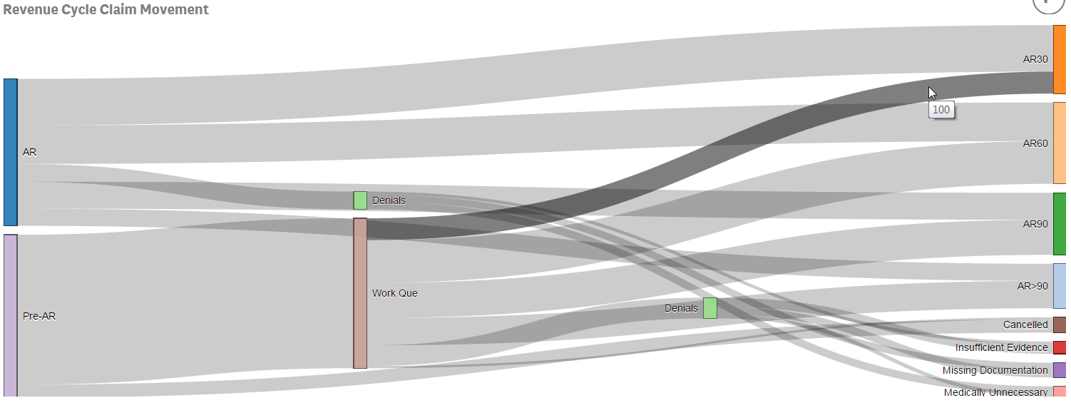
This chart represents # of Claims. The AR section in blue is the number of claims for patients where all of the data was available on first try and could be billed. The Pre-AR section in purple represents the patients where something was askew in their charts and could not be billed.
“Big deal!” You say.
“Even dreaded pie charts can show that context comparison.” You say.
“Did I forget that visualizations are supposed to add value to the raw data?” You ask.
Stay with me about 2 minutes longer and you’ll see the method to my madness of using a Sankey Diagram where you see the entire flow. The proportions are about even on the left, but notice in the up right corner that the proportions aren’t. Also notice one of the wonderful features of a Sankey Diagram, if you hover over an area it turns dark so you can see the path that area has traveled as well as the number it represents. It’s 100 and it brings to the surface the fact that a smaller percentage of claims end up being paid within 30 days when we have to do work to the patients data in order to file the claim.
The proportions are almost even for those paid within 60 days and the proportion of the dreaded money that doesn’t get paid for 90 days or longer is higher for those claims that needed to be worked.
Lone wolf
This my friends is where the Sankey Diagram stands alone in the value it can add. You can easily scroll your eyes through the “flow” and track anything that seems suspicious. And it gets better.
Like any other chart the “# of Claims” doesn’t have to be on the only measurement you visualize. Would you like to see the Dollar ($) values? Why not, you have nothing better to do and I’m sure your curious … here it is:
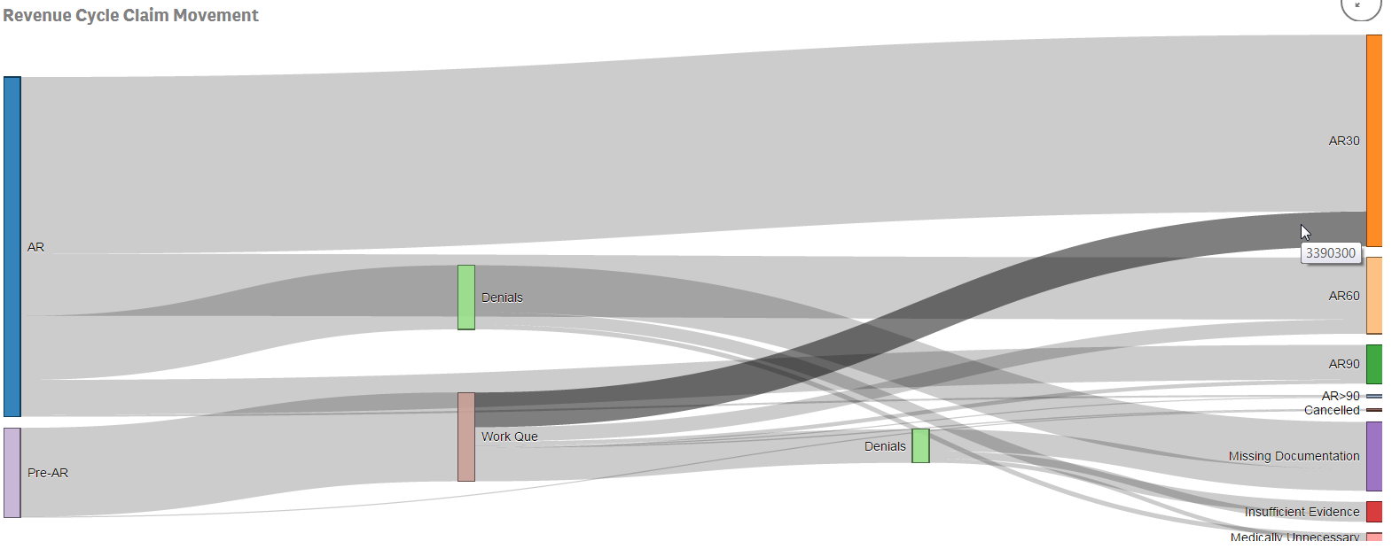
Right away something else jumps out … the proportion of claims was pretty close for AR and Pre-AR but the dollar values, are very far apart. How many bar/pie charts/tables would we have had to look at to uncover what was blatantly obvious thanks to our new friend the Sankey Diagram. Almost immediately we see that we are working a lot of cases to clean up data so we can bill but the dollar volumes for the cases are smaller than the dollar volumes of the “clean data.” What’s causing that? Why do claims that have to be worked before being billed take so much longer to pay once they are billed? True analytics will answer the question you had when you started but will also cause you to ask more questions.
Better lucky than good
I’m lucky in that I had a consultant tell me about the customer in advance. Knowing he was extremely data literate and that he wasn’t satisfied with the status quo excited me. It challenged me to use a visualization I had been dying to try for 6 months. Consider how you could shake things up completely by using a Sankey Diagram or other sexy new visualization.
Forget the example data that the author chose to show (sales/dollars) and focus instead on what the essence of the visualization does for the end user. Why did someone spend weeks/months of their lives designing this new way of looking at 0’s and 1’s? What will it let your end users see in a way that they probably couldn’t get by viewing 10 raw numbers.
Glad to see you are still blogging! Great insight and an example I have never heard of. Is this in QlikSense only? Thanks for sharing!
Dear Rue
thanks for this really nice example.
There are so many great new visualizations which could be easily implement to QlikSense and allow user to analyse their data in a complete new way.
Regards
Ronny
PS: I rfound your post first on QlikCommunity. Unfortunately your link to Qlik Dork is not working on your Community post. (“.com” is missing in the link)