
Visualizing Length of Stay

What do the numbers 3.53, 17.6 and 4 all have in common?
They are completely useless when displayed by themselves because they have no context.
Length of Stay is a vastly important metric in health care and here is the most common way to display it.
Perhaps you can make it prettier using a gauge, an LED, some giant sized font or some really out of this world java extension but will that really change the fact that it’s basically a meaningless number without context?
So often in the health care field we are so starved for data we can’t wait to slap the values on the screen and then start slicing it and dicing it before really thinking through the more basic question “What value does the number actually have?” Prettier isn’t better … it’s just prettier.
Average LOS is a real number that truly represents our average LOS. But does average length of stay truly represent how well we are doing? Is it fair to compare our average length of stay to anyone else? Is it even fair to compare the average length of stay within our organization between time periods? What about comparing the average length of stay between specialties?
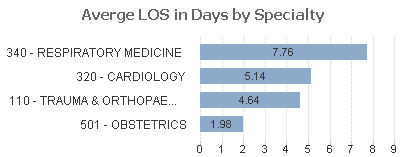
I submit that any comparison of the average length of stay is like comparing the size of pizzas to the size of chocolates. One is much bigger than the other but who cares … we expect it to be. Just like we would expect the average length of stay for obstetrics patients to be less than the average length of stay for cardiology patients.
But LOS is important and the purpose of analytics is to measure where we are and help us find areas that need improving so comparisons are only natural. So how can we go about visualizing the length of stay in a meaningful way that doesn’t involve comparing pizza sizes to chocolate sizes?
Visualizing Length of Staying using CMS for the context
The answer lies in the fact that the CMS already publishes a guide for what they consider the proper pizza and chocolate sizes to be. I mean they publish a guideline of the expected length of stay numbers by MSDRG. [Click here to go to the CMS site so you can download the 2015 CMS MSDRG metrics] I’m sure you are not at all surprised to find that the expected length of stay for the obstetric MSDRG codes are much less than those for the cardiology MSDRG codes. We can then compare our length of stay numbers to the expected guidelines on case by case basis.
Once we download those guidelines and load the data we can simply compare our pizza sizes (LOS) to the expected values and say “Our pizza is that much higher or lower than the expectations.” Then we can visualize the results in terms of the difference in days. We are either under, right at or over on each case and we can display that average.
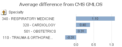
Now for another basic analytics question. Is average even the right thing to display? Our average includes outliers doesn’t it is that really what we want? When you pull the CMS expectations you will notice they provide you with 2 different numbers. One is the Geometric Average Length of Stay (GMLOS) which already has exclusions applied and one the Arithmetic Average Length of Stay which is pure average. The GMLOS is typically the more valuable of the two numbers and if we compare our numbers to that but then include our outliers we aren’t really doing ourselves justice.
The better plan for us would be to also devise a way to eliminate our outliers. Rats my data scientist is off today, so I can’t go that route. Instead lets simply take our median difference.
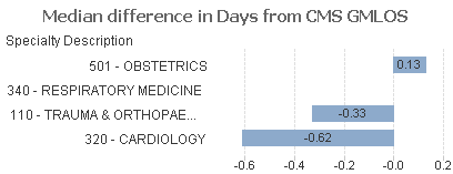
Kind of subtle unless I drive your eyes to it but focus on the Obstetrics specialty and notice that in the raw average length of stay numbers it is by far the lowest and we might choose to ignore it, but when you look at the median difference between our length of stay and the CMS expected GMLOS you will see it is actually the only one over the guidelines.
Folks how we go about visualizing length of stay data, or any of our data, really matters. We have to think carefully about what we are presenting for our directed analytics applications or we will have our analysts spending time evaluating how to improve the wrong things all together.
Now let me challenge you again with another question … is the difference in days from our length of stay to the geometric mean length of stay numbers from the CMS even the right number to be evaluating? If our pizza is a full inch wider than an 18” pizza and our chocolate is only .5” larger than a typical 1” piece of chocolate which are we actually furthest away from the goal on?
The chocolate! It’s 50% larger than the expectation while the pizza is a meager 5.5% larger than the expectation. Quite frankly I’m happy about that as I love chocolate so you can’t convince me that 50% larger is a bad thing, but when it comes to measuring ourselves against the CMS expectations 50% is much worse than 5.5% isn’t it?
Here is the beauty of using the % comparison … it fits perfectly with a gauge. You know those beautiful looking, eye catching, chart types that 99.9% of the time shouldn’t be used. This is perfect opportunity for us to use them. The center of the gauge represents the fact that we would be perfectly in synch with the CMS guidelines while anything under means that we are doing better than the guidelines (green) while anything to the right means that we are over the guidelines (red.)
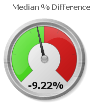
Now we are really cooking. At the beginning we had a bland simple number 3.53 days which told us absolutely nothing. Now we have a drop dead gorgeous way of visualizing length of stay and using the CMS guidelines as the context for our comparisons. 3.53 days means nothing because we don’t know if we sold 100 pizzas and 2 pieces of chocolate or if we sold 100 pieces of chocolate and 2 pizzas. But a % difference lets us compare how we are doing and is adjusted on an item by item basis.
Drilling into the numbers
But wait there is more.
Once we have narrowed down the service line, the physician group how do we drill even deeper to know where the problem is? Might I suggest using what statisticians use … a box plot. A box plot is a wonderful way to visualize complex data that enables you to see the ranges. You can quickly see the median (black line) of your data, the values from 25 – 75% of your data (blue) as well as the range of the outliers in your data what is referred to as the whiskers.
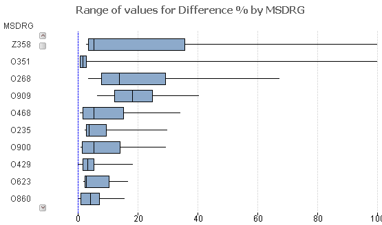
Assume that the encoded values represent the true MSDRG’s for Cardiology visits. Notice that while the median for 0909 is higher than the median for code 0268. That’s 1 piece of information for sure. But is it equally important to see that the range of values is much more tightly grouped and that it’s median value lies pretty much right in the middle? Is important see that a full 70% of our values are just barely above 0, while the top 25% make up a very scattered range of numbers?
Sold on the idea of visualizing length of stay numbers in terms of a range, but aren’t loving the box plot format? Yeah me neither. The following depicts a box plot but with options changed so that it simply looks like a typical bar chart which is much easier for the average analyst who isn’t familiar with box plots to consume.
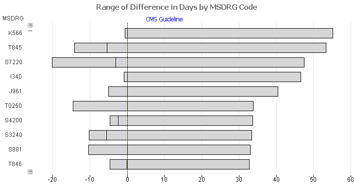
Notice in the chart above that code I340 shows a very interesting and telling range. 50% of the values are very tight together and are just slightly below the CMS guidelines in terms of # of days, while the remaining 50% range to nearly 50 days over the CMS guideline.
The value 3.53 has some meaning in that it truly is the average length of stay. But in the big picture the purpose of data visualization and anlytics is to provide a much deeper context than any single number can possibly portray. Our job as architects/developers/designers is to provide as much meaning as possible in as many ways as it takes for the analysts to consume the true picture and adjust processes to help the organization improve. Visualizing length of stay just happens to be a really complex metric to do that for.
Pingback:Using Qlik - real client in Healthcare
Pingback:Length of Stay as a KPI in Healthcare
Pingback:Actionable Intelligence - Qlik Dork