Visualizing the Story

“It was the best of times,
It was the worst of times,
It was the age of wisdom,
It was the age of foolishness …”
These are the unforgettable opening lines to Charles Dickens’ classic “A Tale of Two Cities.” One of the first pieces of classic literature I ever read. I had just entered the 10’th grade and our teacher loved this book so much that we literally spent half of the entire year just reading and reviewing this book.
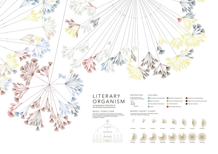
If I had a fraction of Stefanie’s creativity, the graphic art capabilities or the time to truly do it justice I would love to visualize “A Tale of Two Cities.” I’m more of a people person than a words person so I would probably begin with a wonderful Chord diagram that mapped all of the characters to various character traits. How many traits would Charles Darnay, Doctor Manette and Madame Defarge have in common?
No wait the main point of the story is the incredible transformation in characters like Sydney Carton. What great paths a Sankey might divulge if used to map Sydney’s transformation from a lazy alcoholic into a selfless martyr. Where do his changes intersect with others in their development?
Sorry I digress … the whole point of sharing those opening lines wasto describe the period in which we find ourselves, not theirs.
We have petabytes of data available and yet business users can’t access a fraction of it.
We have examples of truly great work, ridiculous amounts of computing and graphic horsepower at our fingertips and yet we can’t build data visualizations that business users want to use despite being starved for data.
I have a confession to make
I recently completed a webinar in which quite frankly a fear raised its ugly head and I backed down from it. I was demonstrating what I had worked on with Qlikview and some of the super cool new functionality of Qlik Sense. Not a problem. I’m very comfortable talking about my data and my work.
My fear came through in my choice to not present one of the coolest new features of Qlik Sense which is “story telling.” I wasn’t really sure how to frame the graphics I was showing as a story that would be compelling. So I chose to simply avoid the issue.
Im pretty confident statistically that there are lots of others who are very much like me. We can import data from cockail napkins, we have incredible tools at our disposal but what we don’t have is the background in story telling.
Quite honestly I’ve avoided learning the art of story telling because I’ve felt like presenting my “view” of the story is against the rules. Aren’t we just supposed to share the underlying data without any of our own prejudice?
The data should just speak for itself shouldn’t it?
It’s the readers responsibility to know what they want the data for isn’t it?
Everything I’ve read in the past few weeks since my presentation has told me … NO.
Everything I’ve read or listened to lately indicates that great info graphics and great news stories have one thing in common … the author presented and guided the story from their point of view. They don’t alter facts to hide other views. They simply provide a lead or direction to the story to ensure that they have at least presented a path for the reader. If the reader chooses to dive really deep they can.
Local Hospital Workers
Battle 5 Headed Monster
Is my take on how our colleagues in data journalism might approach the very situation that many of us in the healthcare field find ourselves. Nearly every day we battle:
- Meaningful Use and a myriad of other governmental regulations
- Converting more and more processes from paper to electronics
- Lessening payment percentages from the government and insurance companies
- Increasing number of patients with super high deductible insurance plans
- An aging population that has multiple complications
- A rapidly growing antibiotic resistant population
Ooops! That’s 6 heads. Unlike data journalists I don’t have an editor to check my facts. Don’t let that cause you to miss this really important point … the data visualizations we build should have attention grabbing headlines to them.
For many many years data journalists have set the example of how to draw readers in and yet we struggle and sulk at the end of each day because with all of the resources available to us we don’t have the kind of adoption rates for our applications that they get with a pen and paper and brute force in gathering their data sources.
What I’m learning tells me that the next big step is to back up those headlines with key points that keep the audiences attention … like the 6 that I mentioned. Those points should then be able to be drilled into until they exhaust the data you have available. The path that your users choose to take is up to them. That’s where your directed story changes course and becomes truly interactive and user guided.
The main point I’m trying to make is that regardless of the medium we should all be visualizing the story. The vast amount of detail which we can provide in our data visualizations should be the only thing that separates us from data journalists who are bound by a limited amount of space.
My own metamorphosis may not be quite like that of Sydney Carton.
My work may never draw the kind of audience that Stefanie Posavec has.
But my friends my eyes are being opened widely to the great synergy between data visualization and data journalism. To anyone who tries to stand in my way as I continue to learn this great craft of story telling I say … “Off with their heads.”