Visualizing Lab Results


Have you heard the joke about the lab technician that walks into the room to stick you with a 15” needle and draw your blood? Of course you haven’t that’s just not very funny stuff.
More than likely you are not as afraid of needles as I am, but I doubt anyone likes being told “I need you to roll up your sleeve.” Seriously do they really have to say out load “This is going to sting a little.” I pretty much guessed ahead of time that a long sharp object inserted into my arm would sting a little.
On a serious note though despite the anxiety I feel I am 100% aware of the very valuable insight that lab results provide physicians about my health so I reluctantly tolerate the “sting” and try not to cry until I’ve left. I tell myself I’m brave because I know that there are scaredy cats out there that don’t even see a physician due to their fear. When you are in the hospital it’s not as easy to hide from them though. The lab techs are generally at your bedside very early in the morning, more than likely waking you up, in order to remove a gallon of your blood, or however much those vials hold.
Your blood is then rushed to the lab where a technician runs the myriad of tests that the physician(s) have requested and then the results are generated. Until someone does something with the results of the lab tests the values are simply like all of the 0’s and 1’s that reside on our disks … useless.
In this post I’m going to discuss how I handled visualizing those lab results for the physicians rounding report I’ve been working on. I began my work on lab results the same way I would anything … “let me see what kind of data and what volume of data I’m dealing with.” LOTS and LOTS. I’m not kidding. It’s almost like every single drop of blood holds 1 MB of data or something. The following is for just the last 3 days of lab results for 1 patient.
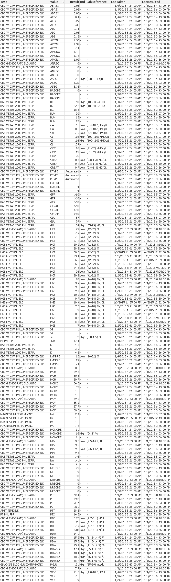
You didn’t like having to scroll all the way down here to finish reading did you? It gets worse … I want you to scroll back up and figure out what the most recent lab result value is for HCT. Painful isn’t it. Certainly we are not going to deliver that as our lab results visualization.
Let’s try a little harder
We can do so much better than just “displaying the data.” At minimum we can use the nifty little QlikView function PEEK when we load the data and rank the values by which is most recent, which is second and which is third.
Then we can at least provide a display of just the ‘Most Recent” data to save the physicians from trying to figure it out. We might even offer some color coding for values that the lab has indicated are too high or are too low. By doing that we take the 150 values above and pair it down to a much prettier 42 values.
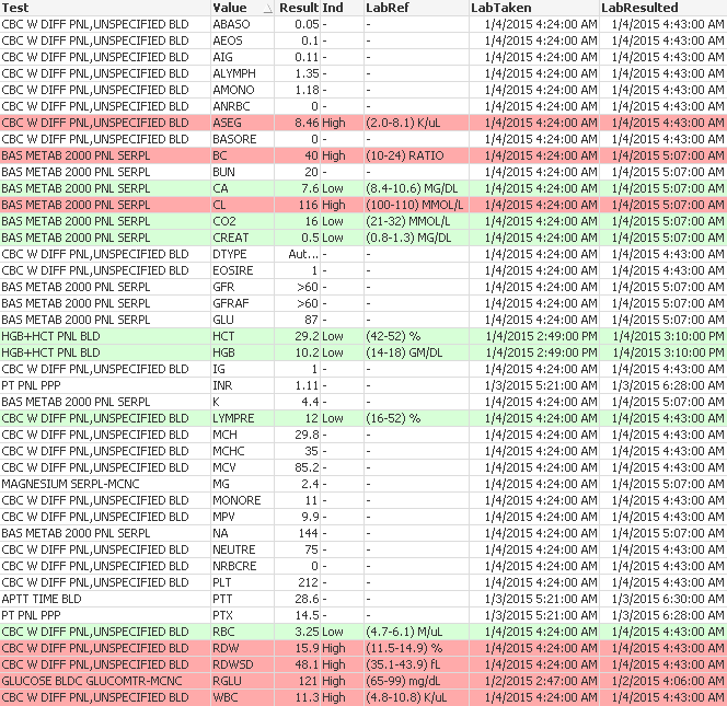
Gotta tell you it did take some time to convert from a table box to a chart so that I could do the color coding but that’s our job. Unfortunately I completely forgot about that whole “context” thing I mentioned in my post on visualizing blood pressure and while making it easier to read and prettier I took away their ability to know how this most recent result compares with the 2 previous results.
Putting some polish on our chart
What the heck … we’ve got a few more minutes before lunch let’s really go out on a limb and change our straight table into a pivot table. Then the physician will be able to see how the results compare. If you refer to the pivot table below you’ll see how important that is for the value “BC” as the physician will clearly be able to see not only that it’s out of bounds but will also be able to see that the trend is getting worse not better.
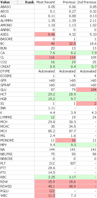
Don’t pat yourself on the back just yet my friend … there are still 42 values that a physician would have to sort through. Not to mention the fact that I used green to indicate a low value and red to indicate a high value. Hello color blindness issues that I forgot all about. But you shouldn’t … click here for a really cool color blind simulator that allows you to upload your image and see how those with various forms of color blindness will see it.
Not to mention the fact that green carries a positive connotation and perhaps the peril with a particular value (thus wanting the negative connotation of red) comes with a value below the expected range. As they say “no good deed goes unpunished.”
I spoke with our Chief Medical Informatics Officer and expressed my displeasure with the whole process. First I haven’t even liked thinking about having blood being drawn and I just couldn’t find any really good way to visualize the lab results.
No matter how I sorted it you had to dig.
No matter what format I changed the charts into tradeoffs ended up costing me valuable information.
It just seemed that if I was the physician and was rounding I would want something better when I was standing next to a patient’s bed. I would want something that let me immediately look for the values I cared about based on the patient’s particular conditions. If I needed to see a particular result or few results I would want a way to immediately see exactly what I wanted without having to scan the other 41 values.
Going Old School
He agreed with me and after some thought walked to his white board. He started with the 5 words he knows really motivate me “you probably can’t do this” and continuedas he started drawing “in the old days when we had paper charting we used Fishbone diagrams…” He went on to describe how they used to use drawings that looked like fish bones and different shapes contained certain sets of values. The “key” values from a basic metabolic panel for instance looks very much like a small fish. The values from a complete metabolic panel look like a bigger fish. While the results from a Complete Blood Count (CBC) form a different shape.
Imagine that … before we had tons of computing power, had millions of rows of lab results to display in grid form or had access to 18,393 books on data visuzalition they were visualizing lab results in an awesome visual way. Simple. Clean. Immediately recognizable. Below I have just 2 of the several forms of fish bone diagrams so you can see the technique. The numbers on the left are the most recent, while the ones inside parenthesis are the previous value. In the top diagram you’ll notice that if either of the values is out of bounds (high or low) I’ve simply enabled the color of the border around the text box. More subtle than color as it blends into the diagram pretty well if you are looking just for Glucose for instance. But if you are looking for their Chloride level then it immediately hits you that the numbers are out of bounds. I’m not as thrilled that the same technique doesn’t work as well for the other diagram shape. Good thing you can comment and give me suggestions.
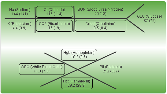
Using the PEEK function I was able to isolate the most recent three lab results. Combining that with SET ANALYSIS I was able to choose which to add to my old school visualization. Without much effort you can do the same for as many previous results as your physicians might like. Guess I better start spending more time with these old timers that wrote things down on paper.
Alright I gotta run … I’ve got a whole bunch more 0’s and 1’s to dump on my rounding report, I mean visualize in a way that will lead to our physicians ability to quickly consume them.
Great article. In a prior tool, not QlikView, I swam in these very same waters, vitals, BP, LOS, OBS hours, hBA1c scores, etc. We will be replacing those “dashboards” with a QlikView solution by the end of 2015, so your work is of great interest. By chance do you work in a Meditech shop?
Thanks for sharing!
Thanks for the feedback Michael. I do not work in a Meditech shop, we have Paragon now and had McKesson’s HCI prior to that. Be sure to be on the lookout for an invite from Qlik to a webinar on Tuesday January 27’th as we are hosting it and will be displaying several of our dashboards. I will be doing an article on LOS very, very soon. So keep an eye out for that.
Thank you – very nice! Do you happen to have other examples of fishbone diagrams available, or will those perhaps be forthcoming?